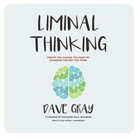
Liminal Thinking: Create the change you want by changing the way you think by Dave Gray is a book that I have toyed with reading for some time. I remember the occasion, quite a few years ago now, when, sat in a presentation at a Teaching and Learning Conference at work, I first encountered the concept of liminal spaces – transitional spaces or places that sit, rather fuzzily, between two different states, spaces or places. Since then, I have become rather fascinated by the concept of limnality, especially where this exists between one state or space that is very familiar and another that is largely, or even wholly, unknown. It’s a concept that I leaned on when writing my poem It Is Time (which should appear on this site in the not-too-distant future, as long as I am able to navigate the liminal space that is wedged between now and then…). So it was not that surprising that when I was looking for a new audiobook to listen to on my way to and from work, Liminal Thinking pushed its way to the head of the queue.
Unfortunately, my ‘reading’ of Liminal Thinking was something of a disappointment.
First, I don’t think Gray’s book is really about limnality at all. Instead, I think it’s a book about how bias creeps into the development of a personal world-view, and how being aware of this can help us to challenge our instinctive thoughts to develop a more robust and accurate set of beliefs. I’m inclined to think that the introduction of the word ‘liminal’ into the title of the book was primarily a case of the author trying to find a distinctive ‘buzzword’ in the hope that it might catch on and become associated with him in similar fashion to ‘atomic’ (Atomic Habits by James Clear) and ‘tiny’ (Tiny Habits by B.J.Fogg). But perhaps that my natural tendency towards cynicism coming into play…
Secondly, my experience listening to this audiobook reinforced a feeling that has been growing inside me for a while now, namely that it doesn’t really work to listen to certain kinds of non-fiction and hope to get much out of the experience. I am thinking here of books that are in any way a bit how to-ish in character. This is because unless you are prepared to be constantly stopping to bookmark segments or to rewind to listen again so as to catch details fully, it’s just not possible to come away from the listening experience with anything tangible (such as some kind of notes), and with no physical, print version available either, there is then nothing to refer back to later on. Still, if nothing else, this does mean that Liminal Thinking taught me one good lesson: that I’m not going to waste my time listening to this kind of book any more.
My experience with Liminal Thinking wasn’t entirely negative. Gray does a nice job of succinctly capturing six ‘principles of beliefs’, namely that:
beliefs are models
beliefs are created
beliefs create a shared world
beliefs create blindspots
beliefs defend themselves
beliefs are tied to identity
These principles are designed to highlight how the things we believe are not necessarily true reflections of reality but are, instead, built on thoughts that we have, mostly automatically, as we process our interactions with the world around us through our unique, personal, and mostly unconscious, set of biases and filters (things like ‘confirmation bias’ or ‘spotlighting’). Gray argues that with the right practice, it is possible to develop the ability to challenge one’s beliefs, and modify the way that we respond to inputs, so that what we come to believe about the world is a more accurate, or at least more reliable, model of our reality. He does this by introducing a number of so-called ‘liminal thinking practices’. These are:
assume that you are not objective
empty your cup
create safe space
triangulate and validate
ask questions, make connections
disrupt routines
act as if in the here and now
make sense with stories
evolve yourself
Most of these practices are pretty much self-explanatory, but if you asked me to explain what it means to ’empty your cup’ (in this context) I’m afraid that I would fail the task… You see, I have developed a belief that when it comes to trying to retain the knowledge and ideas conveyed in non-fiction writing, listening to an audiobook doesn’t work, and that means that whatever ’empty you cup’ is referring to went in one ear and out of the other. What’s more, I am pretty much convinced that no amount of questioning, safe space, routine disruption, story-telling or personal evolution is going to change my mind…
This is the killing field – but the danger does not come to you or me from the piercing horn of a bull’s rush, the digoxin punch of a fox’s glove, or a saliva-damp kiss from a cow’s lip.
This is the killing field – but the danger does not come to you or me from the aconitine grip of the wolf’s bane, the spicular burn from a nettle’s leaf, or a sudden unexpected stroke of a pony’s tail.
This is the killing field – and just for once, the danger does not even come from those who strip the land to build and burn, who work the soil to plant and grow, who take whatever they wish to take, who go wherever they wish to go.
This is the killing field – but the danger does not come to you or me. It comes to the little creatures that scuttle and slither over ground, or paddle at the water’s edge, or take flight into the humid air, or hide away within the sedge. For they refused to yield to kiss the ground before the wise birds’ shrieks, and so were baited by the raptors’ curse.
This is the killing field – but the danger does not come to you or me. It comes to the mouse, the rabbit and the vole, not fast enough to find a hole, the beetle, grub and dragonfly, left with no escape to try, the snake, the newt, the toad, the frog, too slow to get beneath a log, the pigeon, finch and moorhen chick, this time, alas, insufficiently quick.
This is the killing field – and for all the little creatures that you love, death comes unheralded from far above.
First comes Buteo buteo (Buzzard): Mightiest of all, soaring high in thermal plumes, before swooping down to grasp in taloned feet the unfortunate prey it must consume.
Then comes Circus aeruginosus (Marsh Harrier): Not far behind in stature and power, ranging low with undulating flight, before entering the reed bed to pluck out the tiny creatures hiding there in fright.
But not all threats require wings of such size, for now come Falco tinnunculus (Kestrel): Fast wings, steady hover, sharp eyes, before falling like a stone to pounce with great surprise and Falco subbuteo (Hobby): Wings swept, swift flier, thrilling chase, before making the snatch, to prove that it has won the race.
An optimist might think that the setting of the sun and the falling of the dark could bring respite. But this is the killing field – and the danger comes both day and night.
For now, in fading light, comes Tyto alba (Barn Owl): Heavy flaps, ghostly glide, a pause upon a post, before the sudden drop to make the surprise visit to its host.
Then, as darkness gathers like a cloak, comes Athene noctua (Little Owl): Sitting, watching from a lofty perch, shattering the silence with its screech, before flying down, to snaffle up whatever it can reach.
And finally, with all light gone, comes Strix aluco (Tawny Owl): Master of the dark, Night vision goggled, waiting patiently with hunting ears, Before pouncing, silently, on each and every morsel of a meal it hears.
This is the killing field – but the danger does not come to you or me. The danger comes from far above from birds named with gladiatorial sounding words: Buteo buteo and Circus aeruginosus – majestic Buzzard and Marsh Harrier. Falcos tinnunculus and Subbuteo – agile Kestrel and Hobby. Tyto alba, Athene noctua and Strix aluco: Barn, Little, Tawny – three wise owls.
This is the killing field – and the danger comes with such beauty and grace, that seeing Death has never before put such a smile upon my face.
(c) Tim O’Hare, July 2023
THE KILLING FIELD: While staying in Suffolk during the second week of our summer holiday we walked around Redgrave and Lopham Fen one afternoon. Having seen various birds, but not being entirely sure that I had been able to identify them all correctly, I made sure that we went back for a second look, and I was really thrilled to confirm my first ever sightings of a Marsh Harrier and a Hobby along with the oft-seen Buzzard and Kestrel. These are all beautiful birds, and it was fascinating to watch their different flight patterns and to look up information about their diets and hunting styles. But it struck me quite forcibly that with that beauty and guile came death, and the idea that the area around the fen was a ‘Killing Field’ took root in my head. During our stay we also heard or were told of the whereabouts of several different species of owls – the evening and night hunters – and so I threw those into the deadly mix too.
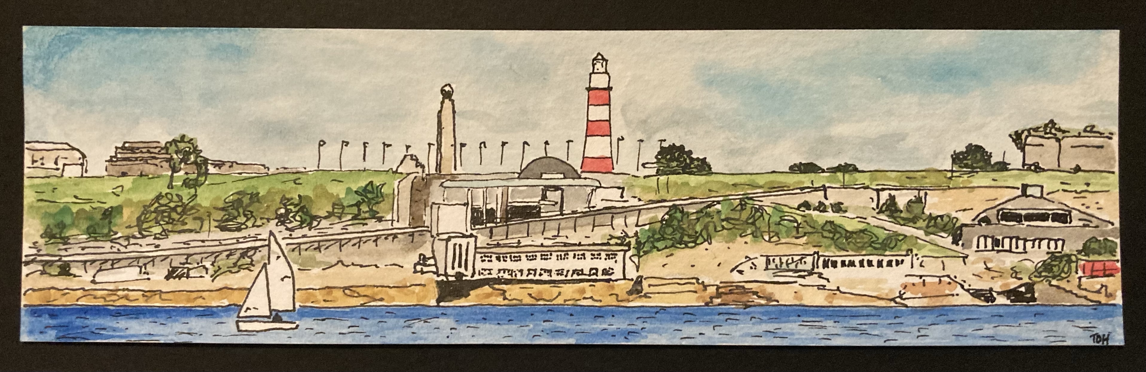
I painted this small panoramic picture of Plymouth Waterfront as viewed from Plymouth Sound as a bookmark to accompany the birthday present (books!) that my wife gave to one or her friends back in March. They enjoy a weekly walk down to the Plymouth Waterfront on most Friday mornings and so this scene was the obvious subject matter to choose.
It was interesting to paint in this wide format, and it’s an approach that I have been using more recently for some Dartmoor pictures. I think that when we view a landscape in real life our brain naturally provides a somewhat wide-screen view, and that this might be why, at least to some extent, it is often somewhat disappointing when you take a photograph of a view and much of what you see in real life seems to be condensed into a very small part of the picture.
One advantage of adopting this kind of panoramic composition, at least for a novice and completely untrained painter like me, is that it reduces the amount of sky, as this is often tricky to paint. And in this particular picture it also reduced the amount of water that I had to paint, something else that I’m not especially confident with.
All in all, I really liked this picture with its pops of colour [did I really just write ‘pops of colour’ – this seems to be such a trendy turn of words these days on TV programmes relating to art, interior design, home improvement etc. I must have caught it from there…]. I am sure that this is a format and also, with its obvious local interest, a view that I will return to in the future.
A couple of weeks ago we paid a visit to Make Southwest, an exhibition space for contemporary craft and design and a leading charity for craft education located in the small town of Bovey Tracey on the southern edge of Dartmoor, about 25 miles from our home in Plymouth. It’s a venue that we have visited a few times before – there is always some kind of special exhibition (this time it was a exhibition of contemporary bells called Sound and Silence) and an interesting array of local artwork, books and assorted items to look at in the shop. On this occasion, the reason for our trip was to see a smaller exhibition of wood engraved prints and, in particular, the printmaker Molly Lemon, who had travelled down from her base in Gloucestershire to demonstrate her work. We have encountered Molly at several Craft/Art Events in the last couple of years and always enjoyed viewing, and chatting to her, about her work. We also enjoyed seeing her compete in, and reach the semi-finals of, the Sky Arts TV Series Landscape Artist of the Year a few weeks ago.
Since I started painting about a year ago, whenever I go to any kind of art gallery or art/craft event I particularly enjoy scavenging the work that is on display or sale for ideas that I can try out for myself. Looking at the various pieces of artwork for sale in the shop at Make Southwest, I was particularly enamoured by some tiny pieces of work created by the printmaker Mike Tingle (also here). These were very small (just a few centimetre) square prints on slightly larger squares of rough-edged paper, with a title and the artist’s name written in pencil around the picture (there is an example of a similar kind of picture just below the centre in this piece of work: Dartmoor Box No 1). I really liked the miniature size and somewhat ‘rough’ nature of the pieces and I immediately thought that it would be fun to try to produce something similar using one of my own small Dartmoor Scenes watercolour paintings.
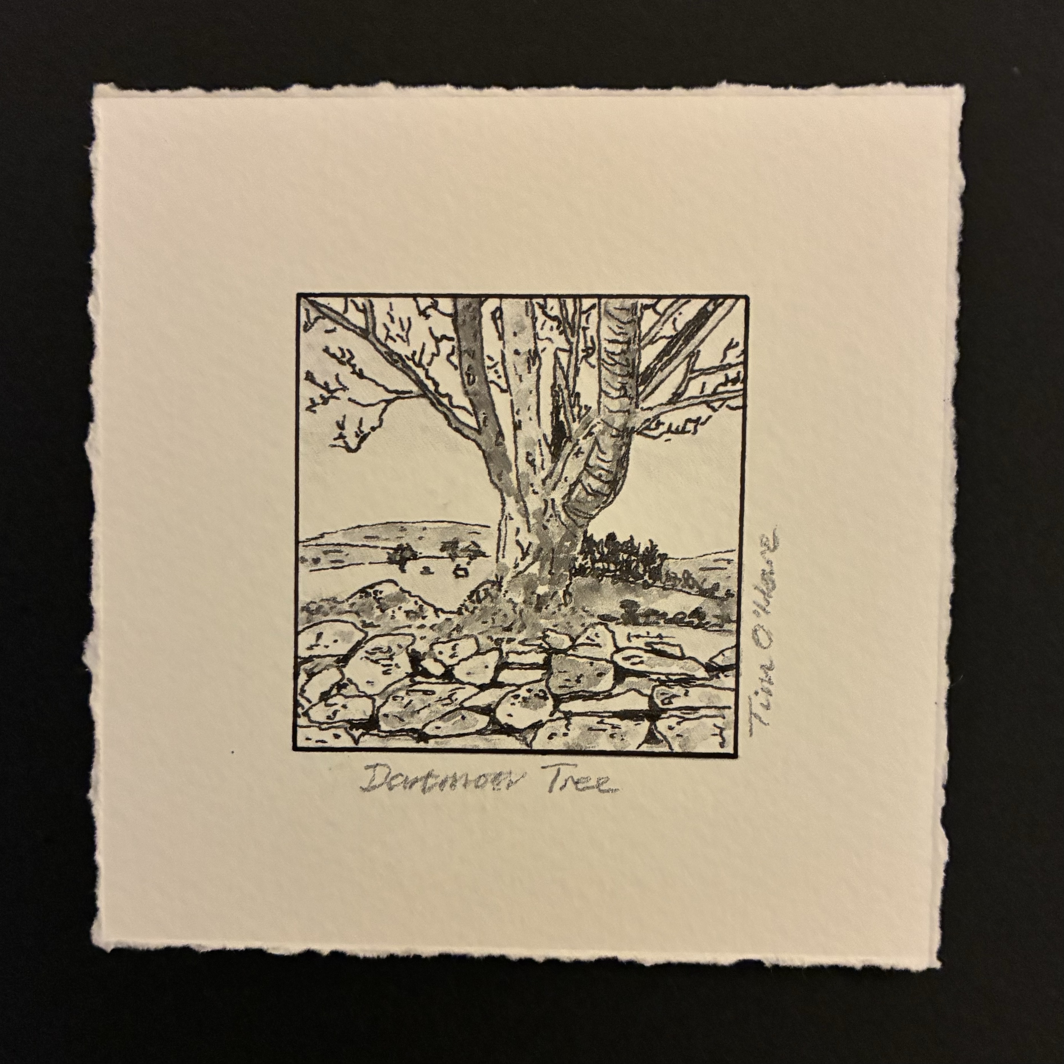
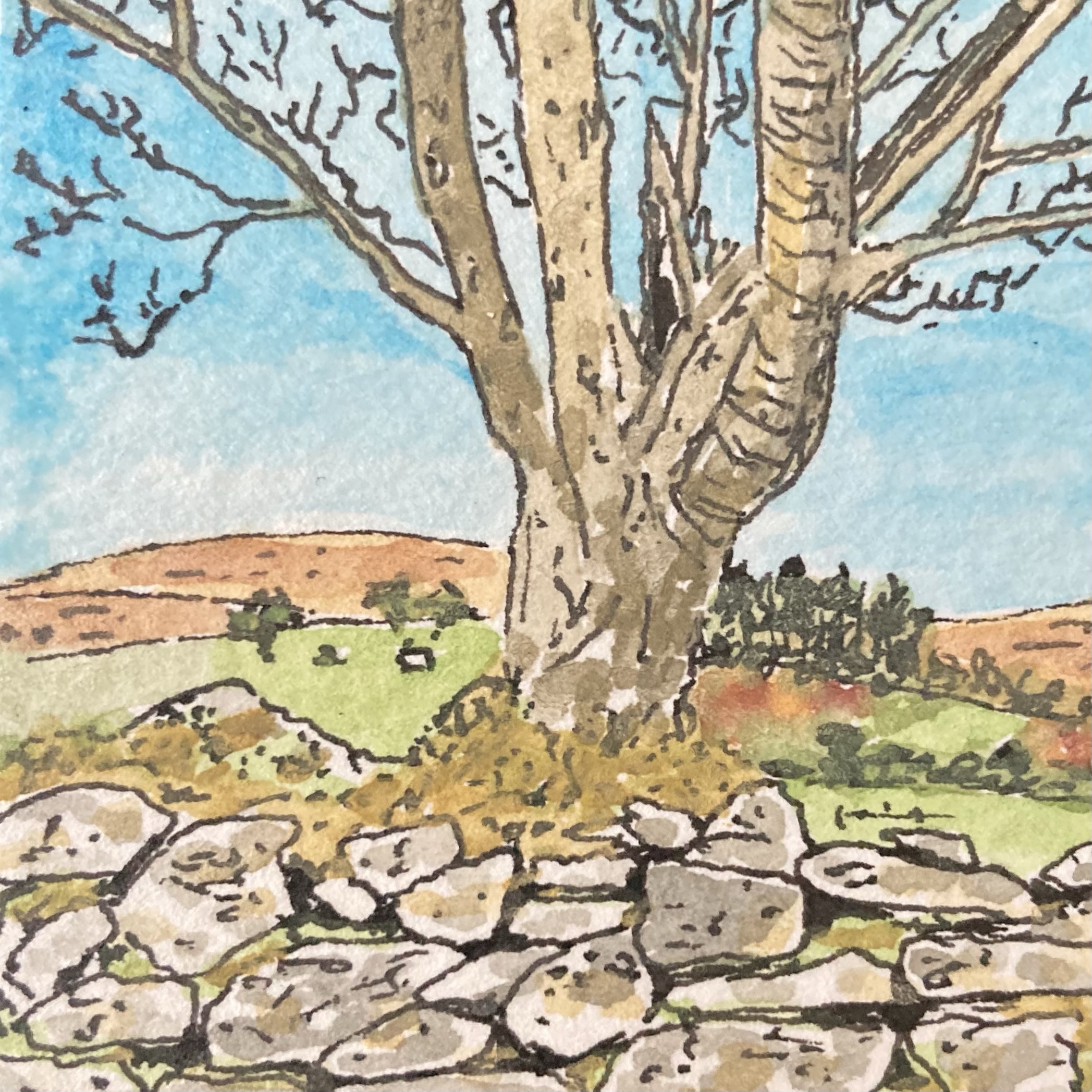
After returning home, I set about seeing what I could produce. First, I selected one of my pictures, opting for this one of a tree growing out of a typical Dartmoor dry-stone wall:
The original picture is a 4.5 cm square ink and watercolour sketch, and my intention was to use our home inkjet printer to make the best quality colour photocopy of it that I could, printing onto a sheet of watercolour paper so that the texture of the original was preserved. I’d already played around with making copies of some of my paintings in this way and so I knew that although the copied versions weren’t quite the same as the originals, with the paler colours tending to wash-out a bit, the process worked pretty well. So far so good.
This is the point at which I made my mistake. In the process of making the copy I somehow selected black-and-white printing, and so when I saw what the printer had spat out into the print tray I was instantly annoyed and frustrated. To make matters worse, because the original picture was on a small square of fairly thick paper, as the scanning light moved below the copier glass a dark shadow line was cast on one side of the copied picture. Not only did I only have a black-and-white copy, but I had a black-and-white copy that had a dark line along one of its edges. What a waste of a sheet of paper and ink…
However, once I had overcome my initial disappointment and self-censure, I decided to press on with the rest of my production process and see what the end result looked like. I had intended that there would be no border between the picture and the surrounding area of paper, but now there was that dark line along one side spoiling that design idea. What could I do? Well, go with the mistake of course. I took my drawing pen and with the aid of a straight edge and a lot of care, I inked in a similar line on the other three sides. Hmmm… it didn’t look as I had planned but I liked the result. Then I measured out a wider border, and again aided by a straight edge, I tore the paper down to size. This part of the process is something that I have found takes a lot of care… if the tear is too sharp you don’t get the nice rough edge I was after, but if you are at all rushed and loose you end up with something that looks clumsy and careless. Fortunately, I managed to do a good job. Finally, I grabbed a soft pencil and quickly wrote a title below the bottom edge and my name on the right-hand side…
The result of this endeavour was the small picture shown at the top of this post and, despite my black-and-white and shadow mistakes in the copying process, I’m really pleased with the end result, so much so, in fact, that I intend to take the rest of my Dartmoor Scenes pictures and treat them in the same fashion. Even better, not only did I end up with a new picture that I really liked and the discovery of a new way to transform existing pictures into a different, somewhat distinctive, form, but I also gave myself a great reminder that making mistakes in life is not always a bad thing. In fact, sometimes, as in this case, a mistake can open up a different path from the one that was intended that leads you towards an unexpected but interesting, exciting or enjoyable destination!
There’s a hill marked on the map, and so we will have to climb up. We need to follow the river along the valley, so then we’ll be quite far down. Let me see, there should be a church tower… yes, on the horizon, over there… which means that our path will go right then left twice, and then another turn right. Next to the fen marsh it will probably be a bit wet, but the stretch along the beach should be sandy and dry. That’s the car park, just in front, so where’s the windpump? Behind us, out of sight.
It is helpful to be able to orientate yourself in time and space, and a comfort to know that everything stands in order, in its rightful place. Believe me, there is a problem if you don’t know which way you should face. I think I’m pretty good at this, so let me help you understand: Left, right, up, down, in front, behind, parched or drowned, the truth is that you must get to know the lie of the land.
No, sorry, wait… It’s not quite that simple… That hill I mentioned is only five metres above sea level. It’s so low down that it can hardly be called a hill, in fact it’s little more than a pimple. The water in the river flows further downtowards the shore, which means that the valley is actually upabove the sea. When we reach the church tower, it won’t be over there, it will be our here, obviously. And when we follow the path back, we will take a left, a right and after that we’ll go right then left again. But it shouldn’t be too confusing, because we’ll be on familiar ground by then.
This isn’t what I was expecting from the map on the visitor centre wall. I guess there’s been so little rain recently that the marsh is bone dry, and there’s hardly any water in the drainage channels at all. The tide must be on its way out, because there are shells and seaweed all along the shore, and so the sand is salty wet. Anyway, it’s been nice since we got away from the car park; I was pleased to leave that behind – all those cars and people made me fret. So, where is the windpump? Have patience, don’t get stressed. Wait for it. Ready? There, right in front. Are you are impressed?
It would be helpful if I could orientate myself in time and space, and comforting if everything would actually get in order, into its rightful place. I definitely have problem when I don’t know which way I should face. I thought I was pretty good at this, but now things are getting out of hand. Left, right, up, down, in front, behind, parched or drowned, I’ve really been made a fool of here by the lies of the land.
(c) Tim O’Hare, July 2023
About this poem: While staying in the Norfolk Broads during our summer holiday we drove out to the coast for a walk at Horsey Gap, parking the car near Horsey Windpump (a National Trust site). On the way there I had been amused to notice that features that were named on the map as hills were, in fact, only a few meters above sea level and the idea that such naming was a ‘lie of the land’ was born. The poem picks up on various elements of the walk which took in fen-land marsh, a beach (with seals swimming in the surf) and, of course, the windpump.
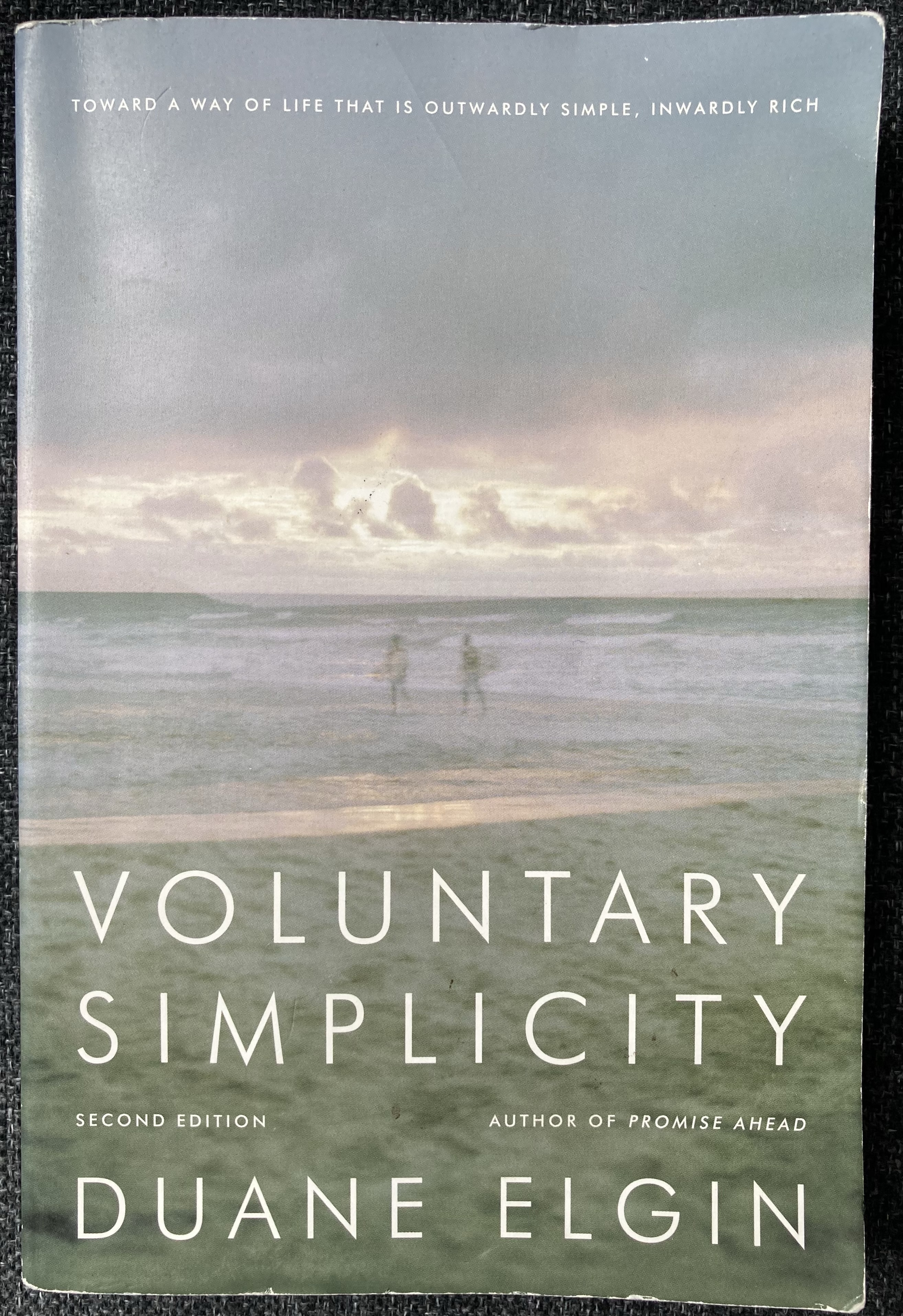
Voluntary Simplicity by Duane Elgin was the March 2025 choice for the TimeCrafting Trust Book Club that I am a member of. I think it’s fair to say that it is unlikely that I would have read it otherwise, although the ideas that it covers – Simplicity and to a lesser extent Minimalism – are certainly ones that I am interested in.
Elgin bases large chunks of the text on a survey he was involved with several decades ago (the first edition of Voluntary Simplicity was published in 1981) which probed the motivations and thinking of many individuals, from many different countries and walks of life, who had opted to simplify their lives. He is at pains to point out the most common perceptions of those who choose to live a ‘simpler life’ – that they tend to be anti-technology, anti-innovation and backward looking – are not generally correct, and that living simply does not have to mean living in poverty, in a rural and/or plain environment, nor does it necessarily result in economic stagnation. In fact, Elgin makes the case that the ever increasing number of people who are choosing to live with simplicity are doing so because it provides a path to greater satisfaction with life, with a deeper connection to the entire world around us.
As the book proceeds, it becomes more and more focused on the necessity that we live more simply in order to survive on the planet as population growth continues, climate changes ever more significantly and obviously, and natural resources are depleted. And, of course, the need for solutions and responses to the challenges that Elgin describes has become significantly more pressing in the years since the book was first released. But Elgin does not get all of his future-visioning right. He places great emphasis on the potential for television to be the vehicle through which positive messages about simplicity can be delivered and is rather dismissive of the potential for new technologies to invade this space. Nevertheless, Elgin’s arguments do mostly stand up to scrutiny.
I felt that Voluntary Simplicity was an ‘okay’ read, although I am sure that there are better, and more up-to-date, books on this topic. I don’t think that it is surprising that prior to reading the announcement that Voluntary Simplicity had been picked as a Book Club book I had ever heard of it or, indeed, of Duane Elgin himself. However, I did my reading did lead me to four quotes that I really liked. The first, comes from one of my favourite sources, the “quote-factory” commonly referred to as Henry David Thoreau. It has perhaps a rather depressing tone – ‘life is frittered away’ – but I think this is what lends it the power to motivate change:
“Our life is frittered away by detail… Simplify, simplify.“
I also really liked Elgin’s own take on the power of simplicity, namely that:
“Simplicity is the razor’s edge that cuts through the trivial and finds the essential.“
and I enjoyed his statement that:
“Our bodies are biodegradable vehicles for acquiring soul-growing experiences.“
‘Biodegradable vehicles for acquiring soul-growing experiences’ – I mean that really is life in a nutshell isn’t it?
Best of all, I think as a result of its own simplicity and the rhythm of the language used, is an adage that Elgin attributes to the New England Puritans:
“Use it up, wear it out, make do, or do without.“
That’s not a bad maxim to try to live by, at least to some extent.
I’m just back in from my morning run. Before I left, she asked me how far I was planning to go, and I replied, “Only about 3 miles – maybe thirty minutes or so”. I showed her my intended route on the map, so that in an emergency she could find me in a hurry.
As soon as I was outside, my mind was transported. There were poppies and other wildflowers in the hay fields, faces turned to greet the morning sun. I ran through swathes of wheat and barley waving in the breeze, reed beds down by the fen, and woods with birds singing merrily in the trees.
But I had been far too optimistic, and so made several false turns, finding my way blocked, not wanting to squeeze my way through tick-infested ferns. At one point I had to whisper my way past a group of young cattle that barred my path, even nibbling at my shorts. Fortunately, that encounter did not end up as a battle.
Some people might laugh at my incompetence, but I have to disagree because I was not lost. And though I will reluctantly admit that I did not know exactly where I was, I don’t think it really mattered that I wasn’t quite where I’d expected myself to be.
Anyway, I’m back now, and as soon as I came through the door I said “sorry” because I didn’t want the atmosphere to sour. You see, I had run five-point-four miles, and been out for almost an hour. And though she didn’t say anything, if past form is anything to go by, I expect that she had started to worry.
My run gave me a chance to think, and realise that even though things didn’t go entirely to plan, I am not lost. In fact, I happily accept that I do not know exactly where I am, because it really doesn’t matter that I am not where I expect myself to be.
(c) Tim O’Hare, July 2023
About this poem: We moved base for the second week of our summer holiday, and after a few less than successful days in Horning in the Norfolk Broads we moved to the village of Redgrave in Suffolk. I instantly relaxed, and was happy, with walks and runs from the doorstep. For my first morning run there I decided to do a loop of Redgrave and Lopham Fen, memorized a route, or at least thought I had memorized a route, and set out. It was a very enjoyable run but, predictably, not knowing the terrain, I dropped off my planned route and had to use my instinct to find my way back to our accommodation, running further, and taking a fair bit longer, than I had planned. I was not exactly lost, but I did not know exactly where I was and as I was running the words ‘I am not lost but I do not now exactly where I am‘ began to play repeatedly in my mind and the seeds of the poem were sown. I think it’s fair to say that the poem isn’t really about being physically lost while out on a run at all…
I thoroughly enjoyed completing my recent series of mini-watercolour landscapes of Dartmoor Scenes, and in the process I found that I had managed to insert a short burst of art practice into my daily(ish) routine. Consequently, it wasn’t a surprise that I found myself wanting to continue painting mini-pictures each morning. The only question was: What should I paint next?
The answer – well the first answer at least – turned out to be house plants. This might seem like a somewhat strange choice, especially as the vast majority of the pictures I have painted in the last year have been location-based: buildings or landscapes of one sort or another. But in fact, house plants are a subject that I have painted before.
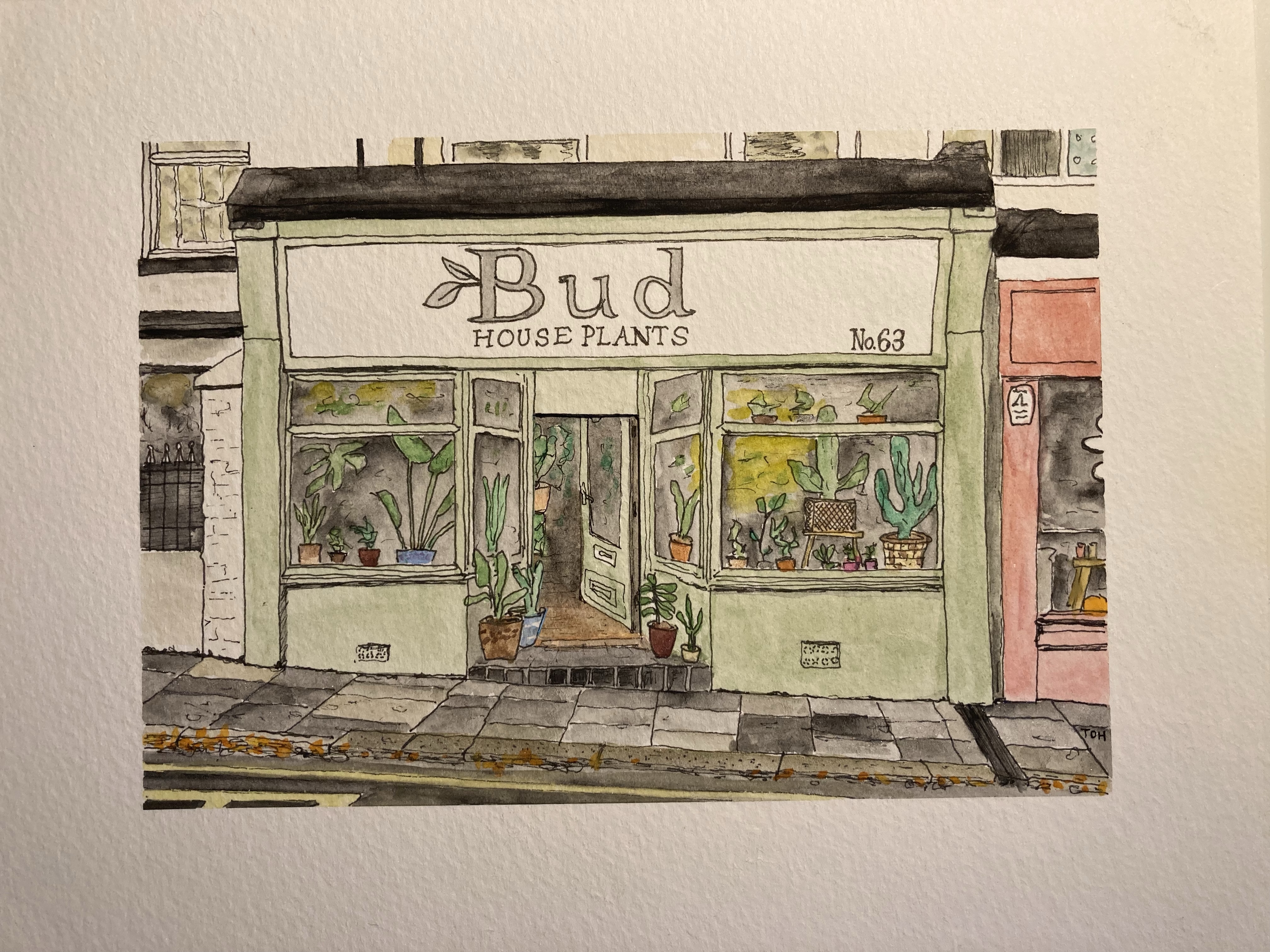
My initial foray into painting house plants stemmed from a ‘location’ painting that I did back in November as a birthday present for a family friend who just happens to run a wonderful plant shop in Plymouth. The picture I produced was much appreciated and has subsequently been professionally framed and put on display…
When I was painting this picture I really enjoyed painting the various plants with their different forms and pots, and so a few weeks afterwards I did a quick painting showing an assortment of plants in a suitably varied set of pots on a couple of wooden shelves (based on some nice chunky wooden ones that we had just put up in our kitchen!).
The next time we paid a visit to the shop it was suggested that I might produce some house plant greetings cards and have them for sale alongside some others (quite different) produced by a couple of local artists that were already on sale in the shop. Unfortunately, when painting my original picture I had not thought about placement of the design, and with some of the painted areas reaching almost to the edge of the paper it was not easy to use it for a printed card without risking some fairly crude surgery to some of the plants on the top shelf! However, that conversation sowed the seed of the idea in my mind, and so when I was considering where to go next with my mini-paintings, house plants were an obvious choice.
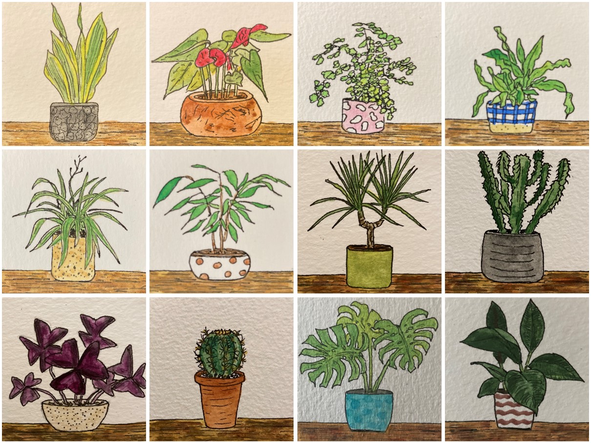
The result was the set of 12 mini-pictures of individual house plants which I have put together into the composite picture at the top of this post. Like my Dartmoor Scenes pictures, these are 5 cm squares, and I have also had a sample greetings card printed from each individual picture and a 3 x 3 composite of a selection of the pictures. These printed version all worked nicely despite being enlarged to almost double their original size, and I will probably pursue trying to sell these in some format in the future. But whilst I loved painting the mini-pictures of individual plants, and really liked the composite pictures too, I did feel that the original picture, with an assortment of plants on shelves was the best of all. The plants are obviously the star players, but those chunky wooden shelves play an important supporting role.
To bring things right up to date, a couple of days ago I sat down and painted a second version of my ‘house plants on shelves’ picture, and this time I made sure that I positioned the painting in the middle of a larger piece of watercolour paper so that I could subsequently crop the picture without fear of pruning the plants! I’m pleased with the result (see below), and I can now go ahead and get some copies printed ready for sale.
Obviously, I’m not expecting to make a fortune from this activity, but I do think it will be fascinating to see whether my picture is able to catch the eyes of any customers enough to persuade them to part with a few pounds of their hard-earned cash…
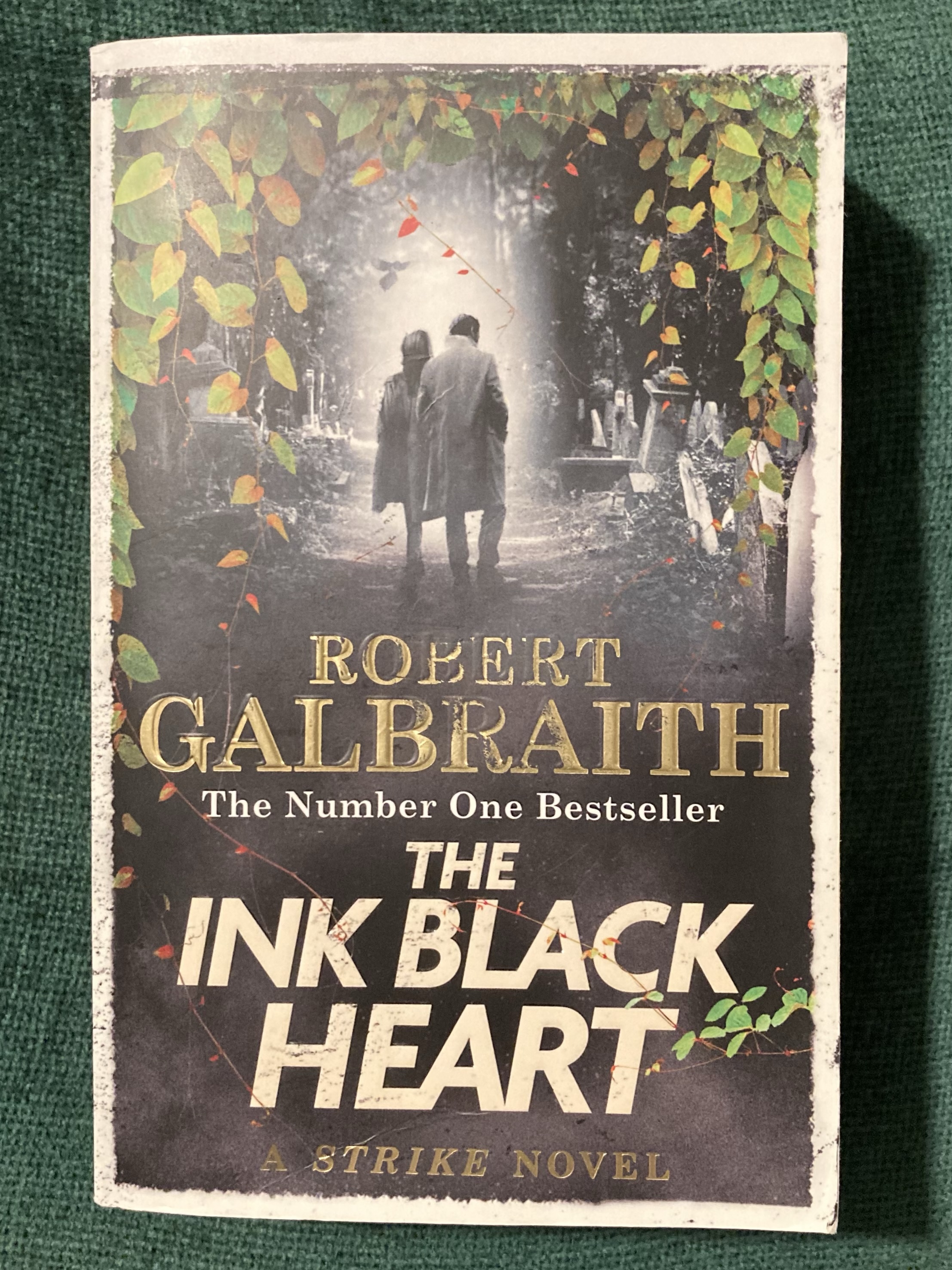
Oh J.K. Rowling (a.k.a. Robert Galbraith)… Why oh why do you seem to be obsessed with writing ever longer lengthier novels?
The Ink Black Heart is the sixth novel in the Cormoran Strike series, written by J.K. Rowling under the pseudonym Robert Galbraith. The plot follows Strike and his former assistant, now professional partner, Robin Ellacott, as they try to get to the bottom of a complex and grisly crime – the murder of the co-creator of a highly successful online cartoon series (The Ink Black Heart of the book’s title) in the very graveyard in which the cartoon is set. The story plot is typically convoluted, throwing in lots of characters, many of whom are suspects at some point, with all of the action happening alongside the ongoing will-they-won’t-they saga of Strike and Robin’s frustrated relationship.
Compounding this complexity, the plot is made even more complicated to follow by the fact that large chunks of the dialogue between some of the characters takes place via online messaging threads. This throws up two issues for the reader. First, because the characters involved in the online messaging conversations hide their identity behind anonymous usernames it is some way into the book before you know who is talking to who (obviously, this is deliberate). Secondly, it is an (impossible?) challenge to work out how to read up to three parallel conversations between different pairs or groups of, sometimes overlapping, individuals. I can understand why the Rowling/Galbraith chose to write these sections in this way – the chat threads take place within an online game that is based on The Ink Black Heart cartoon – but I felt it made reading the book unnecessarily hard, and at times rather frustrating, work.
I should come clean… In general, I’m not a fan of long books. I like to feel that I am making reasonably rapid progress through a novel and that I won’t get stuck on the same book for more than a few weeks. So with The Ink Black Heart extending to around 1200 pages it took me a while to summon up the courage to make a start on it. However, it wasn’t simply the length of The Ink Black Heart that set me off on the wrong foot, because I’ve also had a long-standing gripe about the way that Rowling’s books seem to get longer and longer with each new one that comes out. This happened with the Harry Potter series, in which the first three titles were quite short, easily-tackled, but still satisfying stories, as the later volumes became progressively more ‘doorstop-like’ each time one appeared. I still enjoyed all of these books, but when I read them I really felt that Rowling’s writing could perhaps do with a good dose of editing… [hark at me, calling out one of the most successful, if not the most successful, writers of modern times.]
Rowling’s tendency for bloated writing is something that I think is particularly apparent in the Strike novels. I do enjoy reading them, but I can’t help but wonder whether it is really necessary to drape Strike and Robin’s relationship across quite so many pages. I think it’a all a bit tedious, and find myself almost screaming at the pair of them to just get on with it. [For balance here, I should say that both my wife and my elder daughter completely disagree with me on this point!] There is also a lot of description of minute details of events that have no bearing on the plot, which is fine if you like that sort of thing (i.e. not being allowed to get to the heart of the matter as quickly as you would like), but stretches my patience close to breaking point. I suspect that The Ink Black Heart could probably be half its present length and still be a great read (and obviously a better read in my opinion).
Perhaps, in the future, Rowling/Galbraith could write two separate books that can be read in parallel – one housing all of the crime/sleuthing-related action and then for those that can be bothered to read it, a second volume that takes a microscopic look at the trials and torments of the relationship between Strike and Robin. At the end of each chapter of the first volume the text could read something like this:
Reader: If you want to get straight on with the exciting action to discover just how the shocking realization that Strike and Robin have just made takes them one step closer to uncovering the identity of the killer that lives in their midst, then turn the page and read on. But if, instead, you’d like to lose the thread of the story and forget exactly who said what to whom as you read another account of Robin’s misapprehension of Strike’s words to her in their last conversation and Strike’s desperate attempts to convince himself that getting closer to Robin can’t possibly be the obvious conclusion of them spending almost every waking hour together, then switch over to the companion volume where things might eventually get ever-so-slightly slushy.
I am kneeling on the floor, left arm supporting my weight as my body leans forward. My right arm reaches out with elbow pointing away and fingers spread to rest gently on the soft green cloth. My index finger draws back and swings down to send the small plastic figure skittering forwards. It arcs right before nudging the over-sized plastic sphere so that it rolls perfectly into place. They’re in with a chance here…
I lift my knee to shift my body sideways and disaster strikes. A momentary loss of stability brings my knee rapidly downwards. Instantly, there are two sources of suffering. There is the sharp pain as a small plastic shape drills its way into my knee and as I cry out masking its sound, the crack of the double leg fracture occurs. Another star will be entering the treatment room…
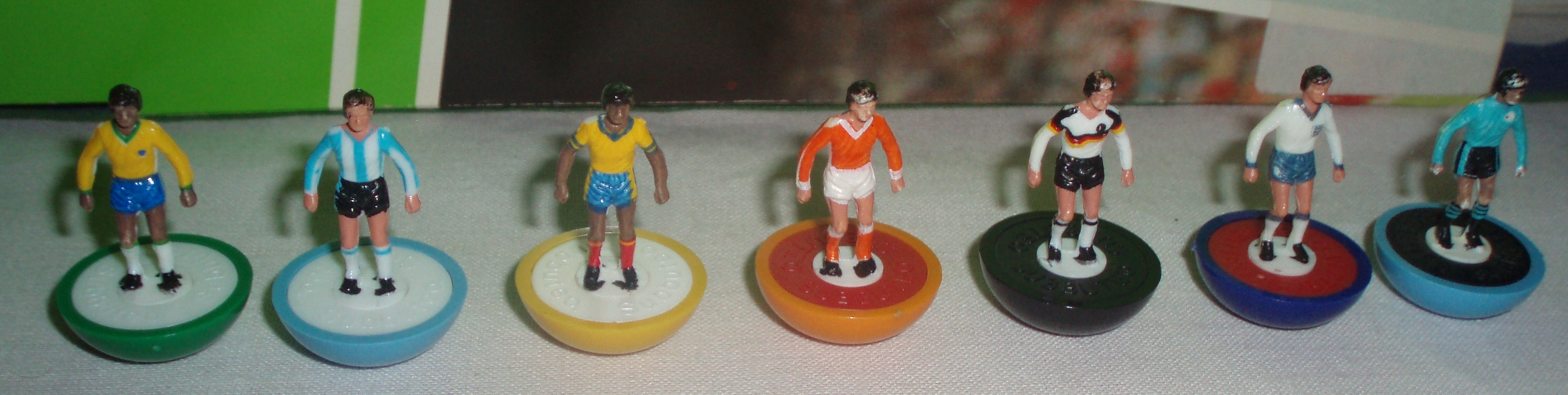
If you were a football-crazy child in the 1970s you may well have experienced something like the event described above. Before football became a constantly-available televisual anaesthetic, we had to make do with the once-a-year spectacle of the FA Cup Final, the stay-up-late drama of Match of the Day, the post-Sunday-lunch-treat of The Big Match or the intoxicating excitement of European games on BBC Radio 2 (2000 metres Long Wave), with their mysterious interference of howls and whistles. To experience the ebbs-and-flows and thrills-and-spills of Liverpool versus Manchester United we had to create them ourselves, on a piece of green cloth with 22 plastic figures, a small ball and a set of goals. This was Subbuteo Table Football.
With the passing of time, my recollection of how Subbuteo entered my life is somewhat hazy. I have always told myself that what I remember is being given a Subbuteo set by my parents as a birthday present. If that is true it would have been the Club Edition, the standard set with cloth pitch, two goals, two teams, three small balls and a set of corner and halfway flags. In this set, the teams sport blue or red shirts and socks and plain white shorts, and so an imaginative youngster can play games between, for example, Everton, Portsmouth or Rochdale and Manchester United, Charlton Athletic or Barnsley. But my memory also tells me that my parents were not impressed with the value for money this set provided, it was taken back to the shop, and an alternative plan put in place to enable their disappointingly football-mad child to indulge what could only be a passing phase. But surely I am misremembering… returning an already gifted child’s present back to the store? That can’t be right. Over fifty years on, I have no way of finding out the truth.
What is certain, is that I never owned the Subbuteo Club Edition as a child, and so I never possessed the thin, green, slightly shiny cloth pitch with its white printed markings, the regulation, square-‘timbered’ goals with red and blue nets, and the two standard teams with their basic blue-white-blue and red-white-red kit combinations. Instead, my games were played out on a pitch lovingly made by my needlework-teacher mother, with line markings zig-zag stitched in white cotton into a piece of heavyweight, deep green cloth, cut, measured and marked to exactly the same size as the official one. That I never owned that standard pitch stung me at the time. Every child knows that there is no substitute for the specific branded item that they want as a Christmas or birthday present, and any parent who has tried to buck that rule will probably know it too. But now it is time for me to confess that my home-made pitch was in many ways better than the proper one. The heaviness of the cloth meant that the playing surface smoothed out better, and the darker colour was so much nicer. True, the stitched lines did sit ever so slightly proud of the playing surface, especially where corners turned or joins were made and the weight of stitches increased, but this was just something to take into account during play. (I wonder now whether this is why I so hate to see defenders trying to guide the ball out for a goal kick as I sit in my seat at Home Park and cheer on the team I adopted some thirty plus years ago!) To accompany my home-made pitch I needed goals and because these were bought as a separate item I had a set of ‘World Cup’ goals, modelled, I think, on those used in the 1974 World Cup in Germany (with round posts and crossbars, and realistic white nets and green plastic bases). Again, somewhat sheepishly, I confess that these were better, more solid, more exotic than the basic goals of the Club Edition.
It was my original teams that were the real source of disappointment, or more precisely it was one of them. My guess is that they were whatever the local stockist had going at a rock-bottom price. I think that one team was the simple red-white-red kit found in the Club Edition, which was fair enough. But the other? Well, that was Bangor. Who in 1974, apart from an actual fan of ‘The Seasiders’, had even heard of Bangor? And what sort of team plays in yellow shirts with blue sleeves and black shorts anyway? I suggest the answers to those two questions are: ‘pretty much no-one’, ‘none of any significance’ and to the first question again: ‘certainly not me’.
Subbuteo proved to be more than a passing phase in my life and over the next few years I built my supplies. There were more teams – Liverpool miraculously appeared one Christmas morning (well done parents!) and a successful raid on a local jumble sale bizarrely gave me imaginary trips from my home in Somerset to the Edinburgh derby, with the deep maroon shirts of the Hearts of Midlothian and, always one of my favourites, the white-sleeved, green shirts of Hibernian. At ‘peak-Subbuteo’ I had maybe ten teams, but which ten they were was always changing as I set to work with Humbrol model paints and fine tipped brushes. Over time, my players put on weight as layers of colour were added, flesh and hair were re-tinted and black boots were polished (always black of course).
There were accessories – corner and line flags (who didn’t snap these?), a referee and linesman set (pointless), self-adhesive shirt numbers (an aid for the internal commentary that filled my head), the TV camera tower, the green, picket-fence-style pitch surround, a set of six ball boys resplendent in yellow tracksuits with red stripes down their arms (useless for retrieving the ball when it rolled under the piano) and, best of all, the scoreboard, with its rotating number dials and two slots to insert whichever of the multitude of small printed card slips displayed the names of the teams currently in play. There were many others, and as a child who could happily spend hours poring over catalogues I certainly knew about and wanted them all – the FA Cup, throw-in taking figures, corner taking figures, working floodlights and eventually, in a move that presaged the stadium building phase of modern football, the grandstand.
By the time of my early teens, my pitch was pinned to a low, perfectly-sized table that had once housed my older brother’s model railway. I fixed a cardboard edge to form a pitch surround complete with painted advertising hoardings and at one end there was room for a stand, lovingly crafted from an old cardboard box. The table sat in the corner of my bedroom and was the venue for countless games, with me playing both teams, one predominantly right-handed, the other left-handed in what must have given games some approximation to home advantage. Subbuteo is clearly a game designed for two players, pitting their wits and their skills against each other in friendly rivalry, but almost all of my matches were played out as me versus me. It was a realm for individual, personal immersion and a chance to escape to victory, and defeat, away from prying eyes.
My knock-out tournaments were huge affairs, and for these the card tabs of the match scoreboard came into their own. I would draw them out one-by-one to build a complete set of fixtures, the cards laid out on the floor in pairs, winners of fixture one playing winners of fixture two etc., each round progressing with ever-decreasing numbers until I arrived at the final pairing. I don’t remember any strong favouritism coming in to play, but I suspect that the referee’s decisions on matters such as penalties or offside were not always without bias and that stoppage time at the end of matches was probably ‘fluid’. These tournaments, with 64 teams at the outset, comprised 63 matches and lasted several days – just me in my own little world of imaginary football, right hand, left hand, back and forth, shoulders aching, knees numb.
At some point, all of my Subbuteo teams and accessories went the same way as my Action Man, Matchbox cars and sundry other items, sold to fund my burgeoning interest in home computers. But my attachment to the game remained strong, such that in the late 1990s, presumably after I had made much mention of it, my wife bought me a set as a wedding anniversary present. Finally, at the age of 30-something, I owned the proper Club Edition complete with its basic goals, its oh-so-breakable corner flags, its boring team kits and its horrible, thin, shiny pitch… That set now resides in our loft along with a Plymouth Argyle team that was also gifted to me (1993/94: green and white striped shirts with black shorts) and I must confess that it has been little played. As an adult I could not escape the obvious bias in my play, and I no longer possessed the patience to let a game unfold or the ability to put up with the strain of reaching, leaning and shuffling around on the floor. But despite this lack of match action, I confess that many, many times I have caught myself scrolling through online listings, just a finger’s flick away from re-uniting myself with the pitch surround, TV tower or scoreboard, and once I gazed with horror at a particular ‘completed item’: Bangor team, in box – sold for £165.
… The big hand in the sky reaches down to lift the star winger from the field. He must await the final whistle before taking his turn on the operating board. Despite horrific injuries he will return to play again, nicknamed ‘Stumpy’, with bulges of glue where shin bones have been fixed and a slight sideways lean that will enable him to turn in ways that none of his teammates can.
Back on the pitch, the ball lies just inside the penalty area. My right hand reaches across and lines up behind the number 10 as my left arm extends, twisting round to grasp the small green plastic handle that emerges behind the goal. This is the moment… Flick. Jerk. The handle swings across, clattering the goalkeeper, arms stretched ever-hopefully upwards, against the frame of the goal. That would most certainly have hurt. But the ball has gone the other way and now lies nestled neatly in the far corner of the goal. The painted fans behind the goal are stunned as they wonder just where the referee found eight minutes of stoppage time, and then the final, silent, whistle sounds. The rotating dial on the scoreboard turns, the next number appears, and the FA Cup has produced its greatest ever shock… Manchester United 0, Southport 1. ‘The Sandgrounders’ have had their day.
I wrote this piece a few years ago, one of three that I produced under the collective working title: ‘Glances and Glimpses’, each capturing my thoughts on, or memories of, an activity or incident that connected different periods of my life and/or opened a window onto some aspect of my character. Earlier this year, I spent some time revising and editing it in the hope that it might be deemed suitable for publication in the magazine When Saturday Comes – it wasn’t, in fact the rejection email came back to me so quickly that was hard not to think that it did not even pass beneath the eyes of the ‘reader’. But it would be a pity if it remained hidden out of sight and didn’t even have the opportunity to find a reader or two, and perhaps spark a few memories of other injured players, self-made competitions, or great cup upsets.
If this piece resonates at all with you then please drop a comment below. It’d be great to read about other similar memories.