Ronda, Spain #art

As I noted in another recent ‘art’ post (Home Park, Plymouth Argyle), it seems to have become a ‘thing’ that I create handmade cards for birthdays and special occasions associated with family and friends. For these cards, I generally paint a small watercolour picture of a scene that has a special connection to the person or event being celebrated or one that just shows a place that they really like. I usually use some small (roughly 10cm x 15cm) rough-edged raggy paper, for the painting and then I tape this to a simple brown card. This gives an interesting and attractive, rather rustic, feel to the cards which I think is appropriate given their handmade nature.

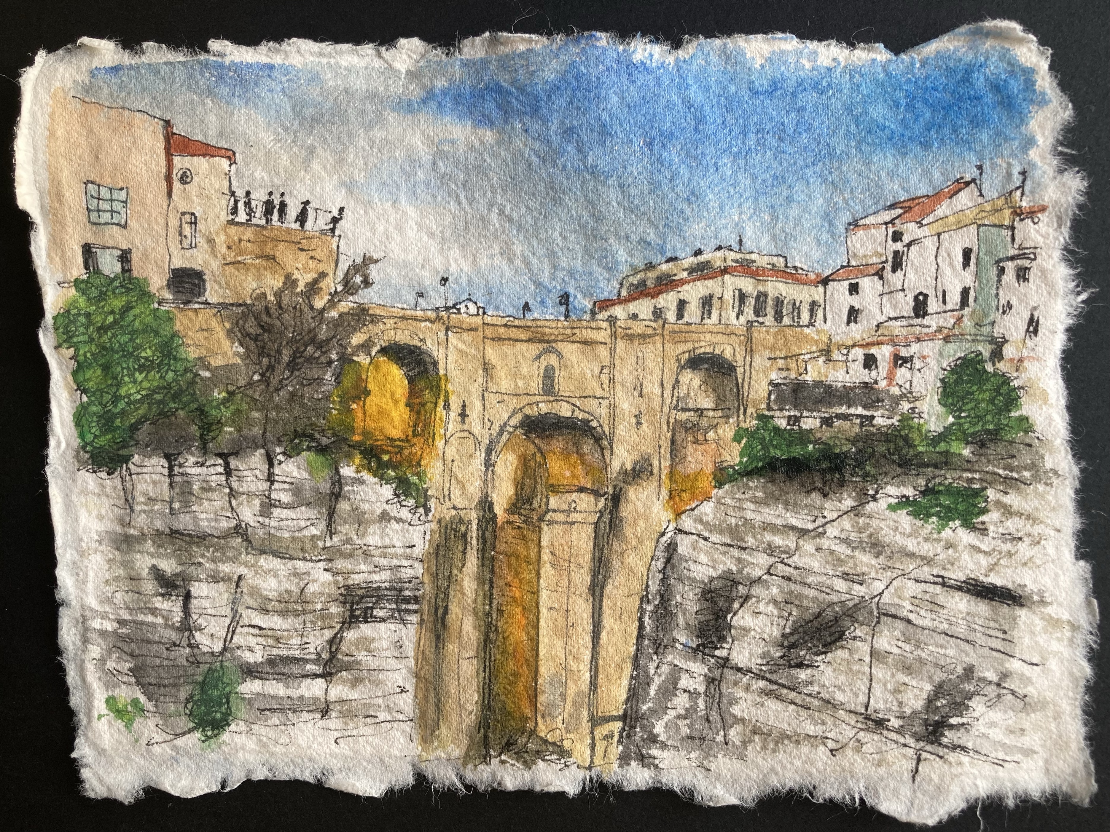
I painted the picture above, of Ronda in southern Spain, at the start of last month to use on a birthday card for my elder daughter’s husband. They travelled to Ronda to attend the wedding of one of my her workmates just a month or two before their own wedding last June and he liked it so much that my daughter was quick to suggest it as the subject for his card. To be completely honest, the other alternative was for me to try to paint a picture of Stamford Bridge, home to Chelsea F.C. (his team sadly) and apart from me not wanting to have to paint a scene that had lots of people in it, it was quite difficult to find a suitable picture to base a painting on. So, Ronda it was…

Funnily enough, despite being an incredibly scenic and much photographed location, with its deep gorge and steep cliff faces, Ronda was also a difficult subject to find a suitable picture to recreate as a painting. Most of the photographs of the town that I could find online were either taken from a distant vantage point designed to show the full majesty of the cliff-top location (which then made all of the interesting details of the buildings etc. shrink to an unworkable size) or were focused on a single ornate building or just the bridge that spans the gorge (and so did not really capture anything about the setting). In the end I opted for this shot of the bridge with a decent chunk of the cliff faces visible and some suitably Spanish-looking buildings. I tried to capture some of the drama in the scene as the setting sun creates its own lightshow between the pillars of the bridge. The picture/card was certainly appreciated, so I can’t have done too bad of job!
Home Park, Plymouth Argyle Football Club #art

I’ve been a regular attender at the home games of Plymouth Argyle Football Club since soon after we moved to Plymouth in summer 1992. The first game I attended was towards the end of the 1992-93 season, and then from 1993-94 onwards I have only missed the odd game each season. In my time as a fan I have seen the team relegated 5 times and promoted 6 times, but sadly, it seems likely that those numbers will have evened out by the time the current season is completed…

In 2003 I started to take my two daughters alternately to games – at that time they were 7 and 5 years old – and then not long after that we would all go together. In the last few years, since my elder daughter moved away to set up her own home in Surrey, I have continued to attend with my younger daughter, and as she has now settled locally, it seems likely that this will continue. Going to Argyle is something that has brought us a lot of great memories, including a few when we travelled to away games for cup matches or key league games. Our trip to Port Vale in May 2023 to see Argyle clinch the League 1 title, achieving over 100 points in the season, was a particular highlight.

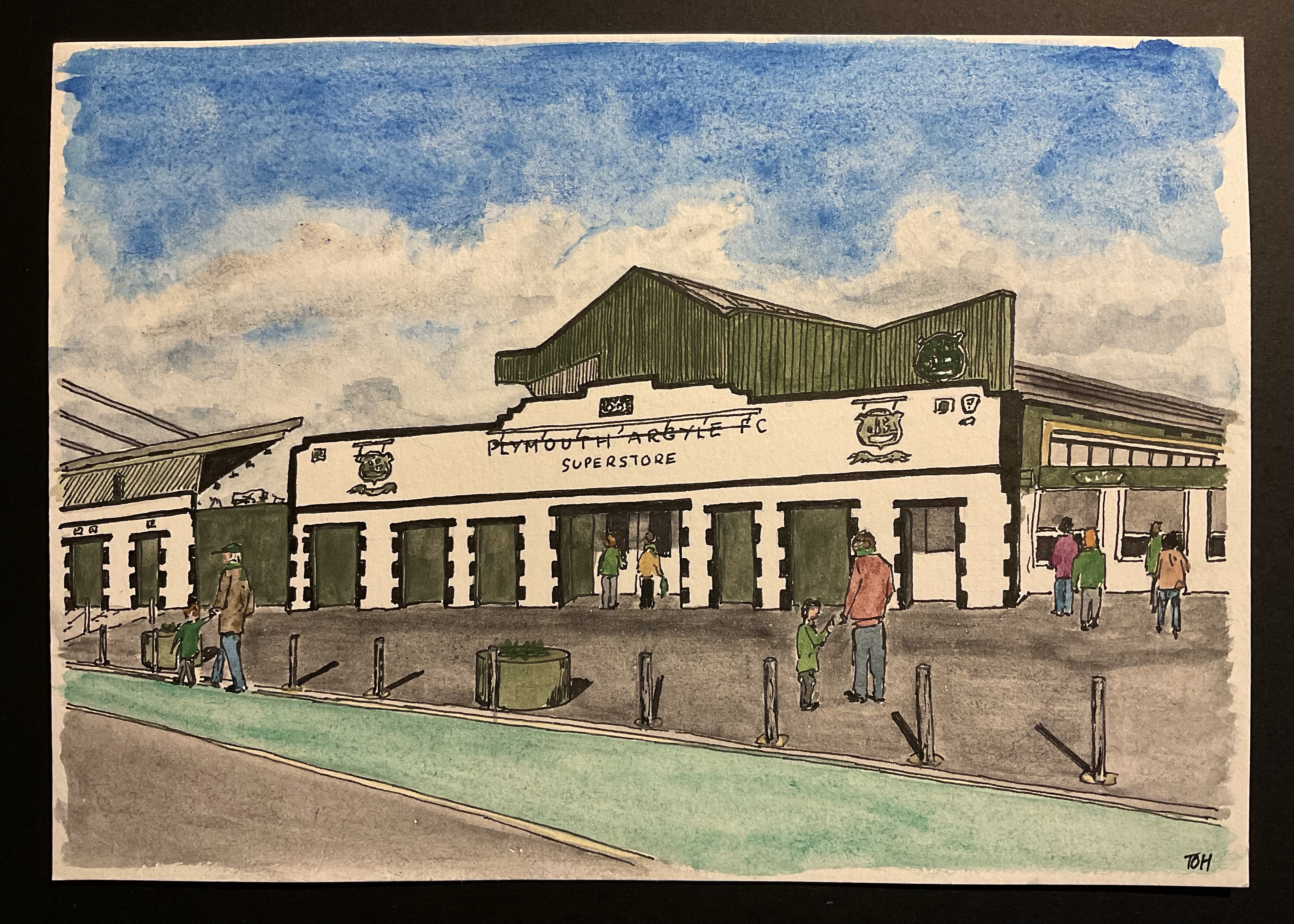
Since I started painting just under a year ago, it seems to have become a bit of a tradition that for birthdays and other special occasions I will paint some kind of artwork to give as a present. Sometimes this is just a small picture for a card or a bookmark, but on a few occasions I have gone for a larger, more ‘significant’ work. So, it was pretty obvious that for my younger daughter’s birthday at the beginning of this month I would produce an Argyle-related picture… The result was the above picture, showing the old entrance to ground, now converted into the club ‘superstore’. I was pleased with how it turned out and also pleased with myself for being brave enough to put a few people into the scene (but notice there are no faces or hands!)

I’m pleased to report that the painting, which I put in a black frame, was very well received… and now it has been given, it’s safe for me to release a picture of it into the world without any risk that I might spoil the surprise. Green Army!

Scott Building and Beckley Point, Plymouth #art

I’m a bit of a perfectionist, something which has definitely held me back over the years as I have held off pursuing certain activities ‘in case I couldn’t live up to expectations’ (a trait that I am sure many serial perfectionist procrastinators will be very familiar with). One such activity was always drawing and painting, so it was a bit of a surprise to me when, about a year ago (April 2024), I quite suddenly started painting and following a short video course on what is usually called ‘loose’ watercolour painting, I found that I was (mostly) quite able to side-step my need for ‘perfect’ and simply paint – deliberately being quick was a key element in this. Even better, not only did perfectionism not get in the way of me being able to paint, but I found that painting in a non-perfect way helped my loosen the grip that perfectionism had on me more generally.

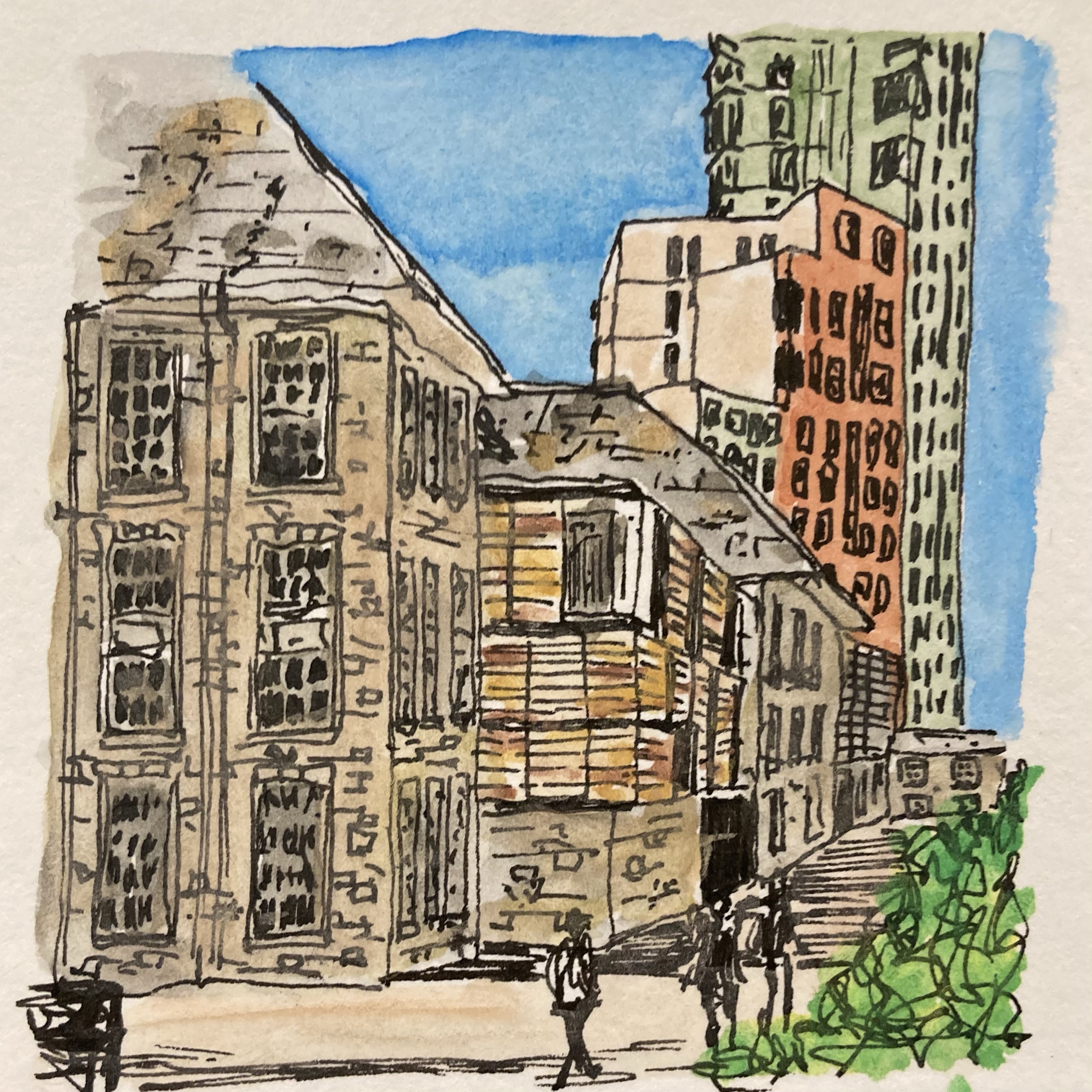
This little picture, painted a few agos, is a nice example of imperfectionism at work. It is a view of the Scott Building (University of Plymouth) on the left with the towering mass of Beckley Point accommodation block behind. If you were to stand where the photo that this picture is based on was taken, you would instantly notice all kinds of discrepancies – the colour of the closest building isn’t quite right, the ground appears to rise upwards because of the way I have used horizontal lines for the shadow cast by the building and the small building in the background (the Reynolds Building in which I used to have my office) is far too small. But none of this really matters. For a start, it’s only a little painting that almost no-one will ever see (and those that do probably won’t know what the scene looks like in reality), but more importantly, I have come to learn that it is the quirky little ‘undetails’ in a picture – a wiggly line here, am improbable colour there, the scratchy outline of a person – that add fun into the mix, and that it is far more important to vaguely capture the sense of a place rather than replicate it in every detail (although pictures like that can also be wonderful and interesting of course).

So, here’s to this quick, little, watercolour picture with all its imperfections – nice and bright, rather jolly and, I think, a sense of movement. It’s not supposed to be a masterpiece, it’s just fine as it is!