The Lies of the Land #poem

There’s a hill marked on the map,
and so we will have to climb up.
We need to follow the river along the valley,
so then we’ll be quite far down.
Let me see, there should be a church tower…
yes, on the horizon, over there
which means that our path will go right then left twice,
and then another turn right.
Next to the fen marsh it will probably be a bit wet,
but the stretch along the beach should be sandy and dry.
That’s the car park, just in front,
so where’s the windpump?
Behind us, out of sight.

It is helpful to be able to orientate yourself in time and space,
and a comfort to know that everything stands in order,
in its rightful place.
Believe me, there is a problem
if you don’t know which way you should face.
I think I’m pretty good at this, so let me help you understand:
Left, right, up, down, in front, behind, parched or drowned,
the truth is that you must get to know
the lie of the land.

No, sorry, wait… It’s not quite that simple…
That hill I mentioned is only five metres above sea level.
It’s so low down that it can hardly be called a hill,
in fact it’s little more than a pimple.
The water in the river flows further down towards the shore,
which means that the valley is actually up above the sea.
When we reach the church tower, it won’t be over there,
it will be our here, obviously.
And when we follow the path back, we will take a left,
a right and after that we’ll go right then left again.
But it shouldn’t be too confusing,
because we’ll be on familiar ground by then.

This isn’t what I was expecting
from the map on the visitor centre wall.
I guess there’s been so little rain recently
that the marsh is bone dry,
and there’s hardly any water in the drainage channels at all.
The tide must be on its way out,
because there are shells and seaweed all along the shore,
and so the sand is salty wet.
Anyway, it’s been nice since we got away from the car park;
I was pleased to leave that behind
all those cars and people made me fret.
So, where is the windpump?
Have patience, don’t get stressed.
Wait for it. Ready?
There, right in front.
Are you are impressed?

It would be helpful if I could orientate myself in time and space,
and comforting if everything would actually get in order,
into its rightful place.
I definitely have problem
when I don’t know which way I should face.
I thought I was pretty good at this,
but now things are getting out of hand.
Left, right, up, down, in front, behind, parched or drowned,
I’ve really been made a fool of here
by the lies of the land.

(c) Tim O’Hare, July 2023


About this poem: While staying in the Norfolk Broads during our summer holiday we drove out to the coast for a walk at Horsey Gap, parking the car near Horsey Windpump (a National Trust site). On the way there I had been amused to notice that features that were named on the map as hills were, in fact, only a few meters above sea level and the idea that such naming was a ‘lie of the land’ was born. The poem picks up on various elements of the walk which took in fen-land marsh, a beach (with seals swimming in the surf) and, of course, the windpump.

Dartmoor Scenes #art

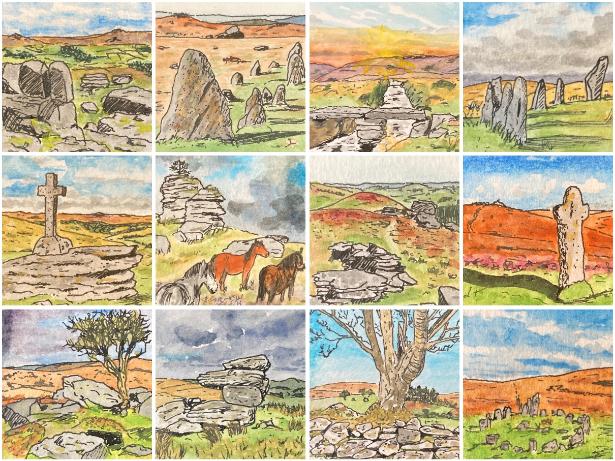
At the beginning of last month (March 2025) I decided that I wanted to try to embed a more regular art practice into my life. So, one evening, I sliced a piece of watercolour paper into a series of 5 cm squares with the intention of painting some kind of miniature picture each morning. I didn’t know what I would paint, just that I would try to paint something, as often as I could.

It was interesting, then, to wake up the next day and find myself sitting down at my painting table at 7:30 am, before I had even eaten breakfast, painting a little scene of a tor and some scattered rocks, a scene that is typical of Dartmoor, the National Park just north of Plymouth where I live. Because I was working on such a small piece of paper, and because I was trying to work quickly, before I got fully enmeshed in the day’s activities, I found myself adopting a simpler style than usual, with fewer, and bolder, colours and some use of cross-hatching to show shadows and darker areas. I liked what emerged.

After that first painting (the one at the top-left of the composite picture at the top of this post) I still didn’t know what would happen next, but at some point, perhaps after two or three days, I came to realise that I was creating a series of miniature pictures that I labelled Dartmoor Scenes. Initially, it was my intention to paint five pictures, one on each weekday, but having successfully reached that number I decided to push on to nine. This seemed to me to be a good number for a series of little square pictures, neatly forming a 3 x 3 grid.

As I approached what I thought would be the final picture, I received a comment on my Bluesky (social media) account on which where I was posting my new picture each day, suggesting that the pictures would make a nice calendar. It was an idea that I liked, a lot, but of course a calendar needs 12 pictures, one for each month… and so my miniature watercolour Dartmoor Scenes series had to become a collection of 12 pictures in total.

I really enjoyed producing these little pictures (and have since gone on to produce two more sets of 12 similarly-sized pictures on different themes – watch this space for details!). I enjoyed being forced to keep things simple and was really happy with the results (more in some cases than in others). I particularly like the stone row and stone circle pictures on the top row (second-left and top-right), and the tree and wall scene (third-left, bottom row). I also really like the way that they look when placed together.

Although it was already almost the end of March by the time I received it, I got a desk calendar printed up as a kind of test run to see how well it worked… and it worked very well indeed, the pictures coping with being expanded to almost double their original size. Subsequently, I have also had each picture printed as a 10 cm square card and had some copies of a larger card printed with a 3 x 3 composite of the nine pictures that I think are the best of the selection. At some point I hope to get more of these cards printed so that I can have a go at trying to sell some of my artwork. It will be interesting to see what happens if and when I do!

As an experiment in trying to be more regular with my artistic endeavours, this activity has worked really well, and although I have now moved on from Dartmoor Scenes, I suspect that I will return to this theme again at some point and complete another set (at least another four to get to a 4 x 4 grid, but who knows, maybe I have another 13, 24 or even 37 Dartmoor Scenes still in me!)

If you like these pictures, I’d love it if you added a quick comment to this post. It would be fun to know which one(s) you like best.

Ronda, Spain #art

As I noted in another recent ‘art’ post (Home Park, Plymouth Argyle), it seems to have become a ‘thing’ that I create handmade cards for birthdays and special occasions associated with family and friends. For these cards, I generally paint a small watercolour picture of a scene that has a special connection to the person or event being celebrated or one that just shows a place that they really like. I usually use some small (roughly 10cm x 15cm) rough-edged raggy paper, for the painting and then I tape this to a simple brown card. This gives an interesting and attractive, rather rustic, feel to the cards which I think is appropriate given their handmade nature.

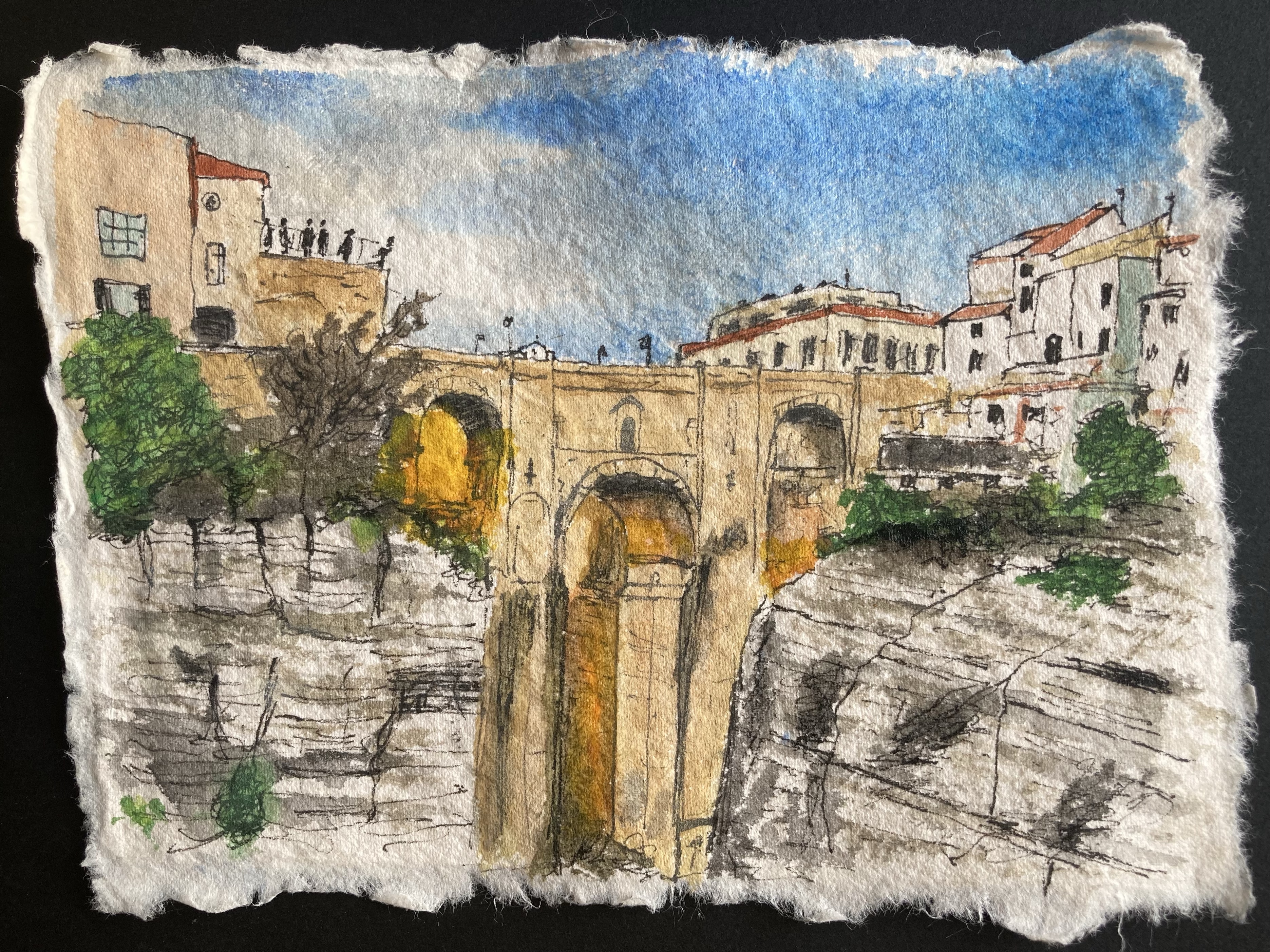
I painted the picture above, of Ronda in southern Spain, at the start of last month to use on a birthday card for my elder daughter’s husband. They travelled to Ronda to attend the wedding of one of my her workmates just a month or two before their own wedding last June and he liked it so much that my daughter was quick to suggest it as the subject for his card. To be completely honest, the other alternative was for me to try to paint a picture of Stamford Bridge, home to Chelsea F.C. (his team sadly) and apart from me not wanting to have to paint a scene that had lots of people in it, it was quite difficult to find a suitable picture to base a painting on. So, Ronda it was…

Funnily enough, despite being an incredibly scenic and much photographed location, with its deep gorge and steep cliff faces, Ronda was also a difficult subject to find a suitable picture to recreate as a painting. Most of the photographs of the town that I could find online were either taken from a distant vantage point designed to show the full majesty of the cliff-top location (which then made all of the interesting details of the buildings etc. shrink to an unworkable size) or were focused on a single ornate building or just the bridge that spans the gorge (and so did not really capture anything about the setting). In the end I opted for this shot of the bridge with a decent chunk of the cliff faces visible and some suitably Spanish-looking buildings. I tried to capture some of the drama in the scene as the setting sun creates its own lightshow between the pillars of the bridge. The picture/card was certainly appreciated, so I can’t have done too bad of job!

A Watercolour Sketch for Valentine’s Day #art

Yesterday was 14th February, commonly known as Valentine’s Day – a day for celebrating the romance in your life and letting your ‘special person’ know that you love them. I have to admit though that I am not known for my romantic gestures, or for expressing my emotions (fortunately for me, neither is my wife!), so in our household, Valentine’s Day is not a day filled with red roses, soft music and a candlelit dinner. Nevertheless, we do acknowledge Valentine’s Day in our own way, and this year I spent an enjoyable hour painting a watercolour sketch to turn into a special card. I based the painting on a photograph that I found online of a couple sitting on a bench looking out towards a magnificent view. It’s the kind of bench and the kind of view that my wife and I enjoy sitting on (the picture also had the advantage that I didn’t need to try to paint the faces of the happy couple…). I personalized the couple’s clothing and the colours of their hair and the caps that they are waving just enough so that the couple in the painting could certainly be us.

I’m glad to report that the card and the picture were very well received – evidence, I think, that it means far more to have taken the time to produce something personal and meaningful for the love of your life than to fork out a few quid for a generic heart or flower themed card and a bunch of flowers from the supermarket!