I like to try to spend a little time painting on as many days as I can, and for obvious reasons, the key to this is to keep my pictures small. One of my favourite formats seems to be 5cm square pictures painted in a fairly loose style, with not too much detail and a fairly limited colour palette. Each picture starts with a few pencil marks that serve as guide lines for the pen work, mostly outlining key features and providing various forms of shading. Once the ink has dried, which only takes a few seconds, I start to apply the watercolour paint, usually colouring the sky and any large blocks of vegetation first, before moving on to fill in any details. The whole process generally takes less than 30 minutes and my preference is to spend time of this as pretty much the first thing I do in the morning. When I completed my first small picture, I didn’t have any particular plans for further pictures on the same theme, but one picture led to another, and it seems that I end up producing these miniature watercolours as part of a series, first Dartmoor Scenes and then House Plants, Capital City Landmarks, and a series of slightly larger Mysterious Britain pictures. Most recently, returning closer to home, I completed this set of pictures showing various landmarks in our neighbouring county, Cornwall.
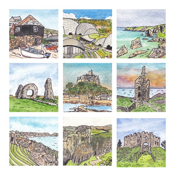
The pictures weren’t painted in this order, but the subjects of my Cornwall Landmarks series are (from top-left working across the rows and down the columns in the composite picture above) The Roundhouse Gallery, Sennen Cove, The Eden Project near St Austell, Bedruthan Steps, Men-An-Tol stone ring, St Michael’s Mount near Penzance, a classic coastal tin mine pumping station, the Minac Theatre, Tintagel Castle and Restormel Castle near Lostwithiel. If I had to choose favourites then I think I would go for the pictures of The Roundhouse Gallery, Bedruthan Steps and Restormel Castle, although I might well make different selections the next time I look at them!
As with each of my other miniature watercolour series, I plan to get some copies of the 3 x 3 composite picture printed as greetings cards to sell at some point, and I will probably try out some of them as individual framed versions too.
I guess the obvious question for me now is where I will go next with this kind of miniature watercolour picture. This morning I painted a view from a photograph I took last week while staying in Exmoor, and so I guess that it is likely that I will end up doing some more from that beautiful part of the world. But whether I will end up with enough for a full series, so that I can make another 3 x 3 composite, only time will tell!
The proximity of Dartmoor to our home in Plymouth generally means that it is our go-to place for weekend walks, so it is hardly surprising that my phone is full of photographs of Dartmoor landscapes. I’m a particular sucker for ‘big views’, but my attempts to capture these in photographs are always something of a let down. Looking with the naked eye, big views fill my visual space with rich detail, but on camera everything seems to shrink, recede and flatten, resulting in a rather distant picture that is dominated by sky, and especially foreground, that the brain somehow filters out of the live view. I expect that this phenomenon is well understood by photographers, and it probably even has a special name, but to me it is just known as ‘disappointment’. This is compounded by the difficulty that I face when I subsequently try to capture this same kind of open, expansive view in one of my paintings. The part of a photograph that I want to paint seems to be only a small component of the whole, and no amount of zooming in seems to really help.
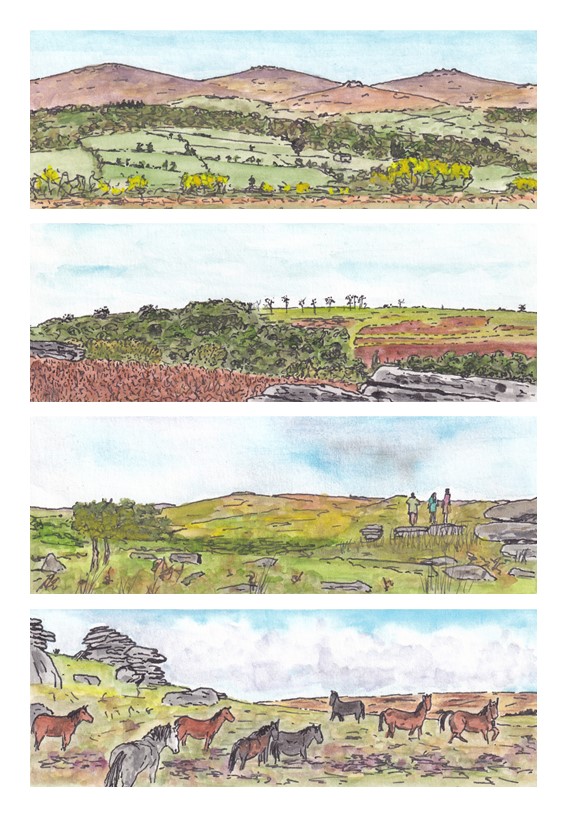
On one recent trip to Dartmoor I was pondering this issue when it occurred to me that what I was seeing with my eyes was a little like the view I got when I used my thumbs and index fingers to create a rectangular, letterbox-like, frame and then looked through that frame as if looking through a window. Despite there being so much more that could be seen, my brain seemed simply to ignore that part of the view that would have outside this frame, whereas my phone camera played no such trick. I began to wonder whether the key to painting this kind of view was to change the size and shape of the picture, adopting a similar letterbox, or panoramic, format. So, for a few days I played with this approach. The results are a series of four small painting that I refer to as my Dartmoor Panorama series.
I’m pleased with these pictures, at least to the extent that they better capture something approximating to the kinds of spacious views that I like best. Using a panoramic format does seem to work. In the third picture I was brave enough to include some people standing on one of the tors and gazing out at the view> I think this little piece of detail adds a lot to the picture, including a splash of contrasting colour. I was even more brave in the fourth picture, including a group of Dartmoor ponies. I tend to think that I’m not able to paint animals, but perhaps I am improving, because at least some of the ponies in this picture seem to have come out pretty well. I am particularly pleased with the grey pony in the foreground and the somewhat lively pony furthest to the right.
I feel sure that I will use this approach to painting expansive views again, and I suspect that at some point my curiosity will lead me to explore some photography guides to see whether I can find a proper explanation of my observation. It might have something to do with ‘foreshortening’ and/or ‘depth-of-field’ (words that I am vaguely familiar with that at least sound like they could be contributing factors). Who knows, perhaps someone reading this post will be able to point me in the right direction!
Back in April, after completing four series on miniature watercolour pictures (Dartmoor Scenes, House Plants, Capital City Landmarks and Mysterious Britain), I decided that I would give myself a new challenge by scaling up my paintings a bit and keep my subject matter close to home with a set of pictures that I described with the working title ‘Plymouth Postcards’. I wanted to try to keep the same kind of fairly loose style but I thought it would be good to be able to capture a bit more detail of each scene. My miniature watercolours had been just 5cm square (or 5cm x 7cm in the case of the Mysterious Britain series) but this new series was, naturally, postcard sized (roughly 10cm x 15cm). That’s an increase in area of up to six times, and so it gave me quite lot more sketching, drawing and painting to complete!
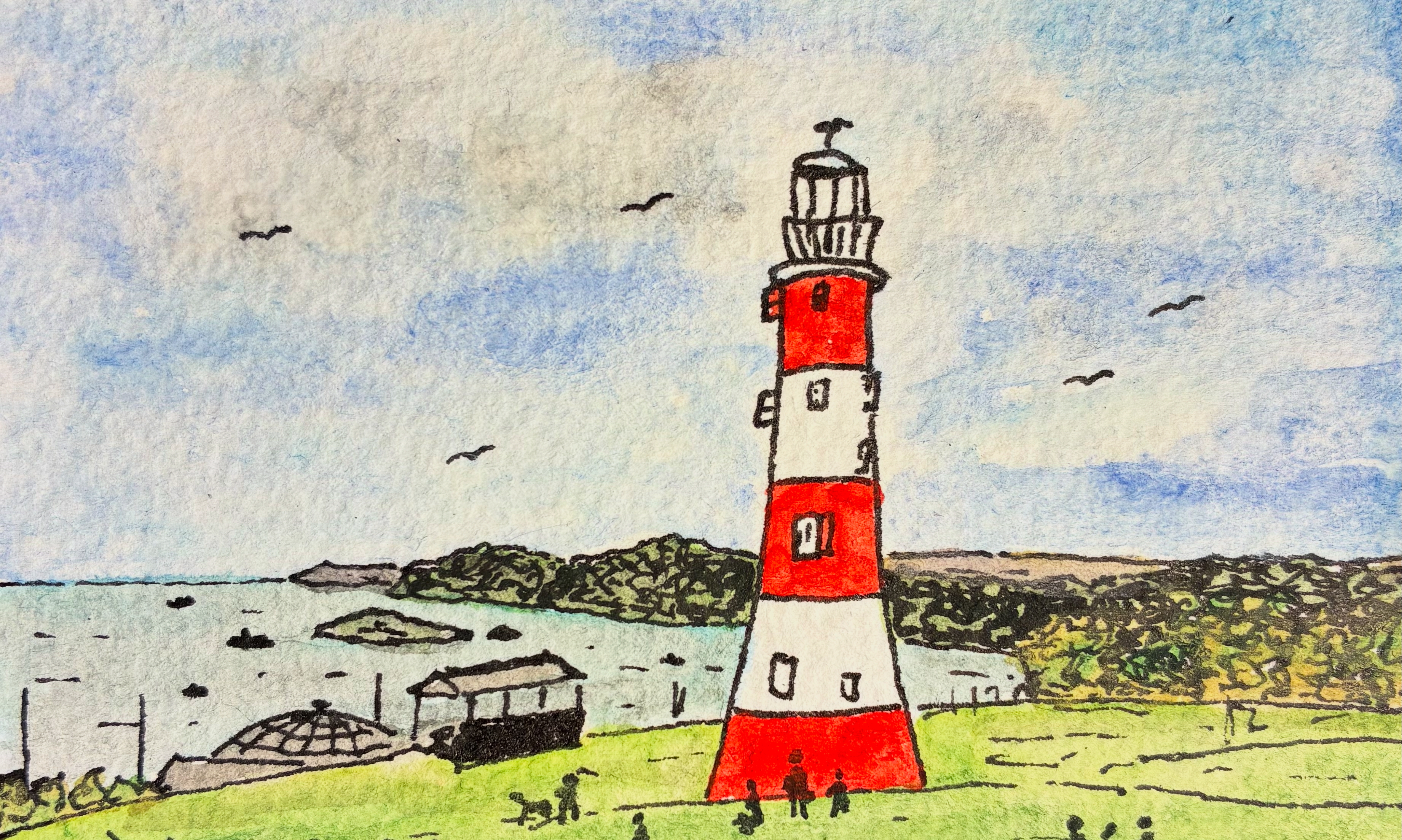
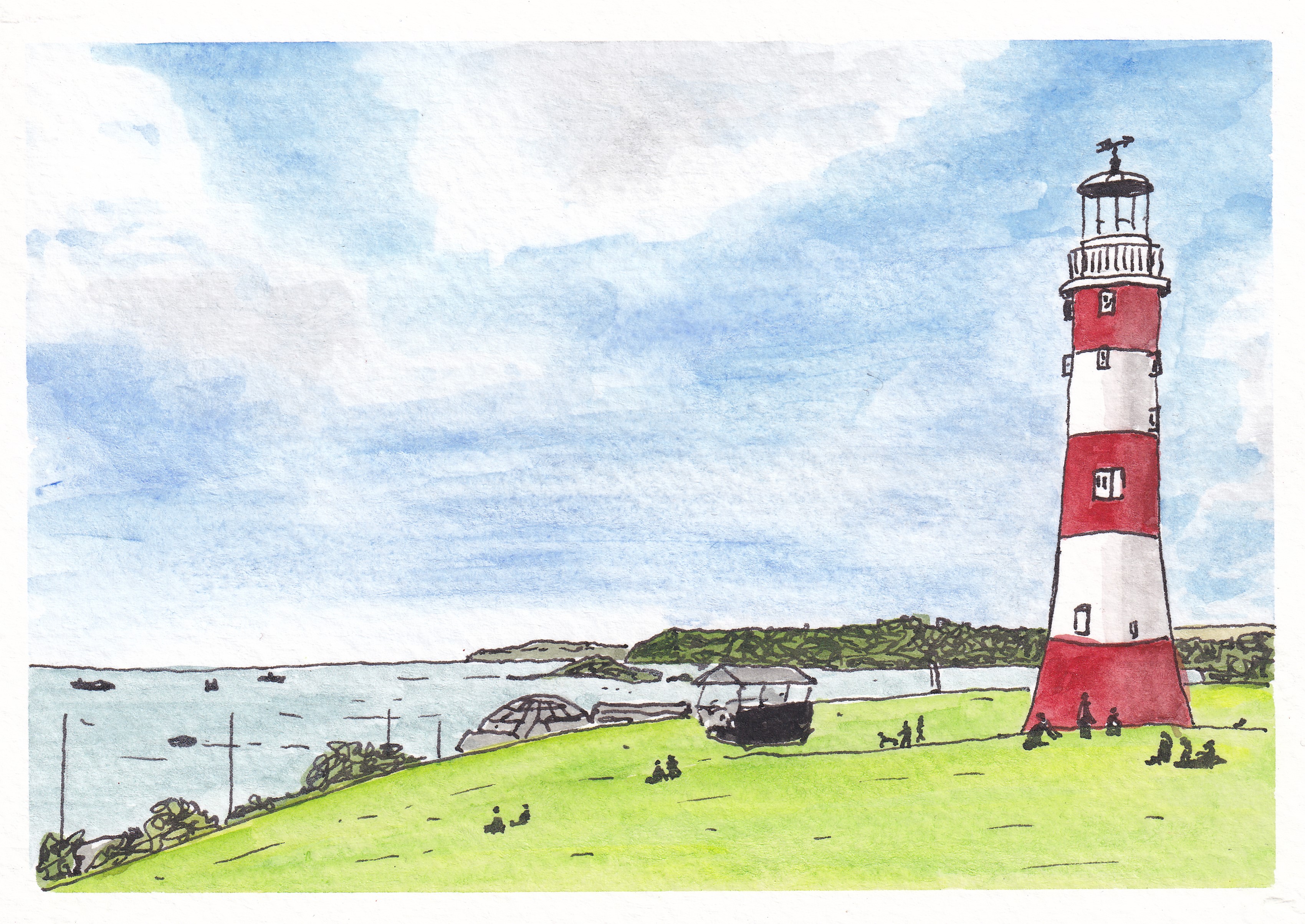
My first picture (above) focused on what is probably the most iconic view associated with Plymouth, the red-and-white striped form of Smeaton’s Tower – one-time lighthouse on the Eddystone Rock which was moved to Plymouth Hoe when it was replaced in the 1880s.
Next up, I remained close to the waterfront with a view across the inner basin of Sutton Harbour towards the old customs house and the Three Crowns pub. I am not sure that the colour of the water there is ever quite as blue as my picture suggests, but I like the bright and cheery feel of this painting…
Sutton Harbour, Plymouth
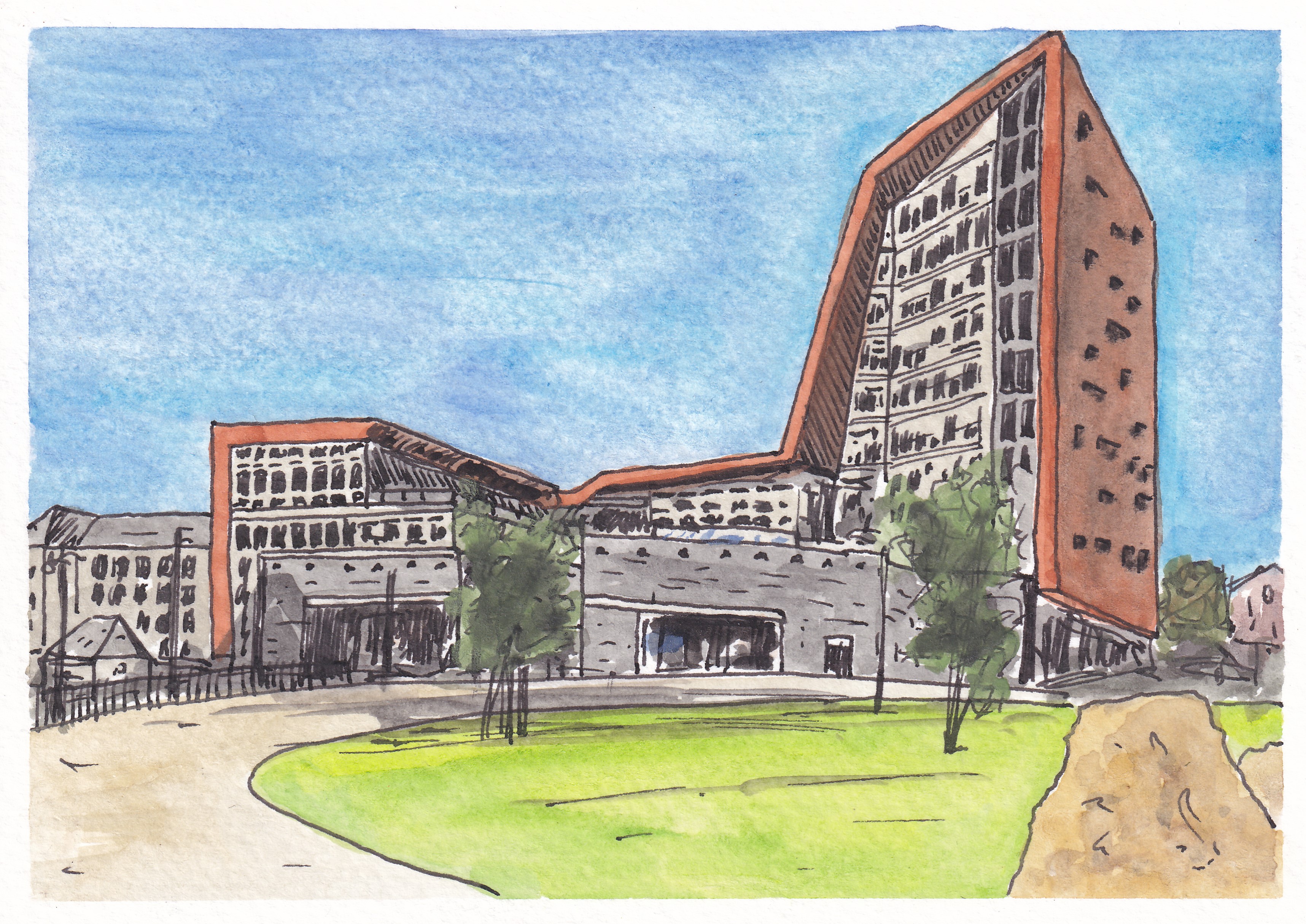
Third came a view of one of Plymouth’s most distinctive new buildings, the Roland Levinsky Building, home of the Arts Faculty at my workplace, the University of Plymouth. Again, the sky is perhaps a little too bright, but I like the three-way competition between the blue sky, the green of the grassy area in the foreground, and the coppery-orange cladding of the building itself…
The Roland Levinsky Building, University of Plymouth
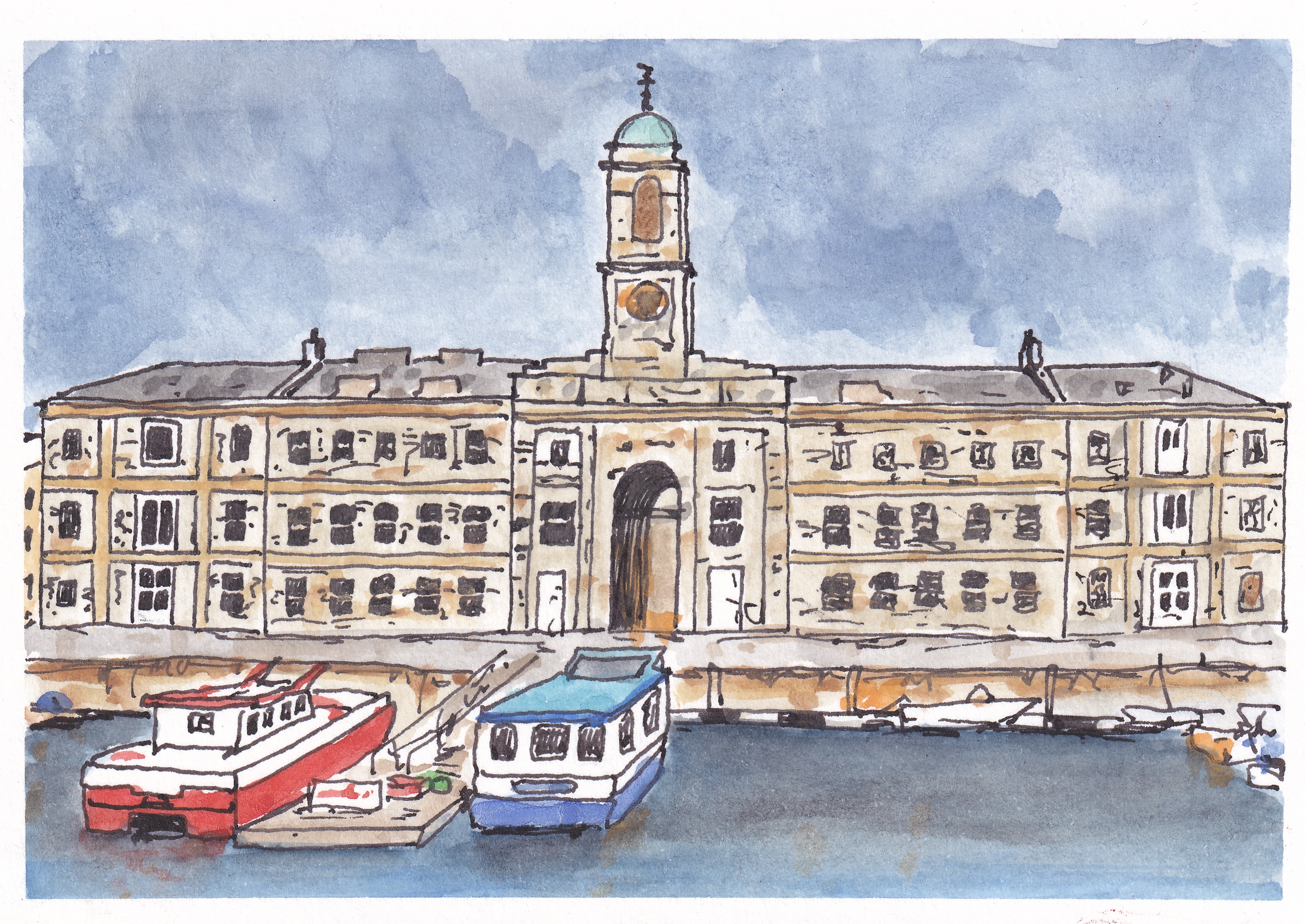
After painting a fairly new building, it was time to visit a much older one with a ffront-on view of one of the main buildings at the Royal William Yard, formerly the victualling yard for the Royal Navy but now a home for swanky apartments, restaurants, various studios and art spaces, and a cinema. I think this is one of my favourites from the series…
Royal William Yard, Plymouth
Then, it was back to the city centre for a picture showing the Charles Church, bombed in the Second World War and left in its broken state as a memorial to lives lost. Behind it, the angular exterior of the eastern end of the Drake Circus Shopping Centre forms an interesting backdrop which was surprisingly challenging to paint…
Charles Church and Drake Circus Shopping Centre, Plymouth
For my sixth Plymouth Postcard, I took a trip down to the Barbican area of the city for a view of the Plymouth Gin Distillery on Southside Street. It was difficult to get the perspective of the curved road right but I think I have just about managed it…
Plymouth Gin Distillery, Southside Street
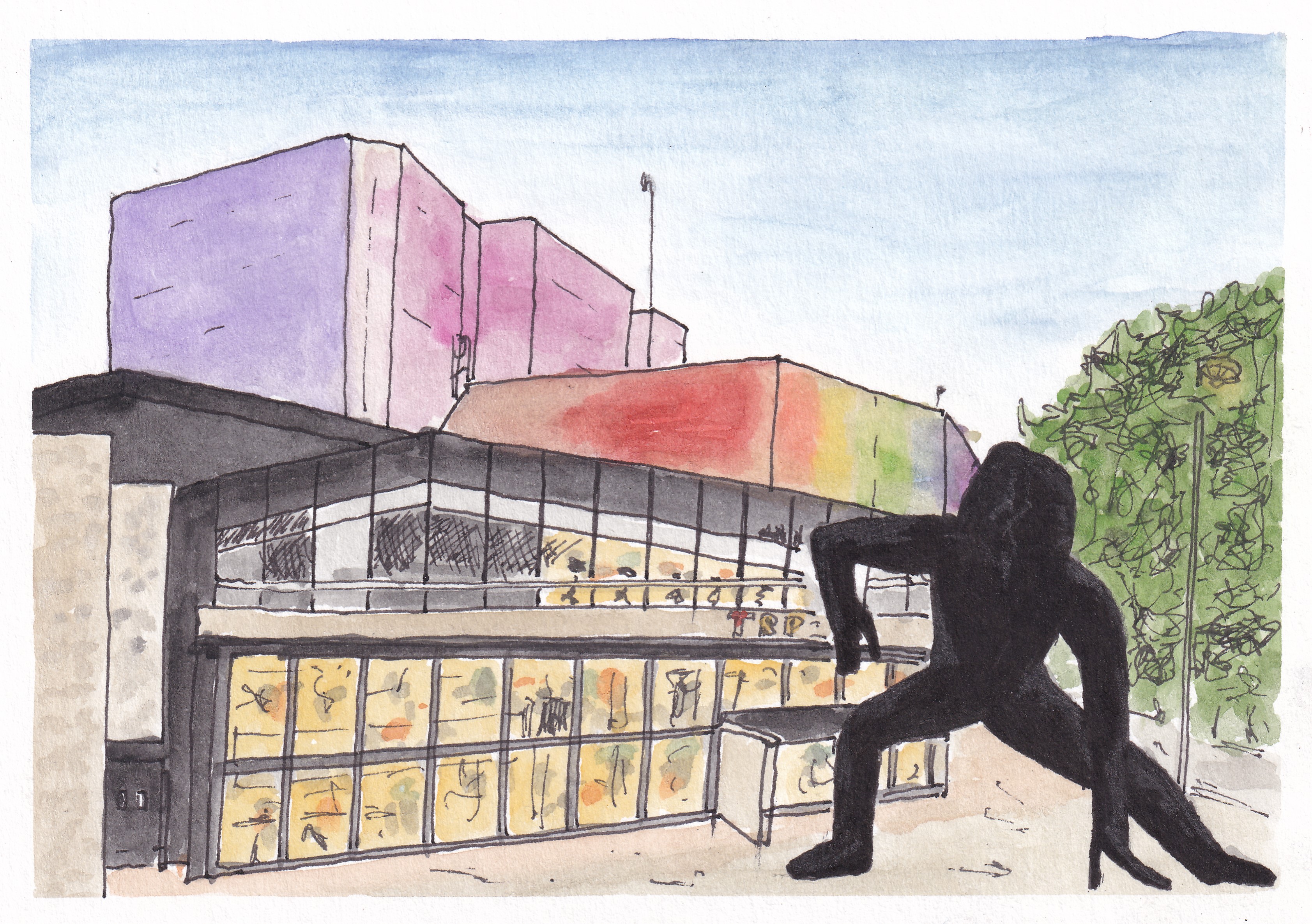
It was time to get a bit ‘arty’, so my next picture was of the interestingly illuminated Theatre Royal, with the imposing form of the statue ‘Messenger’ in front of it. I think that I did pretty well with the theatre itself, and the shape of the statue isn’t too bad, but my initial attempts to shade its dark form resulted in it looking like a hairy gorilla, and so I coloured it black with a permanent marker to try to salvage the picture. Unfortunately, this was only partially successful and I think I would have to describe this one as something of a ‘fail’…
Theatre Royal and ‘Messenger’, Plymouth
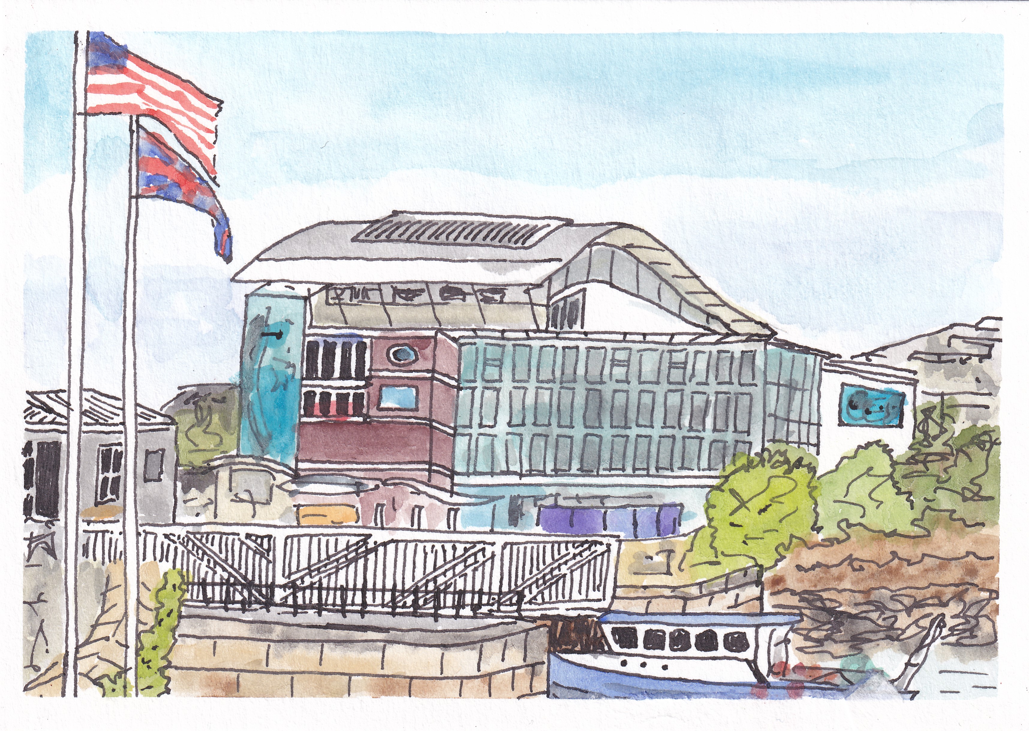
Painting number eight took me back to Sutton Harbour, this time looking across the swing bridge towards the Fish Market on the far left and the National Marine Aquarium, with its wavy roof in the centre. I’m please with the way I captured the blue colour of the windows and the advertising poster on the left of the building, and I like the foreground detail of the boat and bridge. Sadly, my attempt at a Union Jack flag was not quite so successful and the flag of the USA seems to have lost its stars…
The National Marine Aquarium, Plymouth
My ninth picture took me to very familiar territory, with a view of the old turnstiles at Home Park, home of Plymouth Argyle Football Club…
Home Park, Plymouth Argyle Football Club
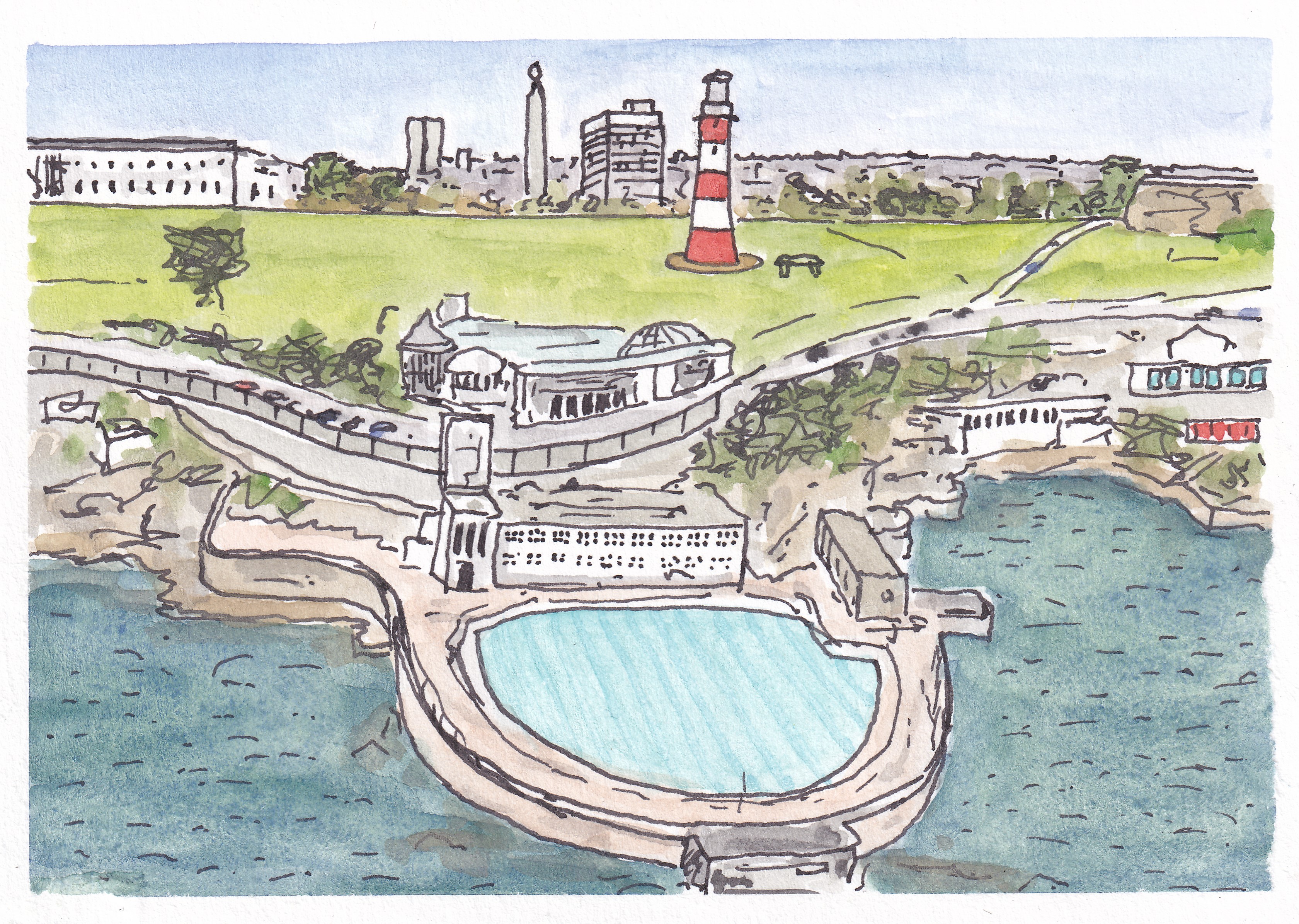
… and then it was back to the waterfront with a view of the art deco Tinside Lido with part of Plymouth Hoe, Smeaton’s Tower and the war memorial in the background…
Tinside Lido and Plymouth Hoe
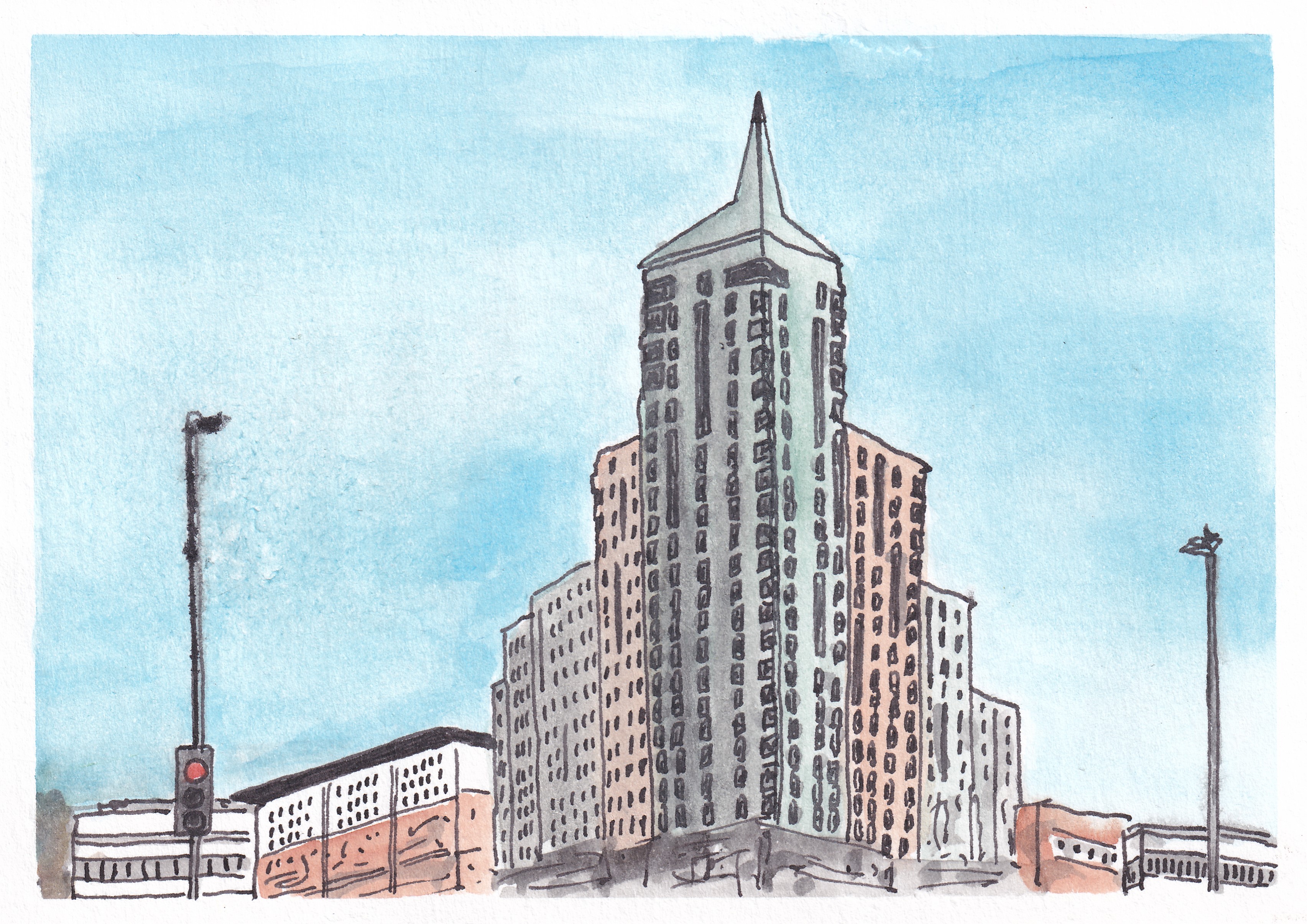
I finished my series with two pictures of contrasting buildings. First up was the Devonport Town Hall and Column, with the oddly coloured and spectacularly fronted (and named) Odd Fellows Hall on the right. Finally, my subject was the sharply-topped, and so highly appropriately named, Beckley Point (a Hall of Residence for students in the city). This is, apparently, the tallest building in the southwest of England (although I don’t know what is being counted as the southwest in this case)…
Devonport Town Hall and Column and the Odd Fellows HallBeckley Point Hall of Residence, Plymouth
This was a fun series to do, taking 17 days to complete, and overall I was pleased with the results of my efforts. It was interesting to try to capture some of the more striking buildings and views that Plymouth has to offer, particularly as it is generally regarded as an architecturally bland and unexciting place (largely as a result of the fact that much of the city centre was flattened by bombing raids in the Second World War).
I am sure that I will do plenty more paintings of Plymouth views in the future, but I think this set forms a good initial collection, showcasing some of the different areas and places of interest in the city nicely.
I have probably mentioned in a previous post that over the last year it has become fairly standard practice that each time we are approaching the birthday of a friend or family member I rustle up a painting showing a scene or location that has a special association for the recipient. I paint these pictures on a piece of very rough-edged, handmade paper that I have a stack of, and then fix the painting onto a 5 x 7 inch recycled card blank. The result is a specially created, uniquely-designed, hand-made card*. These are always well received, and it is funny how often the recipient doesn’t twig that I did the painting, despite me usually putting my initials in the bottom-right corner. I guess I have only been painting for 14 months and so a lot of people aren’t even aware that the picture on their card is a piece of my handiwork.
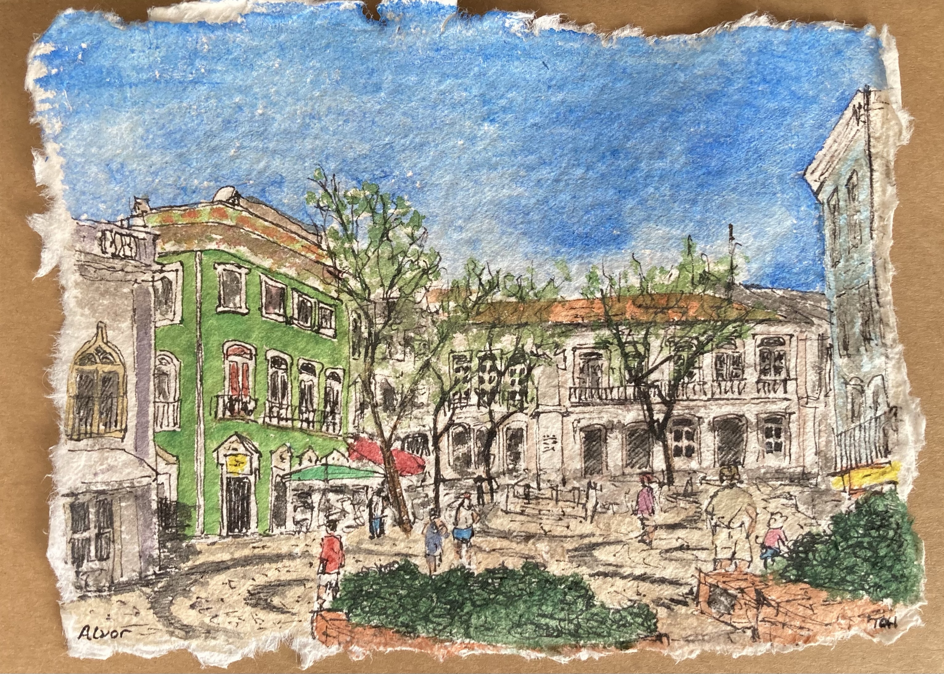
Back in April, I set out to create one such card, this time for Ann, the wife of my wife’s father. For some years, Ann and Keith greatly enjoyed holidays at the resort of Alvor on the Algarve coast of Portugal, but health issues and reduced mobility have meant that these trips have not been possible for quite a while now. Consequently, we decided that it would be fitting for me to paint a scene of Alvor to use for Ann’s card. I took a look online, googling images of Alvor, but couldn’t find anything that grabbed me until I came across what I thought was a suitable picture on a tourist site that was promoting the merits of Alvor. It showed an attractive open square, with people going about their business, a few trees and plants, and some interesting patterns in the paving, surrounded by some fairly grand, old buildings, including one that was a striking bright green – perfect to add an interesting splash of colour to the scene. I duly set to work and perhaps 45-60 minutes later, and as I usually do, I posted the finished picture to my social media accounts on Bluesky and Instagram.
After I had finished making the card itself, and it was safely on its way in the post, a work colleague commented on my instagram post along the lines that ‘there is a green-painted building exactly like the one in my picture just a little way along the coast from Alvor in Lagos‘. The first time I read the comment I simply thought ‘well that’s a coincidence‘… but then it dawned on me that they were perhaps just being polite, or maybe subtle, with their wording. Some more image searching soon revealed that no, the square I had painted was not actually in Alvor, and yes, the square I had painted was actually in Lagos… In fact, as I searched further I found that practically every picture I found online of Lagos seemed to feature that same square with its beautiful, old, bright green building. Doh… I had been duped – the website I had originally found the picture on had obviously (how shall I put this?) been developed by a ‘Creative Geographer’.
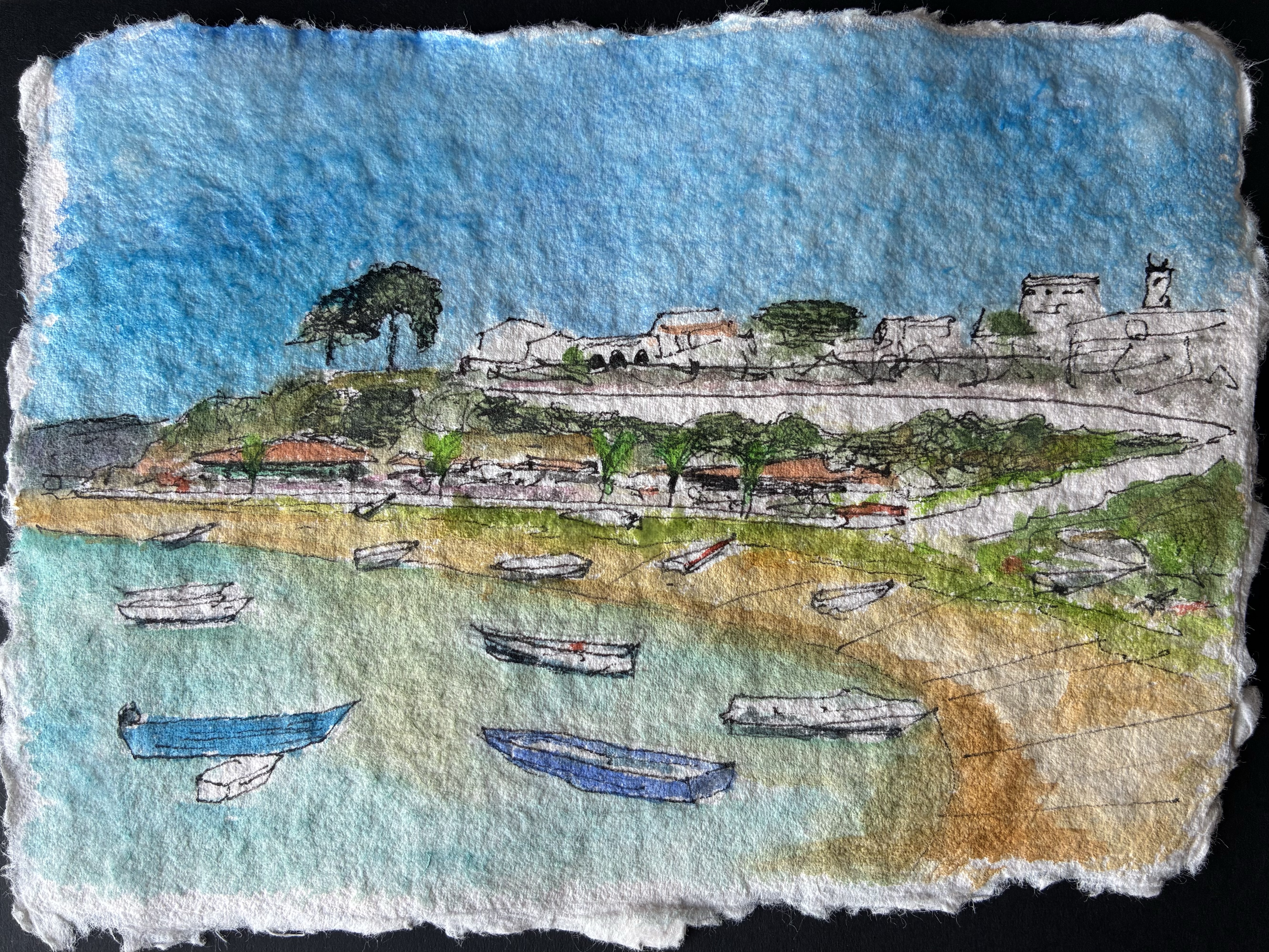
Ann’s birthday came and went. I had already confessed to my error, and the card was much appreciated nevertheless, but, quite obviously, I was left feeling that I had not quite struck the target. So, a few weeks later, when some spare minutes arrived, I did a new, and more careful, search for pictures of Alvor, plumped for a nice beach/waterfront scene, and set to work again. The result of my efforts is shown below.
I learned (or was reminded of) a good lesson here, namely that you cannot believe everything (much?) that you read on the internet, and Ann was thrilled to receive two birthday cards including the second bonus birthday card with a picture that really did bring back happy memories. So, in the end, we both came out as winners!
* If there is a special place that you would like me to paint, for a birthday card or otherwise, feel free to get in touch. I’m on the point of opening my art activity for business and would be happy to take commissions. I think it would be fun, and interesting, to paint some new and different special places.
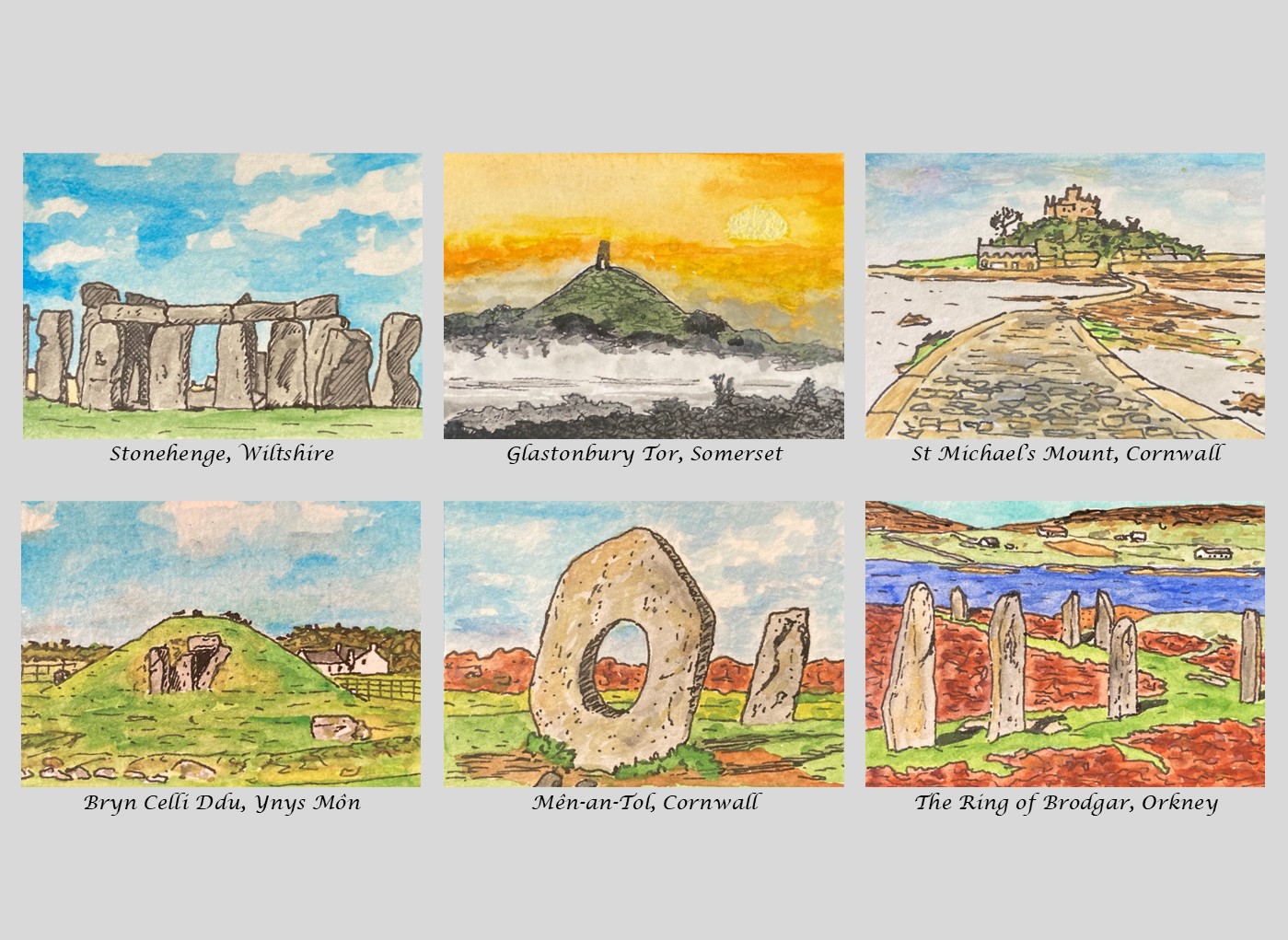
Hot on the heels of my other miniature watercolour series (see: Dartmoor Scenes, House Plants, Capital City Landmarks), the next group of pictures that I painted were slightly larger, rectangular, and given the working title of Mysterious Britain. My idea was to select various ancient landmarks from around the United Kingdom that have some aura of mystery, largely a result of their age.
I started off with a fairly obvious subject for the first picture, the prehistoric megalithic structure known as Stonehenge in Wiltshire, much feared by those who travel along the A303 knowing that there is a very high chance that they will be held up by traffic in its vicinity. I remained in the southwest of England for the next two pictures, to Somerset for a mist-shrouded Glastonbury Tor at sunset (with its much debated history and reputed links to the legend of King Arthur) and St Michael’s Mount in Cornwall (for which there is evidence of population between 4000 and 2500 BCE). But perhaps I should write not describe the latter site as being in England at all and refer to its location as Kernow…
Next, I popped up to northwest Wales (Cymru) for a picture of the prehistoric burial chamber Bryn Celli Ddu (‘the mound in the dark grove’) in Ynys Mon (Anglesey), before returning to the southwest for the later Neolithic or early Bronze Age group of standing stones known as Men-an-Tol (‘stone with a hole’).
Finally, my painting activity for this series took me to the far north, almost as far as it is possible to get in the United Kingdom, to The Ring of Brodgar, a neolithic henge and stone circle on Mainland, the largest island in Orkney.
I enjoyed painting this series and was pleased that for the most part I managed to keep the pictures simple, not putting in too much detail and using a fairly limited colour palette. I’ve tried to pick a favourite, but there are aspects of almost all of the pictures that I particularly like so I’ve not been successful – the simplicity of Stonehenge, the mystery of Glastonbury Tor, the causeway stones of St Michael’s Mount and the little white house behind Bryn Celli Ddu. But like a lot of things, I like the way that these pictures work as a set – taking the viewer on a whistle-stop tour of just a few of the many wonderful locations of Mysterious Britain.
Do you have a favourite? Add a comment to let me know if you do!
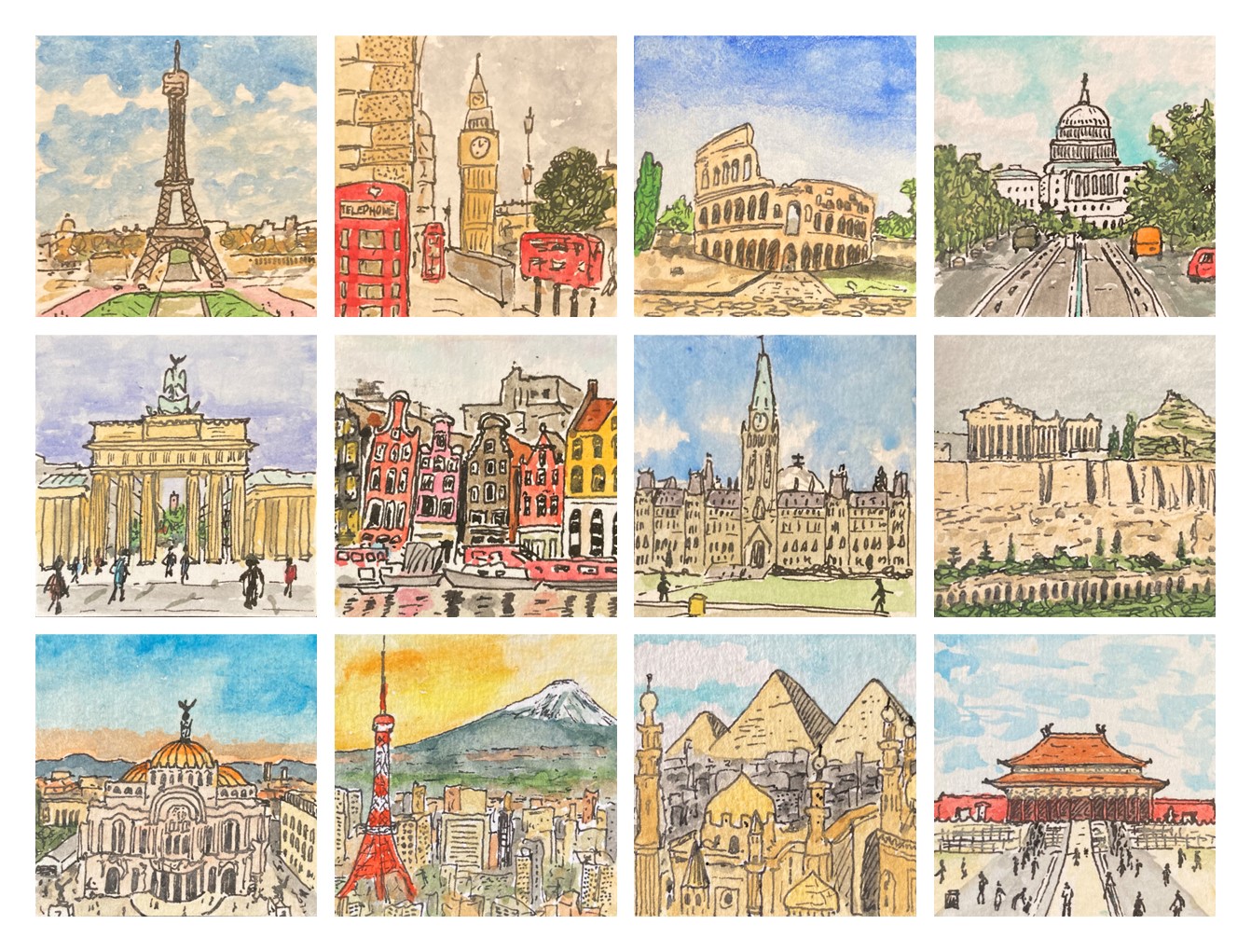
Back in March, I was in a great rhythm with my art, painting a miniature watercolour picture first thing in the morning on most days. Without really thinking about it I found that I slipped into a routine of painting a small (5cm x 5cm) picture on some chosen theme. Each one took me about 30 minutes to do – it was a kind of morning meditation! My first theme was of Dartmoor Scenes and this was followed by a series of House Plant pictures, but for my third set of these pictures I decided to go further afield, and chose Capital City Landmarks.
The first couple of pictures I produced were easy choices – Big Ben in London and The Eiffel Tower in Paris, but then I found myself having to scratch around a bit, wondering where to head next, as I realised that many of the most recognisable landmarks that popped into my head were not located in capital cities. Any sane person would surely have just accepted that fact and switched the theme to City Landmarks, but if you think that’s the kind of thing that I would allow myself to do then you would be sorely mistaken…
In the end, I did manage to find enough subjects to complete a series of twelve pictures and the results are shown in the composite image at the top of this post. It ended up that half of my landmarks were in Europe (London, Paris, Rome, Berlin, Amsterdam and Athens) and the other half where further afield (Washington D.C., Toronto, Mexico City, Tokyo, Cairo and Beijing).
I’m really please with this set of pictures and plan to produce some greetings cards with them.
Do you have a favourite? Are there any other (not necessarily capital) city landmarks that you’d like to see me turn my hand to?
I painted this small panoramic picture of Plymouth Waterfront as viewed from Plymouth Sound as a bookmark to accompany the birthday present (books!) that my wife gave to one or her friends back in March. They enjoy a weekly walk down to the Plymouth Waterfront on most Friday mornings and so this scene was the obvious subject matter to choose.
It was interesting to paint in this wide format, and it’s an approach that I have been using more recently for some Dartmoor pictures. I think that when we view a landscape in real life our brain naturally provides a somewhat wide-screen view, and that this might be why, at least to some extent, it is often somewhat disappointing when you take a photograph of a view and much of what you see in real life seems to be condensed into a very small part of the picture.
One advantage of adopting this kind of panoramic composition, at least for a novice and completely untrained painter like me, is that it reduces the amount of sky, as this is often tricky to paint. And in this particular picture it also reduced the amount of water that I had to paint, something else that I’m not especially confident with.
All in all, I really liked this picture with its pops of colour [did I really just write ‘pops of colour’ – this seems to be such a trendy turn of words these days on TV programmes relating to art, interior design, home improvement etc. I must have caught it from there…]. I am sure that this is a format and also, with its obvious local interest, a view that I will return to in the future.
A couple of weeks ago we paid a visit to Make Southwest, an exhibition space for contemporary craft and design and a leading charity for craft education located in the small town of Bovey Tracey on the southern edge of Dartmoor, about 25 miles from our home in Plymouth. It’s a venue that we have visited a few times before – there is always some kind of special exhibition (this time it was a exhibition of contemporary bells called Sound and Silence) and an interesting array of local artwork, books and assorted items to look at in the shop. On this occasion, the reason for our trip was to see a smaller exhibition of wood engraved prints and, in particular, the printmaker Molly Lemon, who had travelled down from her base in Gloucestershire to demonstrate her work. We have encountered Molly at several Craft/Art Events in the last couple of years and always enjoyed viewing, and chatting to her, about her work. We also enjoyed seeing her compete in, and reach the semi-finals of, the Sky Arts TV Series Landscape Artist of the Year a few weeks ago.
Since I started painting about a year ago, whenever I go to any kind of art gallery or art/craft event I particularly enjoy scavenging the work that is on display or sale for ideas that I can try out for myself. Looking at the various pieces of artwork for sale in the shop at Make Southwest, I was particularly enamoured by some tiny pieces of work created by the printmaker Mike Tingle (also here). These were very small (just a few centimetre) square prints on slightly larger squares of rough-edged paper, with a title and the artist’s name written in pencil around the picture (there is an example of a similar kind of picture just below the centre in this piece of work: Dartmoor Box No 1). I really liked the miniature size and somewhat ‘rough’ nature of the pieces and I immediately thought that it would be fun to try to produce something similar using one of my own small Dartmoor Scenes watercolour paintings.
After returning home, I set about seeing what I could produce. First, I selected one of my pictures, opting for this one of a tree growing out of a typical Dartmoor dry-stone wall:
The original picture is a 4.5 cm square ink and watercolour sketch, and my intention was to use our home inkjet printer to make the best quality colour photocopy of it that I could, printing onto a sheet of watercolour paper so that the texture of the original was preserved. I’d already played around with making copies of some of my paintings in this way and so I knew that although the copied versions weren’t quite the same as the originals, with the paler colours tending to wash-out a bit, the process worked pretty well. So far so good.
This is the point at which I made my mistake. In the process of making the copy I somehow selected black-and-white printing, and so when I saw what the printer had spat out into the print tray I was instantly annoyed and frustrated. To make matters worse, because the original picture was on a small square of fairly thick paper, as the scanning light moved below the copier glass a dark shadow line was cast on one side of the copied picture. Not only did I only have a black-and-white copy, but I had a black-and-white copy that had a dark line along one of its edges. What a waste of a sheet of paper and ink…
However, once I had overcome my initial disappointment and self-censure, I decided to press on with the rest of my production process and see what the end result looked like. I had intended that there would be no border between the picture and the surrounding area of paper, but now there was that dark line along one side spoiling that design idea. What could I do? Well, go with the mistake of course. I took my drawing pen and with the aid of a straight edge and a lot of care, I inked in a similar line on the other three sides. Hmmm… it didn’t look as I had planned but I liked the result. Then I measured out a wider border, and again aided by a straight edge, I tore the paper down to size. This part of the process is something that I have found takes a lot of care… if the tear is too sharp you don’t get the nice rough edge I was after, but if you are at all rushed and loose you end up with something that looks clumsy and careless. Fortunately, I managed to do a good job. Finally, I grabbed a soft pencil and quickly wrote a title below the bottom edge and my name on the right-hand side…
The result of this endeavour was the small picture shown at the top of this post and, despite my black-and-white and shadow mistakes in the copying process, I’m really pleased with the end result, so much so, in fact, that I intend to take the rest of my Dartmoor Scenes pictures and treat them in the same fashion. Even better, not only did I end up with a new picture that I really liked and the discovery of a new way to transform existing pictures into a different, somewhat distinctive, form, but I also gave myself a great reminder that making mistakes in life is not always a bad thing. In fact, sometimes, as in this case, a mistake can open up a different path from the one that was intended that leads you towards an unexpected but interesting, exciting or enjoyable destination!
I thoroughly enjoyed completing my recent series of mini-watercolour landscapes of Dartmoor Scenes, and in the process I found that I had managed to insert a short burst of art practice into my daily(ish) routine. Consequently, it wasn’t a surprise that I found myself wanting to continue painting mini-pictures each morning. The only question was: What should I paint next?
The answer – well the first answer at least – turned out to be house plants. This might seem like a somewhat strange choice, especially as the vast majority of the pictures I have painted in the last year have been location-based: buildings or landscapes of one sort or another. But in fact, house plants are a subject that I have painted before.
My initial foray into painting house plants stemmed from a ‘location’ painting that I did back in November as a birthday present for a family friend who just happens to run a wonderful plant shop in Plymouth. The picture I produced was much appreciated and has subsequently been professionally framed and put on display…
When I was painting this picture I really enjoyed painting the various plants with their different forms and pots, and so a few weeks afterwards I did a quick painting showing an assortment of plants in a suitably varied set of pots on a couple of wooden shelves (based on some nice chunky wooden ones that we had just put up in our kitchen!).
The next time we paid a visit to the shop it was suggested that I might produce some house plant greetings cards and have them for sale alongside some others (quite different) produced by a couple of local artists that were already on sale in the shop. Unfortunately, when painting my original picture I had not thought about placement of the design, and with some of the painted areas reaching almost to the edge of the paper it was not easy to use it for a printed card without risking some fairly crude surgery to some of the plants on the top shelf! However, that conversation sowed the seed of the idea in my mind, and so when I was considering where to go next with my mini-paintings, house plants were an obvious choice.
The result was the set of 12 mini-pictures of individual house plants which I have put together into the composite picture at the top of this post. Like my Dartmoor Scenes pictures, these are 5 cm squares, and I have also had a sample greetings card printed from each individual picture and a 3 x 3 composite of a selection of the pictures. These printed version all worked nicely despite being enlarged to almost double their original size, and I will probably pursue trying to sell these in some format in the future. But whilst I loved painting the mini-pictures of individual plants, and really liked the composite pictures too, I did feel that the original picture, with an assortment of plants on shelves was the best of all. The plants are obviously the star players, but those chunky wooden shelves play an important supporting role.
To bring things right up to date, a couple of days ago I sat down and painted a second version of my ‘house plants on shelves’ picture, and this time I made sure that I positioned the painting in the middle of a larger piece of watercolour paper so that I could subsequently crop the picture without fear of pruning the plants! I’m pleased with the result (see below), and I can now go ahead and get some copies printed ready for sale.
Obviously, I’m not expecting to make a fortune from this activity, but I do think it will be fascinating to see whether my picture is able to catch the eyes of any customers enough to persuade them to part with a few pounds of their hard-earned cash…
At the beginning of last month (March 2025) I decided that I wanted to try to embed a more regular art practice into my life. So, one evening, I sliced a piece of watercolour paper into a series of 5 cm squares with the intention of painting some kind of miniature picture each morning. I didn’t know what I would paint, just that I would try to paint something, as often as I could.
It was interesting, then, to wake up the next day and find myself sitting down at my painting table at 7:30 am, before I had even eaten breakfast, painting a little scene of a tor and some scattered rocks, a scene that is typical of Dartmoor, the National Park just north of Plymouth where I live. Because I was working on such a small piece of paper, and because I was trying to work quickly, before I got fully enmeshed in the day’s activities, I found myself adopting a simpler style than usual, with fewer, and bolder, colours and some use of cross-hatching to show shadows and darker areas. I liked what emerged.
After that first painting (the one at the top-left of the composite picture at the top of this post) I still didn’t know what would happen next, but at some point, perhaps after two or three days, I came to realise that I was creating a series of miniature pictures that I labelled Dartmoor Scenes. Initially, it was my intention to paint five pictures, one on each weekday, but having successfully reached that number I decided to push on to nine. This seemed to me to be a good number for a series of little square pictures, neatly forming a 3 x 3 grid.
As I approached what I thought would be the final picture, I received a comment on my Bluesky (social media) account on which where I was posting my new picture each day, suggesting that the pictures would make a nice calendar. It was an idea that I liked, a lot, but of course a calendar needs 12 pictures, one for each month… and so my miniature watercolour Dartmoor Scenes series had to become a collection of 12 pictures in total.
I really enjoyed producing these little pictures (and have since gone on to produce two more sets of 12 similarly-sized pictures on different themes – watch this space for details!). I enjoyed being forced to keep things simple and was really happy with the results (more in some cases than in others). I particularly like the stone row and stone circle pictures on the top row (second-left and top-right), and the tree and wall scene (third-left, bottom row). I also really like the way that they look when placed together.
Although it was already almost the end of March by the time I received it, I got a desk calendar printed up as a kind of test run to see how well it worked… and it worked very well indeed, the pictures coping with being expanded to almost double their original size. Subsequently, I have also had each picture printed as a 10 cm square card and had some copies of a larger card printed with a 3 x 3 composite of the nine pictures that I think are the best of the selection. At some point I hope to get more of these cards printed so that I can have a go at trying to sell some of my artwork. It will be interesting to see what happens if and when I do!
As an experiment in trying to be more regular with my artistic endeavours, this activity has worked really well, and although I have now moved on from Dartmoor Scenes, I suspect that I will return to this theme again at some point and complete another set (at least another four to get to a 4 x 4 grid, but who knows, maybe I have another 13, 24 or even 37 Dartmoor Scenes still in me!)
If you like these pictures, I’d love it if you added a quick comment to this post. It would be fun to know which one(s) you like best.