Quantock Paintings – Part 1 #art

Driftwood Cafe, Blue Anchor, Somerset

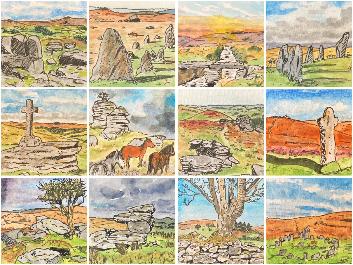
In recent summers we have take a series of summer holidays walking in the Yorkshire Dales – first in Swaledale (staying at Low Row near Reeth), then in Wharfedale (based in Ilkley) and last year in ‘Bronte Country’ near Haworth. In each case we combined our week in Yorkshire with a day or two staying somewhere en route to and from our home in Plymouth, or in one case a second week away in Norfolk and Suffolk. For a change, this year, we decided that we’d like to spread our holiday time out over the summer months, and so we picked a couple of fairly local destinations for ‘long weekend’ walking holidays and also booked five days over in Suffolk, combining this with a visit to elderly relatives and an old university friend on mine.

The first of our summer 2025 mini-break locations, in June, took us back to the very familiar territory (for me at least) of the Quantock Hills and the Somerset coast. I grew up a short distance from there in Bridgwater, and we would frequently go on family outings to the area. I also spent quite a lot of time at an activity centre in Kilve on short courses of various kinds (mostly musical).

Although I do like discovering new places, I also very much enjoy returning to familiar haunts, especially for a short trip when you want to be able to slot straight into holiday mode without having to spend time orienting yourself and getting the lie of the land. Our Somerset trip – staying in an AirBnB Shepherd’s Hut near the village of Crowcombe, tucked at the bottom of the western side of the Quantock Hills ridge, very much fell into this ‘familiar territory’ category.

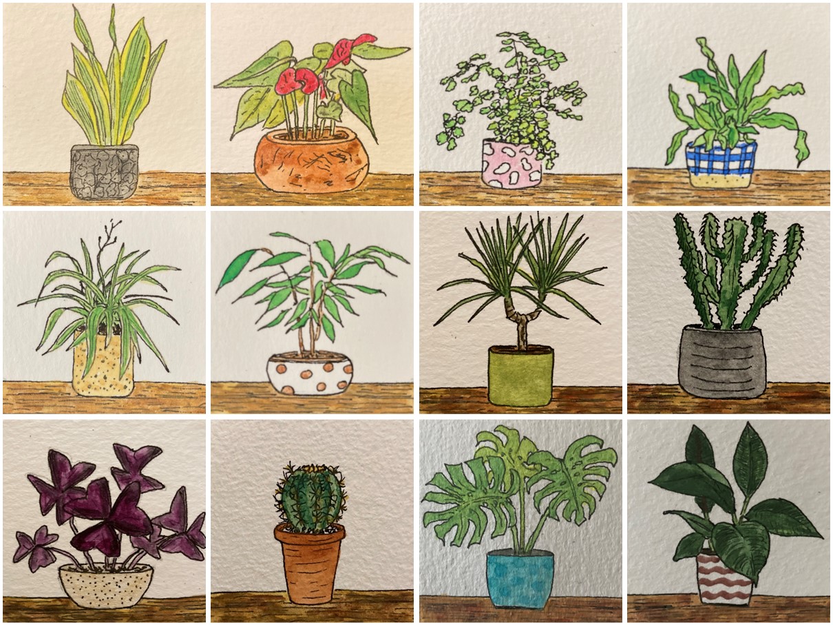
While we were away we enjoyed completing a couple of lengthy walks direct from our accommodation (I particular enjoy a stay away that doesn’t involve having to get in the car), and I was able to spend quite a bit of time painting. In this post I’ll feature four of the pictures that I produced during the break, and I’ll pick up the thread with another post soon that will feature a further group of five pictures.

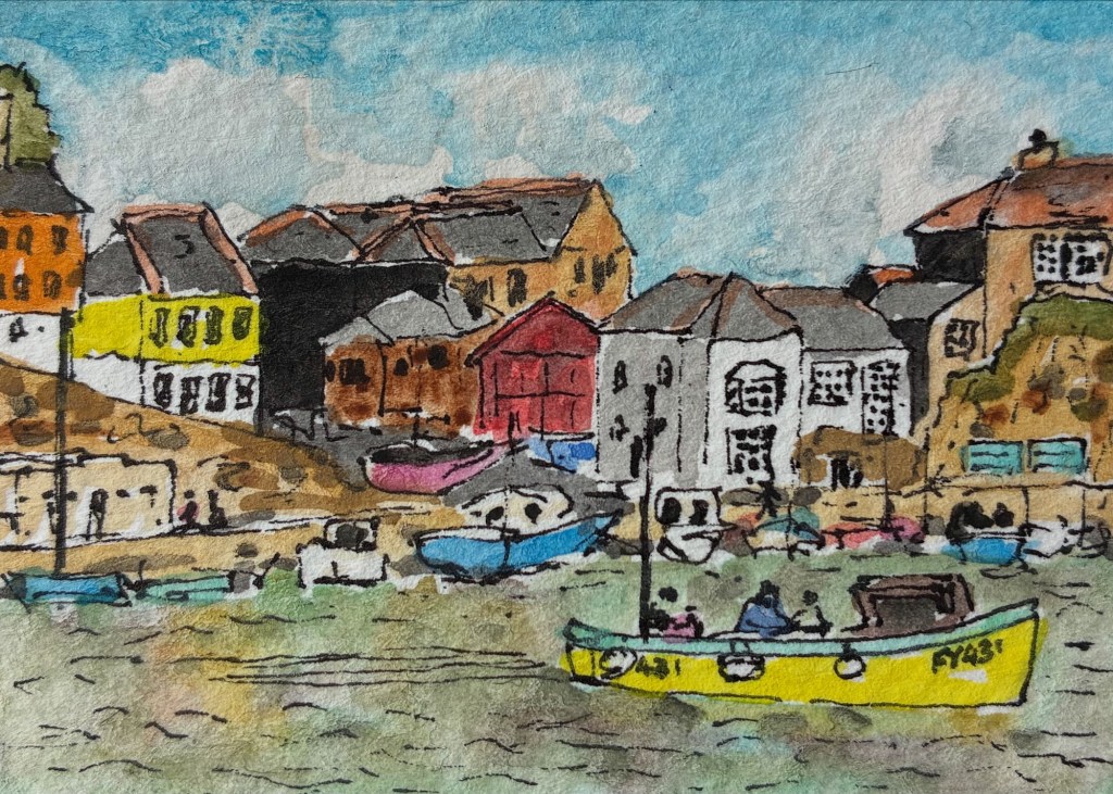
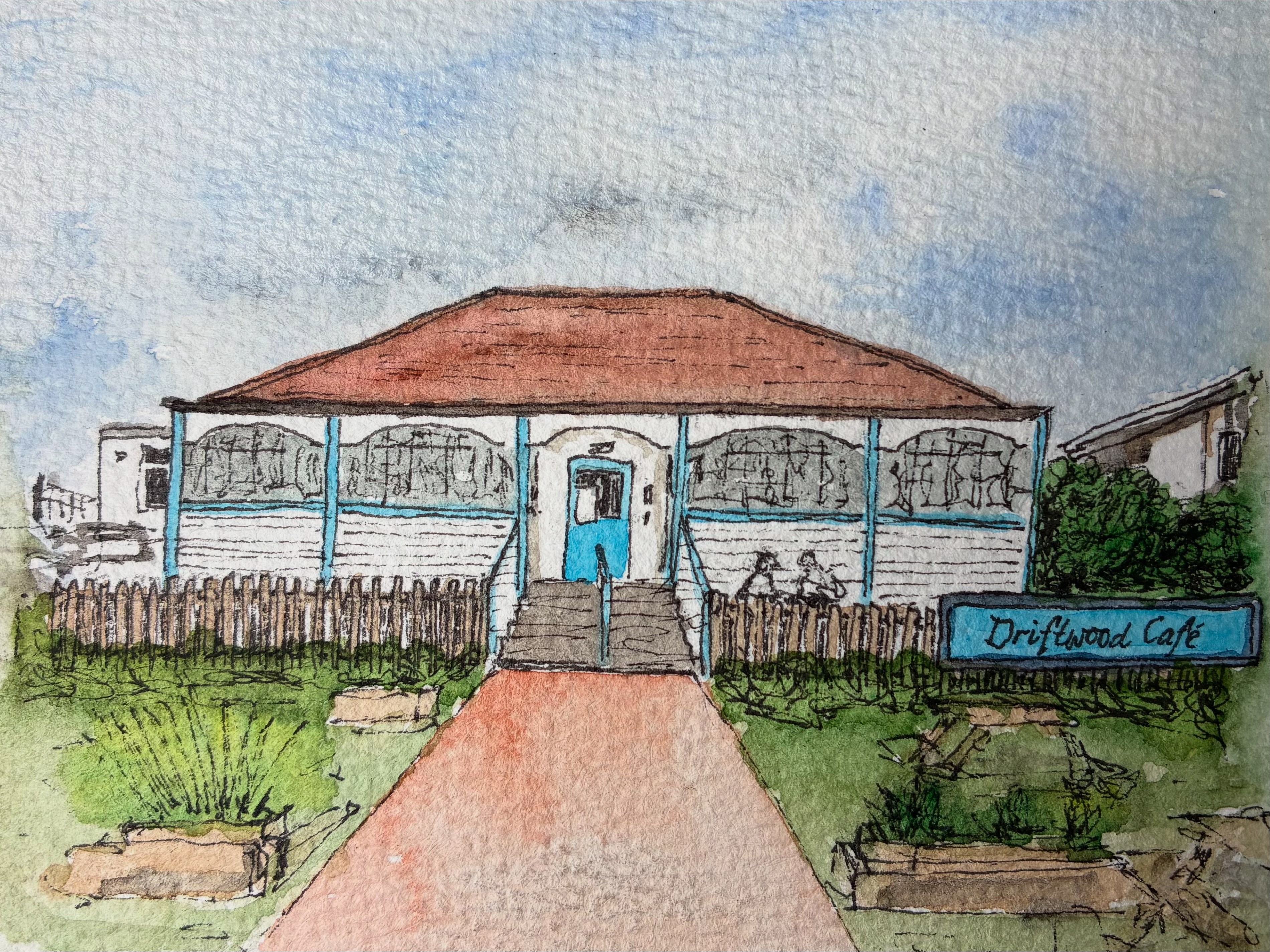
We started our holiday with lunch at a favourite cafe, the Driftwood Cafe at Blue Anchor – the subject of my first picture (shown at the top of this post). It’s not a fancy cafe at all – I’d describe it as a ham, egg and chips or baked potato cafe – it’s just a nice, simple, easy-going place for a quick bite to eat.

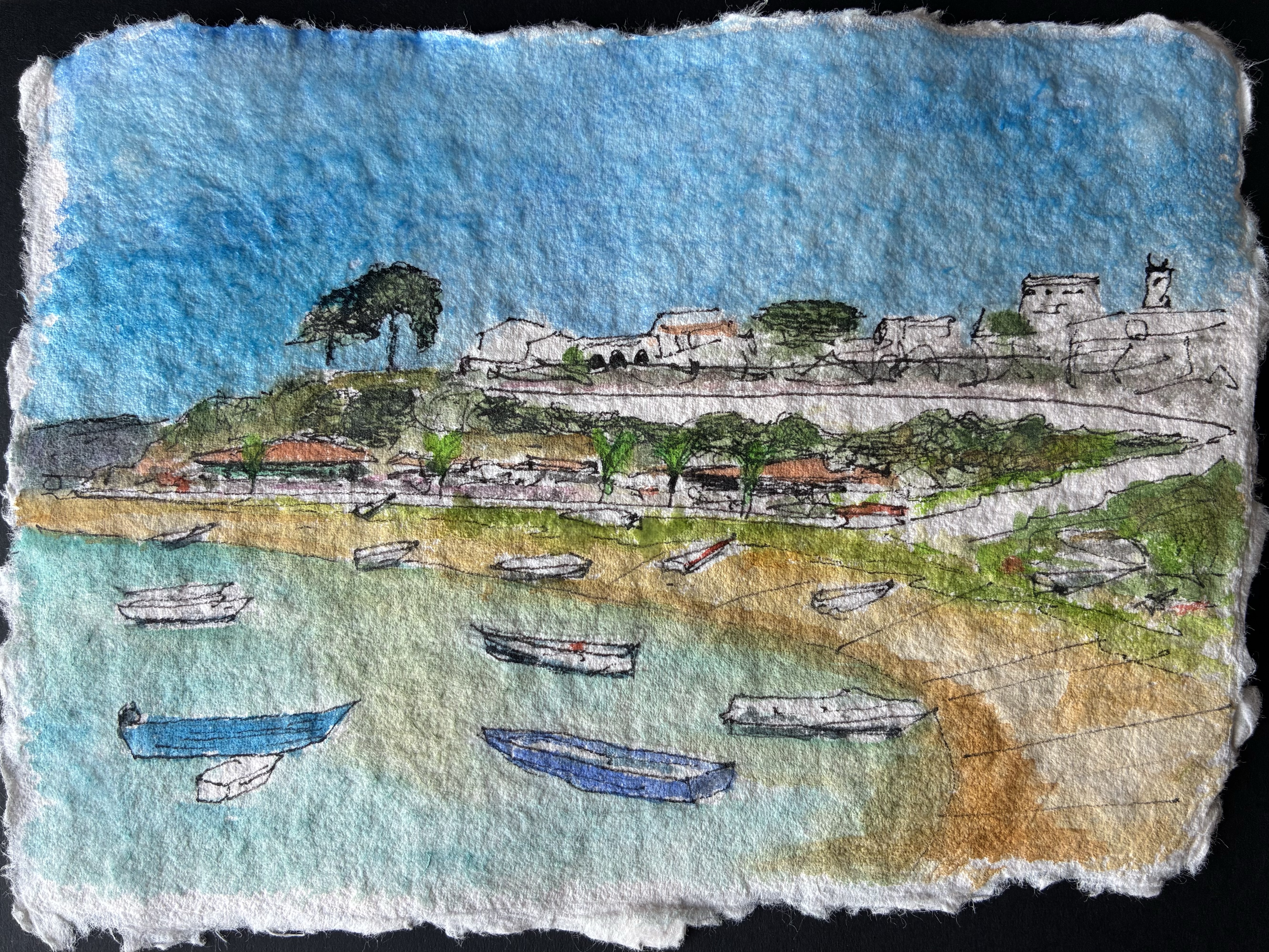
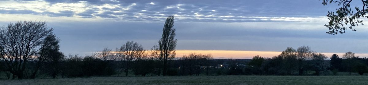
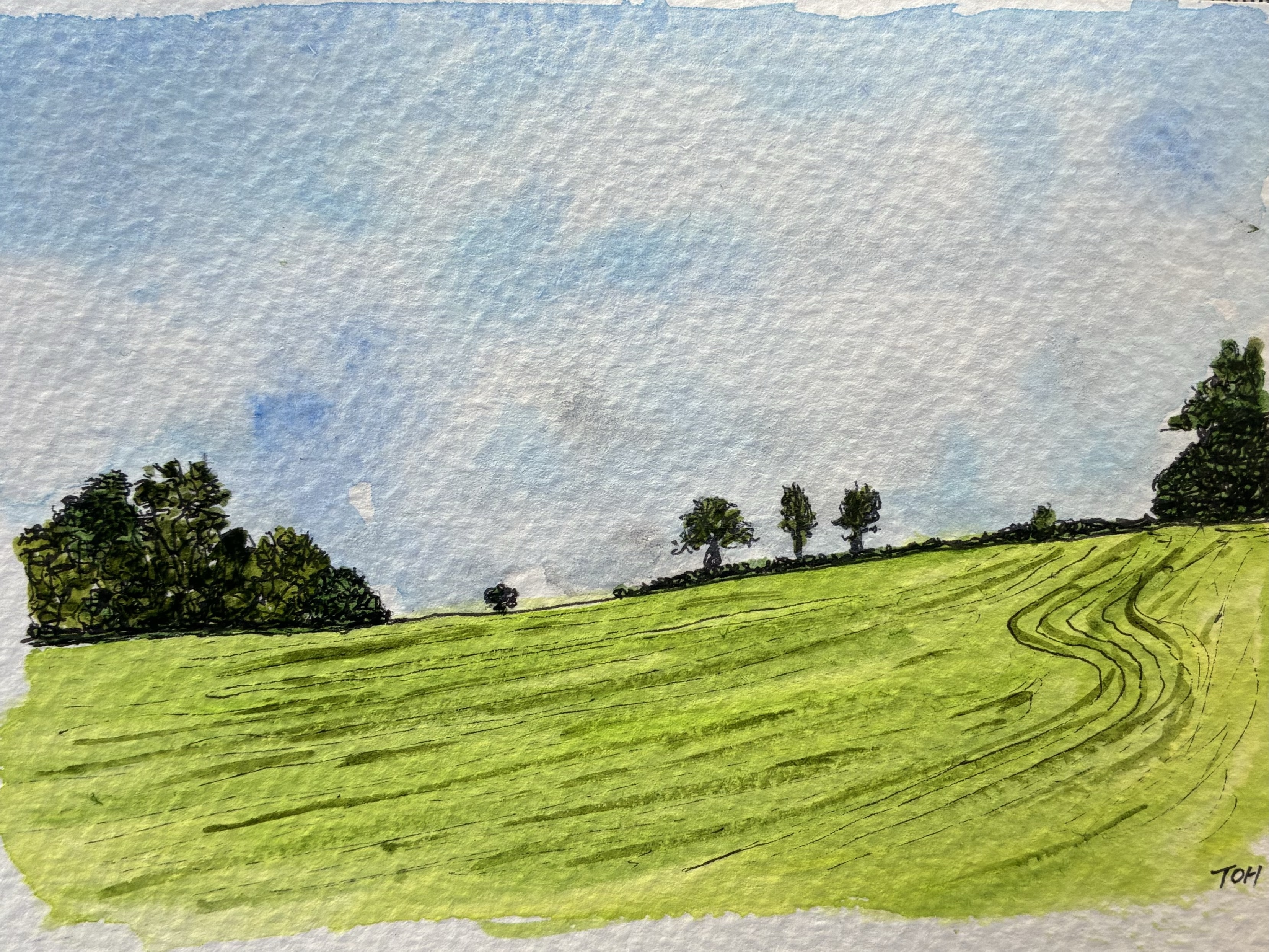
Suitably refueled we then drove the short distance to Kilve and did a short walk (~3 miles) along the coast to East Quantoxhead, before turning inland and returning to the car, with a stop at the Chantry Tea Garden at Kilve where we were the only customers and had an interesting conversation with the owner, who used to be a frequent visitor to Plymouth. The two pictures below show a view of a field that we passed on the return leg (I’ve got a thing for trees silhouetted on the horizon) and the view that we had from our table in the cafe garden of The Chantry itself and the white cottage from which the cafe was run.

Grass Cut Field Near Kilve, Somerset
The Chantry Tea Garden, Kilve, Somerset

Finally, for now, here’s a scene I painted of the view looking west in the direction of Exmoor from the base of the Quantock Hills. I’ve tried to capture the way that there are successive ‘layers’ of rolling hills as the eye moves towards the horizon, each becoming progressively just a little higher than the previous one. Although wild landscapes can be exhilarating, I do like a farmed landscape – a patchwork of fields, hedges, copses and the odd farm building.

Somerset Fields Looking West From Near Crowcombe

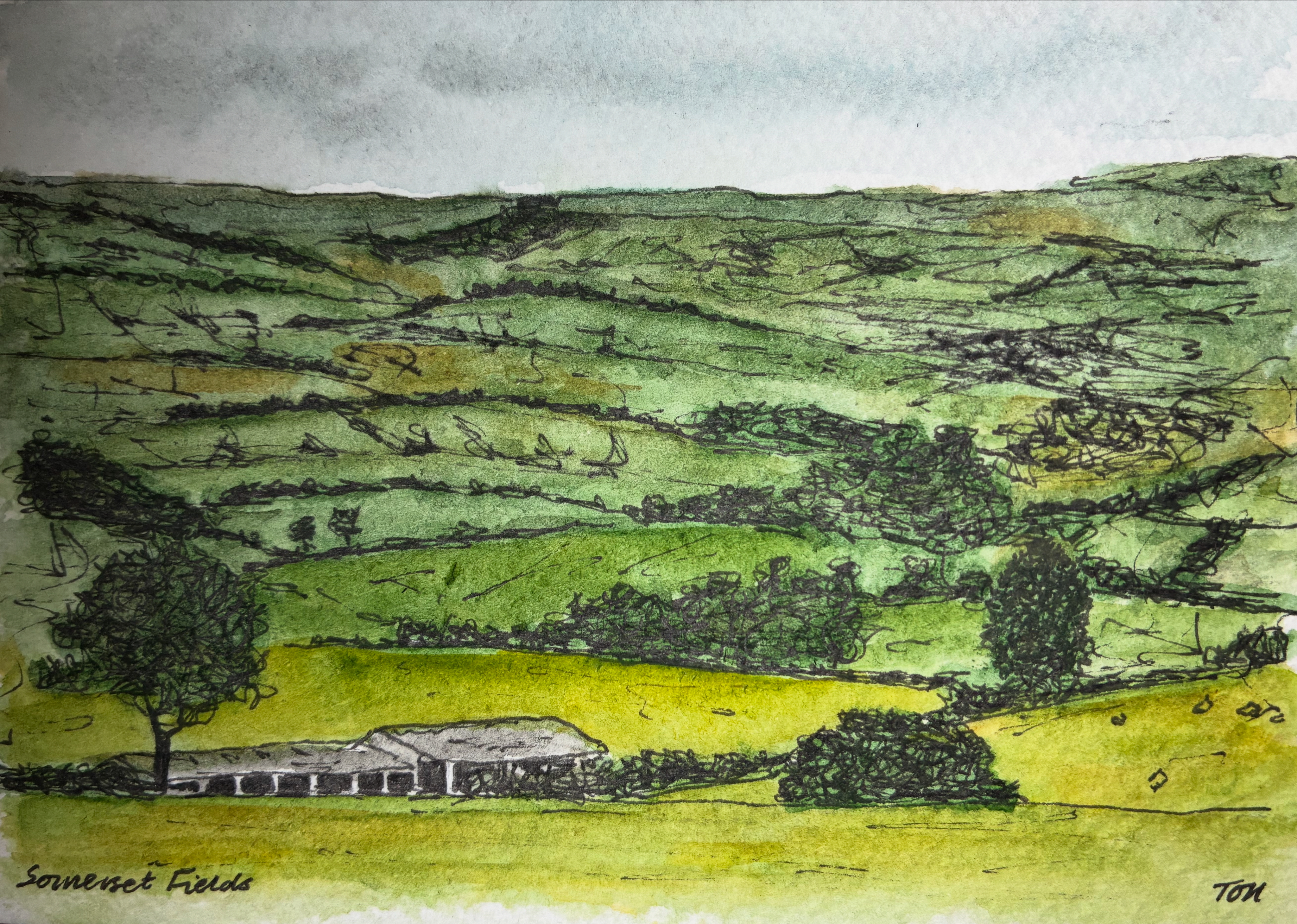
All of these pictures were really just quick ‘practice’ pieces, but I like them all in different ways – Driftwood Cafe for its small details, the grass-cut field for its slightly abstract form, Chantry Tea Garden for its looseness, and Somerset Fields for the way it captures something of the wide expansiveness of the view.

If you have a favourite of these four pictures write a quick comment to let me know!

Mevagissey #art

I painted this little watercolour picture of Mevagissey harbour back in June. I was looking to paint a picture to use for a birthday card for the son of one of my wife’s best friends, and brother to one of my elder daughter’s closest friends (by which I mean that the son was also the brother!). As it happened, a couple of months previously, his mum had seen some of my pictures when visiting our home, we got talking about art, and along the way she told us how he had surprised her by saying that when he finally got his own place to live (he’s in his mid/late 20s) he wanted to have pictures of two places that were special to him – Pew Tor on Dartmoor, close to their home in Tavistock, and Mevagissey in Cornwall.

As the date of the birthday approached I started to think of painting one of my ‘special place’ pictures for his card. The trouble was, I was faced with a choice, and anyone who knows me well will know that one thing I am not good at dealing with is choice. It’s tempting to think that choice is a good thing, and I am sure that I would say that I’d prefer to always have a choice than not, but in many ways I’d find life a lot easier if there was a little creature sitting on my shoulder, or tucked into my sleeve, whispering to tell me what to do all of the time.

Should I paint Pew Tor or should I paint Mevagissey?

I’d painted a larger picture of Pew Tor back in early March and knew that I could produce something smaller but similar that would work as a birthday card. I’d also painted various places in Cornwall as part of my Cornwall Landmarks Miniature Watercolours Series. But I’d never tackled Mevagissey… So, one morning I took a small piece of watercolour paper, performed a quick Google search for a suitable photograph, and set to work.

I like the results of my effort – the painting that introduces this post. The picture I chose was a fairly busy scene, with the quayside at Mevagissey backed by all kinds of interestingly shaped and coloured buildings, a host of colourful boats moored at the water’s edge, a pair of rather striking light-blue benches towards the right of the scene, and the bright yellow fishing boat pulling out confidently towards open waters. It was a picture that provided lots of splashes of colour that give the painting a nice sense of aliveness I think.

But, in the end, it was Pew Tor that won the mental tug-of-war that was taking place inside my head. I put my little Mevagissey picture, really just a test piece, to one side, and opted instead for the Dartmoor ‘special place’ rather than the Cornish one. If you are reading this soon after it was originally posted (on 9th September 2025) and want to see the Pew Tor picture that I ended up using, then you’ll just have to visit this site again in a few days time… because if all goes to plan I will post it here soon. For now, you’ll just have to enjoy a quick trip to Mevagissey – a perfect example of the many picturesque little harbour towns that line the southern Cornish coastline.

Cornwall Landmarks #art

I like to try to spend a little time painting on as many days as I can, and for obvious reasons, the key to this is to keep my pictures small. One of my favourite formats seems to be 5cm square pictures painted in a fairly loose style, with not too much detail and a fairly limited colour palette. Each picture starts with a few pencil marks that serve as guide lines for the pen work, mostly outlining key features and providing various forms of shading. Once the ink has dried, which only takes a few seconds, I start to apply the watercolour paint, usually colouring the sky and any large blocks of vegetation first, before moving on to fill in any details. The whole process generally takes less than 30 minutes and my preference is to spend time of this as pretty much the first thing I do in the morning. When I completed my first small picture, I didn’t have any particular plans for further pictures on the same theme, but one picture led to another, and it seems that I end up producing these miniature watercolours as part of a series, first Dartmoor Scenes and then House Plants, Capital City Landmarks, and a series of slightly larger Mysterious Britain pictures. Most recently, returning closer to home, I completed this set of pictures showing various landmarks in our neighbouring county, Cornwall.

The pictures weren’t painted in this order, but the subjects of my Cornwall Landmarks series are (from top-left working across the rows and down the columns in the composite picture above) The Roundhouse Gallery, Sennen Cove, The Eden Project near St Austell, Bedruthan Steps, Men-An-Tol stone ring, St Michael’s Mount near Penzance, a classic coastal tin mine pumping station, the Minac Theatre, Tintagel Castle and Restormel Castle near Lostwithiel. If I had to choose favourites then I think I would go for the pictures of The Roundhouse Gallery, Bedruthan Steps and Restormel Castle, although I might well make different selections the next time I look at them!

As with each of my other miniature watercolour series, I plan to get some copies of the 3 x 3 composite picture printed as greetings cards to sell at some point, and I will probably try out some of them as individual framed versions too.

I guess the obvious question for me now is where I will go next with this kind of miniature watercolour picture. This morning I painted a view from a photograph I took last week while staying in Exmoor, and so I guess that it is likely that I will end up doing some more from that beautiful part of the world. But whether I will end up with enough for a full series, so that I can make another 3 x 3 composite, only time will tell!

Plymouth Postcards #art

Smeaton’s Tower Lighthouse, Plymouth Hoe

Back in April, after completing four series on miniature watercolour pictures (Dartmoor Scenes, House Plants, Capital City Landmarks and Mysterious Britain), I decided that I would give myself a new challenge by scaling up my paintings a bit and keep my subject matter close to home with a set of pictures that I described with the working title ‘Plymouth Postcards’. I wanted to try to keep the same kind of fairly loose style but I thought it would be good to be able to capture a bit more detail of each scene. My miniature watercolours had been just 5cm square (or 5cm x 7cm in the case of the Mysterious Britain series) but this new series was, naturally, postcard sized (roughly 10cm x 15cm). That’s an increase in area of up to six times, and so it gave me quite lot more sketching, drawing and painting to complete!

My first picture (above) focused on what is probably the most iconic view associated with Plymouth, the red-and-white striped form of Smeaton’s Tower – one-time lighthouse on the Eddystone Rock which was moved to Plymouth Hoe when it was replaced in the 1880s.

Next up, I remained close to the waterfront with a view across the inner basin of Sutton Harbour towards the old customs house and the Three Crowns pub. I am not sure that the colour of the water there is ever quite as blue as my picture suggests, but I like the bright and cheery feel of this painting…

Sutton Harbour, Plymouth

Third came a view of one of Plymouth’s most distinctive new buildings, the Roland Levinsky Building, home of the Arts Faculty at my workplace, the University of Plymouth. Again, the sky is perhaps a little too bright, but I like the three-way competition between the blue sky, the green of the grassy area in the foreground, and the coppery-orange cladding of the building itself…

The Roland Levinsky Building, University of Plymouth

After painting a fairly new building, it was time to visit a much older one with a ffront-on view of one of the main buildings at the Royal William Yard, formerly the victualling yard for the Royal Navy but now a home for swanky apartments, restaurants, various studios and art spaces, and a cinema. I think this is one of my favourites from the series…

Royal William Yard, Plymouth

Then, it was back to the city centre for a picture showing the Charles Church, bombed in the Second World War and left in its broken state as a memorial to lives lost. Behind it, the angular exterior of the eastern end of the Drake Circus Shopping Centre forms an interesting backdrop which was surprisingly challenging to paint…

Charles Church and Drake Circus Shopping Centre, Plymouth

For my sixth Plymouth Postcard, I took a trip down to the Barbican area of the city for a view of the Plymouth Gin Distillery on Southside Street. It was difficult to get the perspective of the curved road right but I think I have just about managed it…

Plymouth Gin Distillery, Southside Street

It was time to get a bit ‘arty’, so my next picture was of the interestingly illuminated Theatre Royal, with the imposing form of the statue ‘Messenger’ in front of it. I think that I did pretty well with the theatre itself, and the shape of the statue isn’t too bad, but my initial attempts to shade its dark form resulted in it looking like a hairy gorilla, and so I coloured it black with a permanent marker to try to salvage the picture. Unfortunately, this was only partially successful and I think I would have to describe this one as something of a ‘fail’…

Theatre Royal and ‘Messenger’, Plymouth

Painting number eight took me back to Sutton Harbour, this time looking across the swing bridge towards the Fish Market on the far left and the National Marine Aquarium, with its wavy roof in the centre. I’m please with the way I captured the blue colour of the windows and the advertising poster on the left of the building, and I like the foreground detail of the boat and bridge. Sadly, my attempt at a Union Jack flag was not quite so successful and the flag of the USA seems to have lost its stars…

The National Marine Aquarium, Plymouth

My ninth picture took me to very familiar territory, with a view of the old turnstiles at Home Park, home of Plymouth Argyle Football Club…

Home Park, Plymouth Argyle Football Club

… and then it was back to the waterfront with a view of the art deco Tinside Lido with part of Plymouth Hoe, Smeaton’s Tower and the war memorial in the background…

Tinside Lido and Plymouth Hoe

I finished my series with two pictures of contrasting buildings. First up was the Devonport Town Hall and Column, with the oddly coloured and spectacularly fronted (and named) Odd Fellows Hall on the right. Finally, my subject was the sharply-topped, and so highly appropriately named, Beckley Point (a Hall of Residence for students in the city). This is, apparently, the tallest building in the southwest of England (although I don’t know what is being counted as the southwest in this case)…

Devonport Town Hall and Column and the Odd Fellows Hall
Beckley Point Hall of Residence, Plymouth

This was a fun series to do, taking 17 days to complete, and overall I was pleased with the results of my efforts. It was interesting to try to capture some of the more striking buildings and views that Plymouth has to offer, particularly as it is generally regarded as an architecturally bland and unexciting place (largely as a result of the fact that much of the city centre was flattened by bombing raids in the Second World War).

I am sure that I will do plenty more paintings of Plymouth views in the future, but I think this set forms a good initial collection, showcasing some of the different areas and places of interest in the city nicely.

Alvor – oh no it’s not – oh yes it is #art

I have probably mentioned in a previous post that over the last year it has become fairly standard practice that each time we are approaching the birthday of a friend or family member I rustle up a painting showing a scene or location that has a special association for the recipient. I paint these pictures on a piece of very rough-edged, handmade paper that I have a stack of, and then fix the painting onto a 5 x 7 inch recycled card blank. The result is a specially created, uniquely-designed, hand-made card*. These are always well received, and it is funny how often the recipient doesn’t twig that I did the painting, despite me usually putting my initials in the bottom-right corner. I guess I have only been painting for 14 months and so a lot of people aren’t even aware that the picture on their card is a piece of my handiwork.

Back in April, I set out to create one such card, this time for Ann, the wife of my wife’s father. For some years, Ann and Keith greatly enjoyed holidays at the resort of Alvor on the Algarve coast of Portugal, but health issues and reduced mobility have meant that these trips have not been possible for quite a while now. Consequently, we decided that it would be fitting for me to paint a scene of Alvor to use for Ann’s card. I took a look online, googling images of Alvor, but couldn’t find anything that grabbed me until I came across what I thought was a suitable picture on a tourist site that was promoting the merits of Alvor. It showed an attractive open square, with people going about their business, a few trees and plants, and some interesting patterns in the paving, surrounded by some fairly grand, old buildings, including one that was a striking bright green – perfect to add an interesting splash of colour to the scene. I duly set to work and perhaps 45-60 minutes later, and as I usually do, I posted the finished picture to my social media accounts on Bluesky and Instagram.

After I had finished making the card itself, and it was safely on its way in the post, a work colleague commented on my instagram post along the lines that ‘there is a green-painted building exactly like the one in my picture just a little way along the coast from Alvor in Lagos‘. The first time I read the comment I simply thought ‘well that’s a coincidence‘… but then it dawned on me that they were perhaps just being polite, or maybe subtle, with their wording. Some more image searching soon revealed that no, the square I had painted was not actually in Alvor, and yes, the square I had painted was actually in Lagos… In fact, as I searched further I found that practically every picture I found online of Lagos seemed to feature that same square with its beautiful, old, bright green building. Doh… I had been duped – the website I had originally found the picture on had obviously (how shall I put this?) been developed by a ‘Creative Geographer’.

Ann’s birthday came and went. I had already confessed to my error, and the card was much appreciated nevertheless, but, quite obviously, I was left feeling that I had not quite struck the target. So, a few weeks later, when some spare minutes arrived, I did a new, and more careful, search for pictures of Alvor, plumped for a nice beach/waterfront scene, and set to work again. The result of my efforts is shown below.

I learned (or was reminded of) a good lesson here, namely that you cannot believe everything (much?) that you read on the internet, and Ann was thrilled to receive two birthday cards including the second bonus birthday card with a picture that really did bring back happy memories. So, in the end, we both came out as winners!

* If there is a special place that you would like me to paint, for a birthday card or otherwise, feel free to get in touch. I’m on the point of opening my art activity for business and would be happy to take commissions. I think it would be fun, and interesting, to paint some new and different special places.

Plymouth Waterfront from Plymouth Sound #art

I painted this small panoramic picture of Plymouth Waterfront as viewed from Plymouth Sound as a bookmark to accompany the birthday present (books!) that my wife gave to one or her friends back in March. They enjoy a weekly walk down to the Plymouth Waterfront on most Friday mornings and so this scene was the obvious subject matter to choose.

It was interesting to paint in this wide format, and it’s an approach that I have been using more recently for some Dartmoor pictures. I think that when we view a landscape in real life our brain naturally provides a somewhat wide-screen view, and that this might be why, at least to some extent, it is often somewhat disappointing when you take a photograph of a view and much of what you see in real life seems to be condensed into a very small part of the picture.

One advantage of adopting this kind of panoramic composition, at least for a novice and completely untrained painter like me, is that it reduces the amount of sky, as this is often tricky to paint. And in this particular picture it also reduced the amount of water that I had to paint, something else that I’m not especially confident with.

All in all, I really liked this picture with its pops of colour [did I really just write ‘pops of colour’ – this seems to be such a trendy turn of words these days on TV programmes relating to art, interior design, home improvement etc. I must have caught it from there…]. I am sure that this is a format and also, with its obvious local interest, a view that I will return to in the future.

House Plants #art

I thoroughly enjoyed completing my recent series of mini-watercolour landscapes of Dartmoor Scenes, and in the process I found that I had managed to insert a short burst of art practice into my daily(ish) routine. Consequently, it wasn’t a surprise that I found myself wanting to continue painting mini-pictures each morning. The only question was: What should I paint next?

The answer – well the first answer at least – turned out to be house plants. This might seem like a somewhat strange choice, especially as the vast majority of the pictures I have painted in the last year have been location-based: buildings or landscapes of one sort or another. But in fact, house plants are a subject that I have painted before.

My initial foray into painting house plants stemmed from a ‘location’ painting that I did back in November as a birthday present for a family friend who just happens to run a wonderful plant shop in Plymouth. The picture I produced was much appreciated and has subsequently been professionally framed and put on display…

When I was painting this picture I really enjoyed painting the various plants with their different forms and pots, and so a few weeks afterwards I did a quick painting showing an assortment of plants in a suitably varied set of pots on a couple of wooden shelves (based on some nice chunky wooden ones that we had just put up in our kitchen!).

The next time we paid a visit to the shop it was suggested that I might produce some house plant greetings cards and have them for sale alongside some others (quite different) produced by a couple of local artists that were already on sale in the shop. Unfortunately, when painting my original picture I had not thought about placement of the design, and with some of the painted areas reaching almost to the edge of the paper it was not easy to use it for a printed card without risking some fairly crude surgery to some of the plants on the top shelf! However, that conversation sowed the seed of the idea in my mind, and so when I was considering where to go next with my mini-paintings, house plants were an obvious choice.

The result was the set of 12 mini-pictures of individual house plants which I have put together into the composite picture at the top of this post. Like my Dartmoor Scenes pictures, these are 5 cm squares, and I have also had a sample greetings card printed from each individual picture and a 3 x 3 composite of a selection of the pictures. These printed version all worked nicely despite being enlarged to almost double their original size, and I will probably pursue trying to sell these in some format in the future. But whilst I loved painting the mini-pictures of individual plants, and really liked the composite pictures too, I did feel that the original picture, with an assortment of plants on shelves was the best of all. The plants are obviously the star players, but those chunky wooden shelves play an important supporting role.

To bring things right up to date, a couple of days ago I sat down and painted a second version of my ‘house plants on shelves’ picture, and this time I made sure that I positioned the painting in the middle of a larger piece of watercolour paper so that I could subsequently crop the picture without fear of pruning the plants! I’m pleased with the result (see below), and I can now go ahead and get some copies printed ready for sale.

Obviously, I’m not expecting to make a fortune from this activity, but I do think it will be fascinating to see whether my picture is able to catch the eyes of any customers enough to persuade them to part with a few pounds of their hard-earned cash…

Dartmoor Scenes #art

At the beginning of last month (March 2025) I decided that I wanted to try to embed a more regular art practice into my life. So, one evening, I sliced a piece of watercolour paper into a series of 5 cm squares with the intention of painting some kind of miniature picture each morning. I didn’t know what I would paint, just that I would try to paint something, as often as I could.

It was interesting, then, to wake up the next day and find myself sitting down at my painting table at 7:30 am, before I had even eaten breakfast, painting a little scene of a tor and some scattered rocks, a scene that is typical of Dartmoor, the National Park just north of Plymouth where I live. Because I was working on such a small piece of paper, and because I was trying to work quickly, before I got fully enmeshed in the day’s activities, I found myself adopting a simpler style than usual, with fewer, and bolder, colours and some use of cross-hatching to show shadows and darker areas. I liked what emerged.

After that first painting (the one at the top-left of the composite picture at the top of this post) I still didn’t know what would happen next, but at some point, perhaps after two or three days, I came to realise that I was creating a series of miniature pictures that I labelled Dartmoor Scenes. Initially, it was my intention to paint five pictures, one on each weekday, but having successfully reached that number I decided to push on to nine. This seemed to me to be a good number for a series of little square pictures, neatly forming a 3 x 3 grid.

As I approached what I thought would be the final picture, I received a comment on my Bluesky (social media) account on which where I was posting my new picture each day, suggesting that the pictures would make a nice calendar. It was an idea that I liked, a lot, but of course a calendar needs 12 pictures, one for each month… and so my miniature watercolour Dartmoor Scenes series had to become a collection of 12 pictures in total.

I really enjoyed producing these little pictures (and have since gone on to produce two more sets of 12 similarly-sized pictures on different themes – watch this space for details!). I enjoyed being forced to keep things simple and was really happy with the results (more in some cases than in others). I particularly like the stone row and stone circle pictures on the top row (second-left and top-right), and the tree and wall scene (third-left, bottom row). I also really like the way that they look when placed together.

Although it was already almost the end of March by the time I received it, I got a desk calendar printed up as a kind of test run to see how well it worked… and it worked very well indeed, the pictures coping with being expanded to almost double their original size. Subsequently, I have also had each picture printed as a 10 cm square card and had some copies of a larger card printed with a 3 x 3 composite of the nine pictures that I think are the best of the selection. At some point I hope to get more of these cards printed so that I can have a go at trying to sell some of my artwork. It will be interesting to see what happens if and when I do!

As an experiment in trying to be more regular with my artistic endeavours, this activity has worked really well, and although I have now moved on from Dartmoor Scenes, I suspect that I will return to this theme again at some point and complete another set (at least another four to get to a 4 x 4 grid, but who knows, maybe I have another 13, 24 or even 37 Dartmoor Scenes still in me!)

If you like these pictures, I’d love it if you added a quick comment to this post. It would be fun to know which one(s) you like best.

Ronda, Spain #art

As I noted in another recent ‘art’ post (Home Park, Plymouth Argyle), it seems to have become a ‘thing’ that I create handmade cards for birthdays and special occasions associated with family and friends. For these cards, I generally paint a small watercolour picture of a scene that has a special connection to the person or event being celebrated or one that just shows a place that they really like. I usually use some small (roughly 10cm x 15cm) rough-edged raggy paper, for the painting and then I tape this to a simple brown card. This gives an interesting and attractive, rather rustic, feel to the cards which I think is appropriate given their handmade nature.

I painted the picture above, of Ronda in southern Spain, at the start of last month to use on a birthday card for my elder daughter’s husband. They travelled to Ronda to attend the wedding of one of my her workmates just a month or two before their own wedding last June and he liked it so much that my daughter was quick to suggest it as the subject for his card. To be completely honest, the other alternative was for me to try to paint a picture of Stamford Bridge, home to Chelsea F.C. (his team sadly) and apart from me not wanting to have to paint a scene that had lots of people in it, it was quite difficult to find a suitable picture to base a painting on. So, Ronda it was…

Funnily enough, despite being an incredibly scenic and much photographed location, with its deep gorge and steep cliff faces, Ronda was also a difficult subject to find a suitable picture to recreate as a painting. Most of the photographs of the town that I could find online were either taken from a distant vantage point designed to show the full majesty of the cliff-top location (which then made all of the interesting details of the buildings etc. shrink to an unworkable size) or were focused on a single ornate building or just the bridge that spans the gorge (and so did not really capture anything about the setting). In the end I opted for this shot of the bridge with a decent chunk of the cliff faces visible and some suitably Spanish-looking buildings. I tried to capture some of the drama in the scene as the setting sun creates its own lightshow between the pillars of the bridge. The picture/card was certainly appreciated, so I can’t have done too bad of job!

Scott Building and Beckley Point, Plymouth #art

I’m a bit of a perfectionist, something which has definitely held me back over the years as I have held off pursuing certain activities ‘in case I couldn’t live up to expectations’ (a trait that I am sure many serial perfectionist procrastinators will be very familiar with). One such activity was always drawing and painting, so it was a bit of a surprise to me when, about a year ago (April 2024), I quite suddenly started painting and following a short video course on what is usually called ‘loose’ watercolour painting, I found that I was (mostly) quite able to side-step my need for ‘perfect’ and simply paint – deliberately being quick was a key element in this. Even better, not only did perfectionism not get in the way of me being able to paint, but I found that painting in a non-perfect way helped my loosen the grip that perfectionism had on me more generally.

This little picture, painted a few agos, is a nice example of imperfectionism at work. It is a view of the Scott Building (University of Plymouth) on the left with the towering mass of Beckley Point accommodation block behind. If you were to stand where the photo that this picture is based on was taken, you would instantly notice all kinds of discrepancies – the colour of the closest building isn’t quite right, the ground appears to rise upwards because of the way I have used horizontal lines for the shadow cast by the building and the small building in the background (the Reynolds Building in which I used to have my office) is far too small. But none of this really matters. For a start, it’s only a little painting that almost no-one will ever see (and those that do probably won’t know what the scene looks like in reality), but more importantly, I have come to learn that it is the quirky little ‘undetails’ in a picture – a wiggly line here, am improbable colour there, the scratchy outline of a person – that add fun into the mix, and that it is far more important to vaguely capture the sense of a place rather than replicate it in every detail (although pictures like that can also be wonderful and interesting of course).

So, here’s to this quick, little, watercolour picture with all its imperfections – nice and bright, rather jolly and, I think, a sense of movement. It’s not supposed to be a masterpiece, it’s just fine as it is!