Tim O’Hare Art is open for business! #art

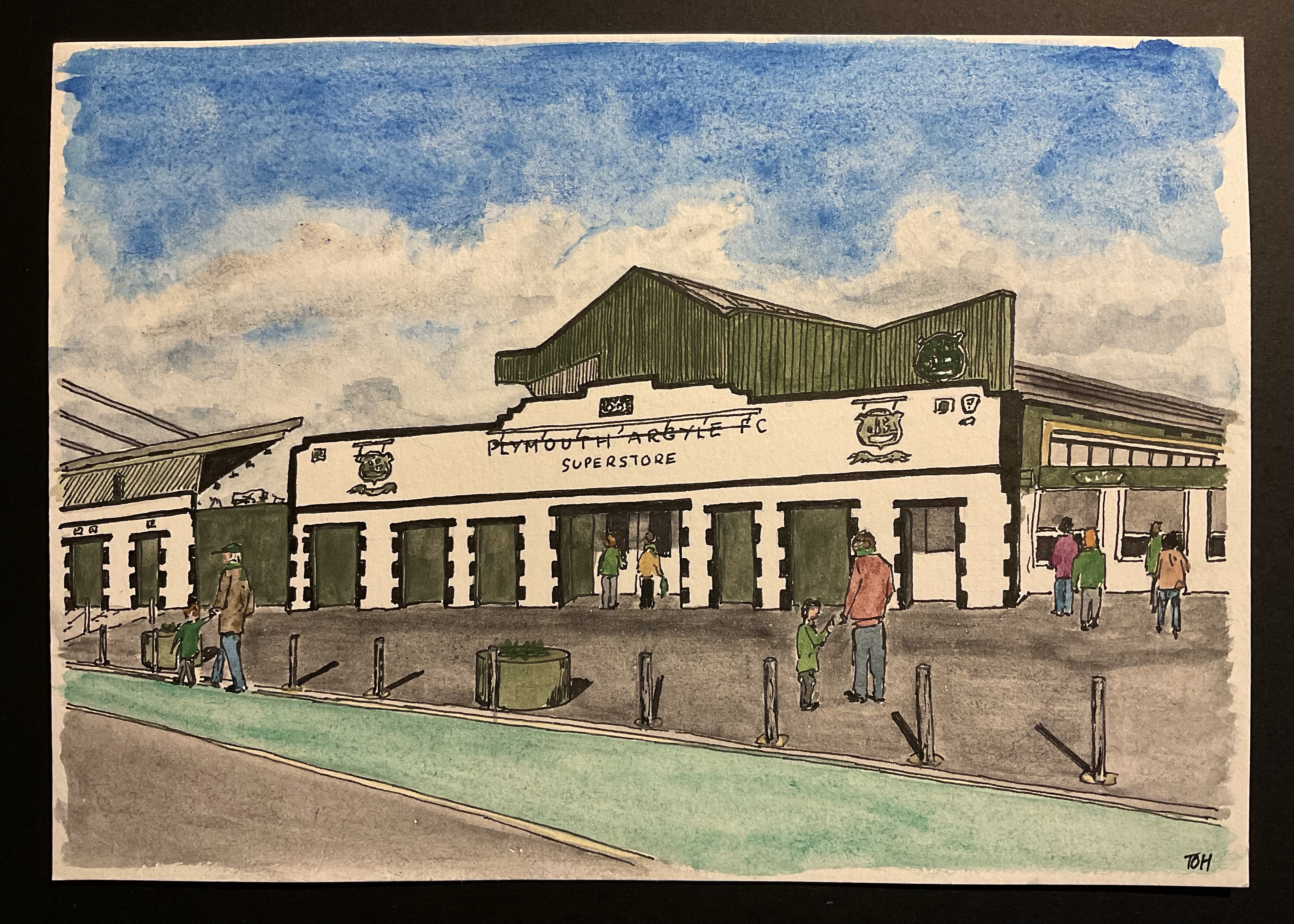
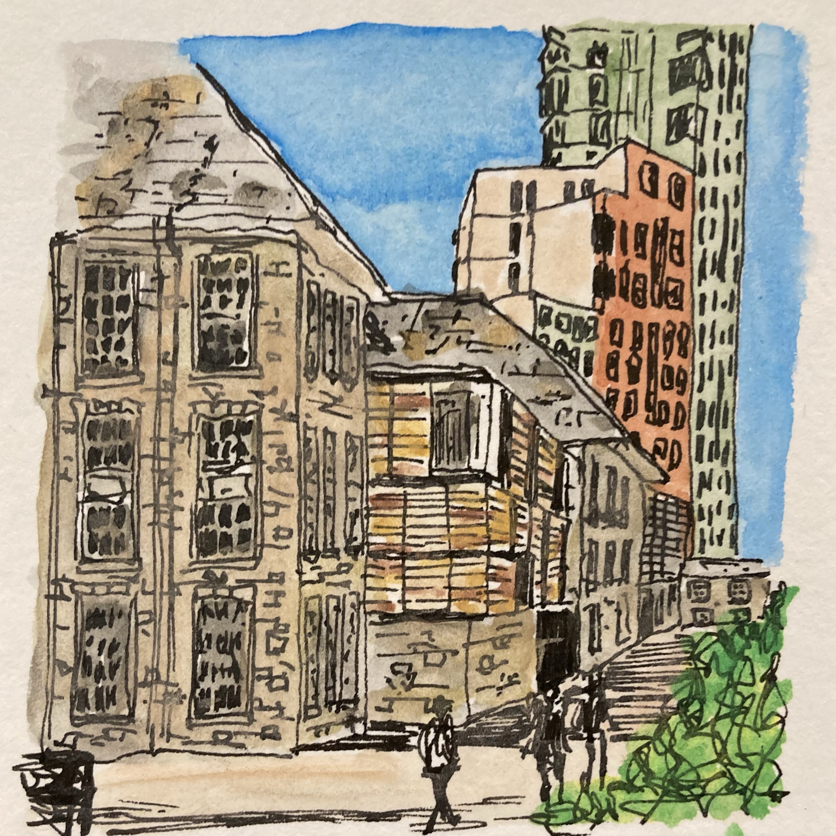
Over the last couple of months I have been gradually gearing up to start trying to sell some of my artwork. Obviously, I am not thinking that there will be crowds flocking to part with their hard-earned money to the extent that I might become rich through my artist endeavours. Rather, people who see my pictures often pass comment that they think I could sell them, and the inquisitive part of me thinks that it will be interesting to find out whether that is true, and if it is, which pieces of my output people like enough to pay for. [Okay, okay – I admit it – I’d also love to have the implicit praise and external validation that would come my way if my artwork attracted interest in this way… but I know that it’s far better for me not to get hung up on this aspect of things and, instead, to focus on simply enjoying the process of creating art and then allowing it to leak out into the world.]

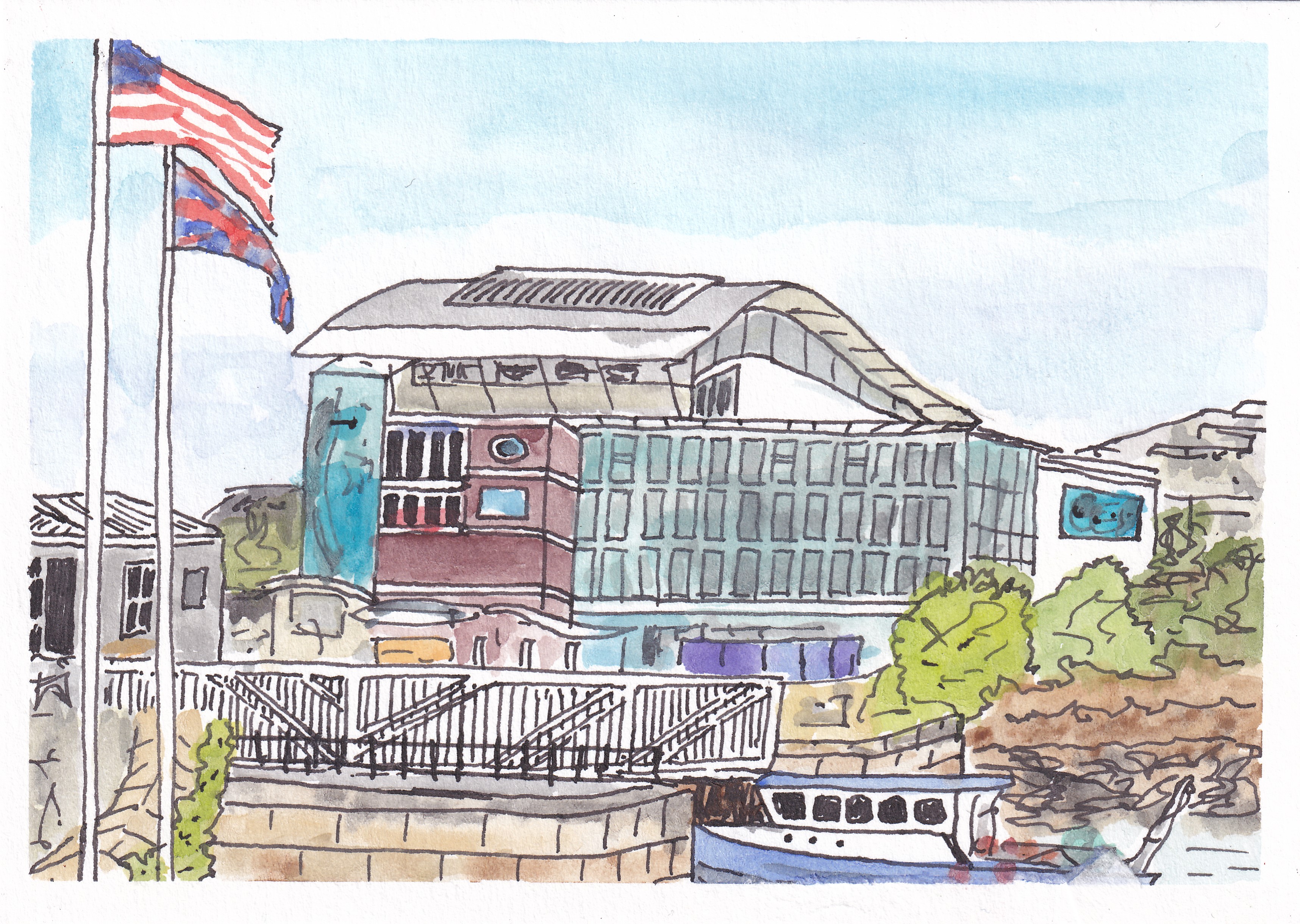
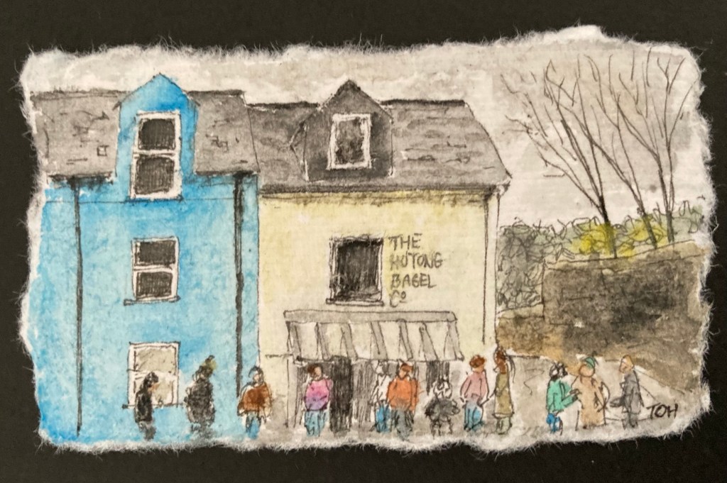
So far, my art selling has only gone as far as listing prints of my Dartmoor Stone Circle painting on eBay (two copies sold, albeit to the same buyer, in almost four months…) and, more recently, to set up an online shop on Etsy. In this shop I have listed my Dartmoor Stone Circle print (one copy sold) and lots of different Greetings Cards based on some of my miniature watercolour series: Dartmoor Scenes, House Plants, Capital City Landmarks, Cornwall Landmarks and Exmoor Views (of which I have sold the grand total of two: one of ‘The Forbidden City, Beijing’ from my Capital City Landmarks series and one of ‘The Roundhouse Gallery, Sennen Cove’ from my Cornwall Landmarks series). Clearly, it is slow going, partly because I need to master the art of marketing and try to drive some traffic to the shop, but also, because I doubt that there are many people shopping online for greetings cards of random places or plants! Nevertheless, it was a bit of a thrill when my phone pinged to tell me that these sales had been made..

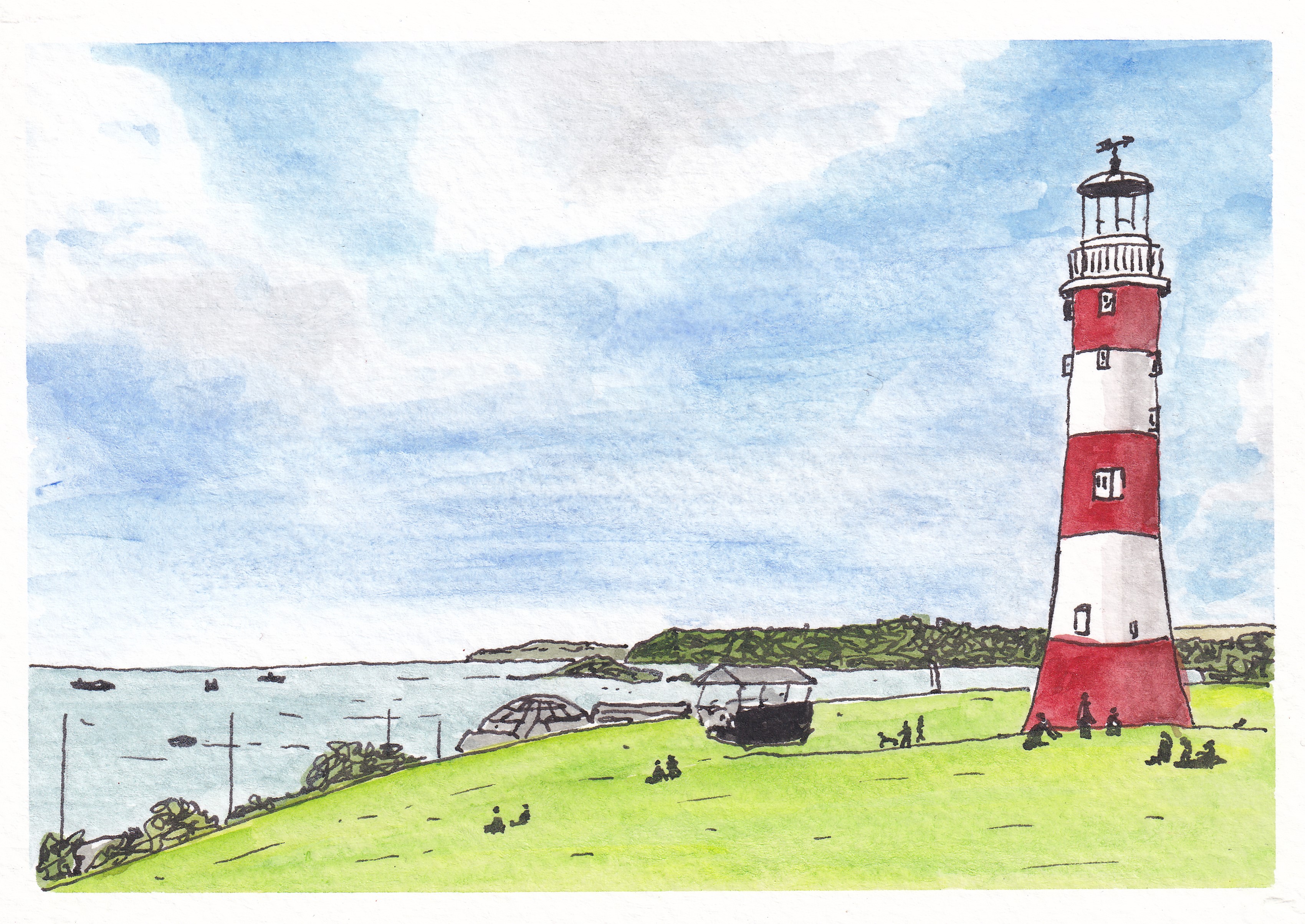
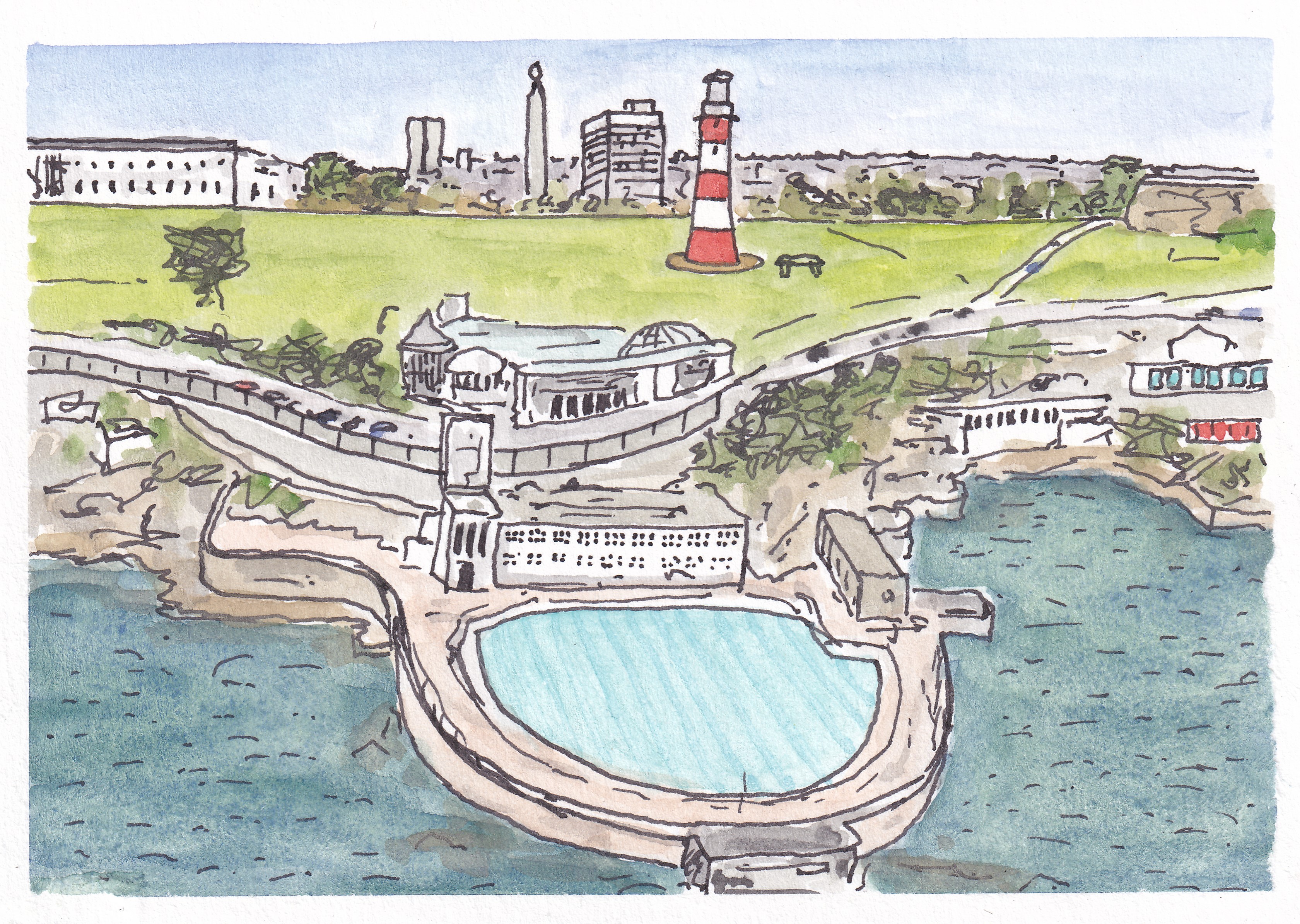
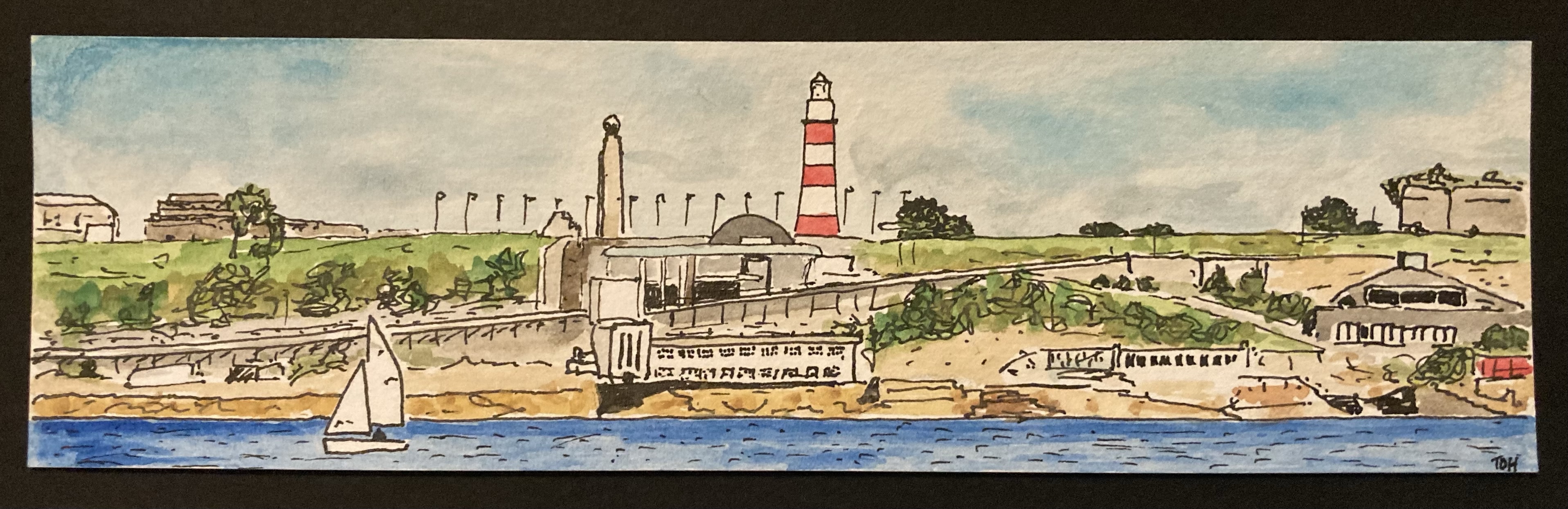
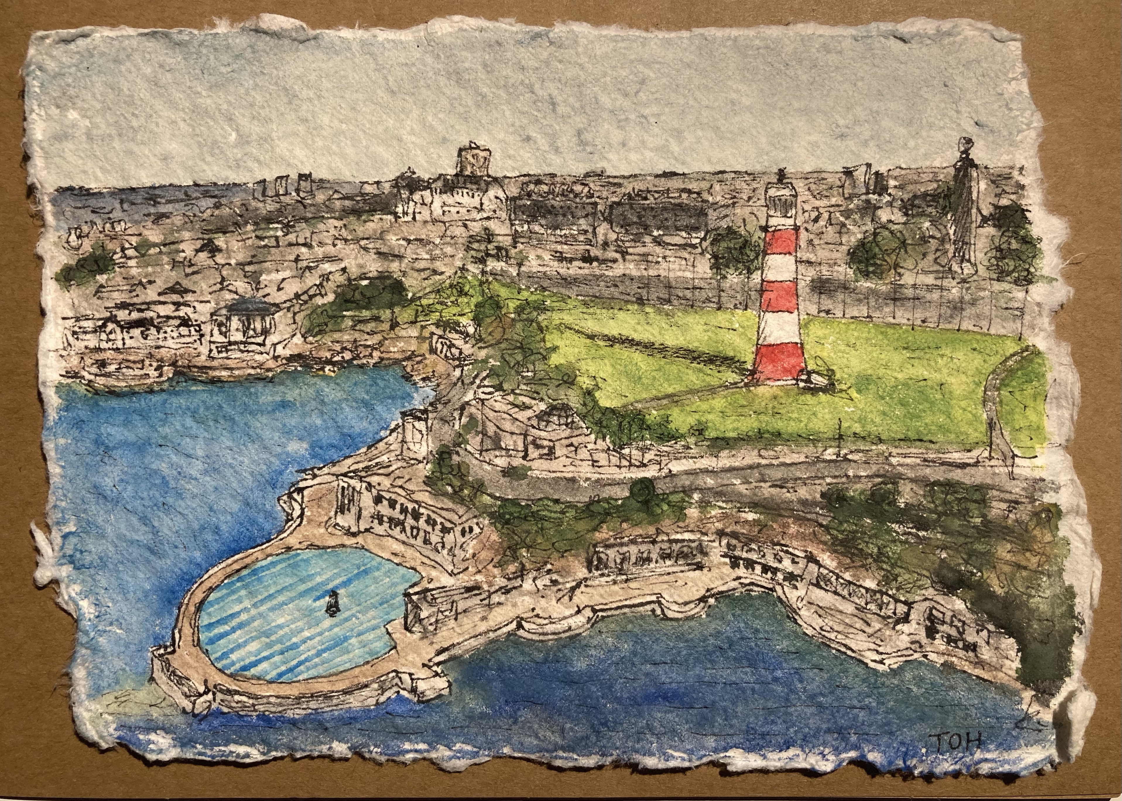
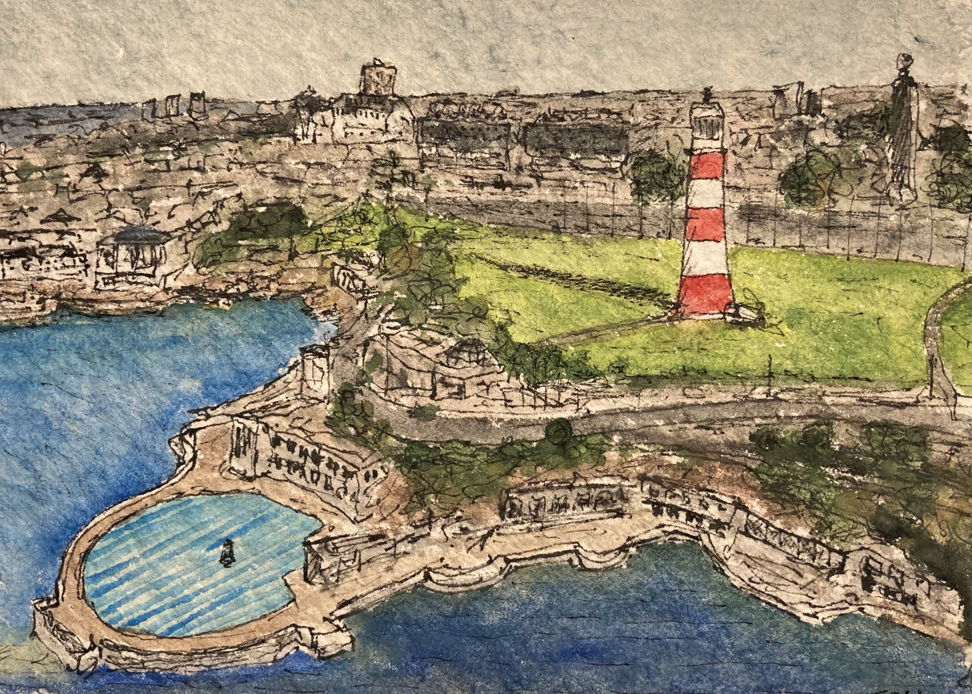
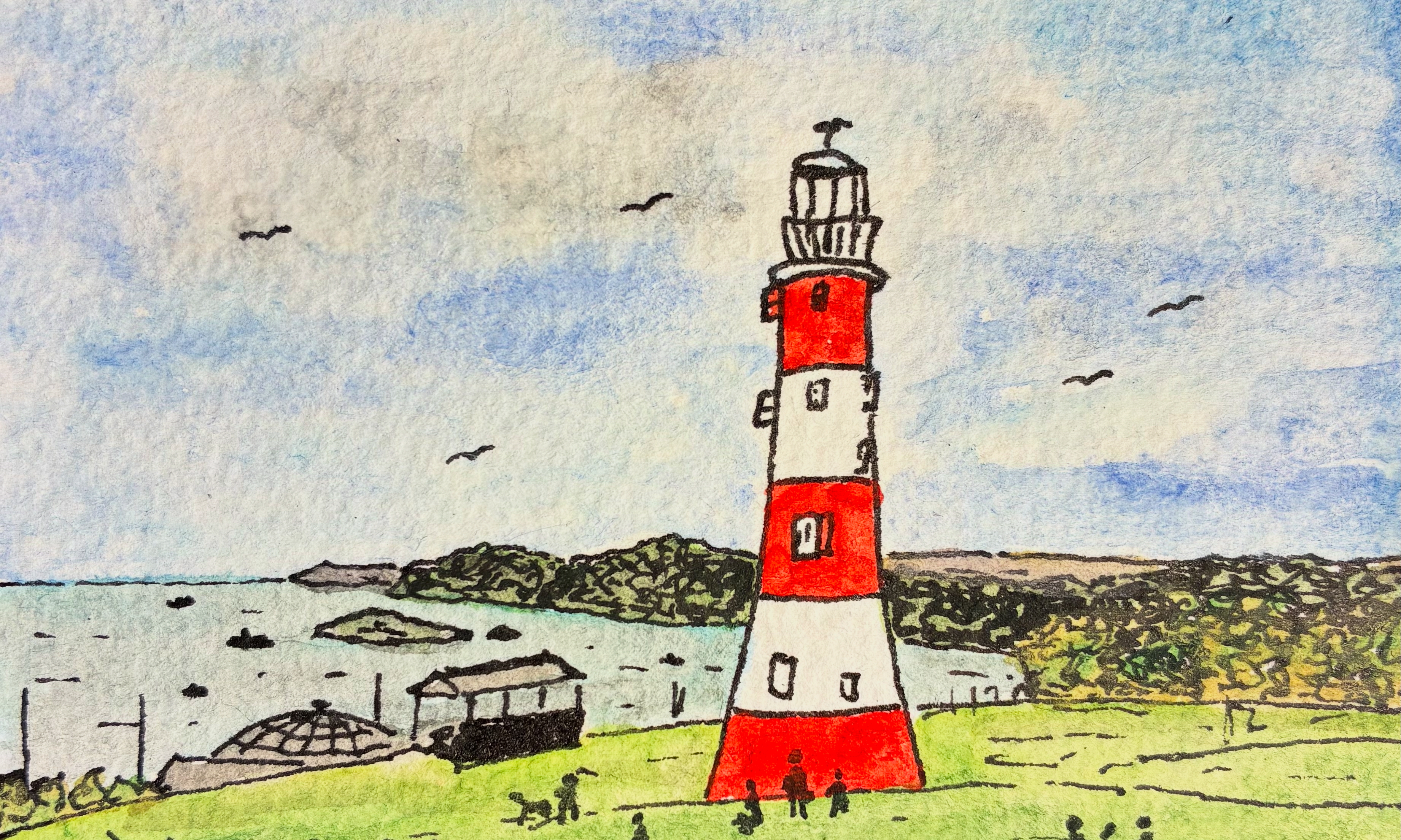
One of the things that I wanted to make sure of before I launched my online shop was that I had all of my art-related points of contact joined up nicely. To that end, I managed to get hold of an email address and accounts on all of the major social media sites (Instagram, X, Bluesky, Facebook, Meta) that matched the name of my etsy shop (@timohareart). To help with future networking and promotion activities, I designed some business cards to convey all of this information to anyone interested. For these, I decided that I would paint a picture of Plymouth’s most iconic landmark, Smeaton’s Tower, with Plymouth Sound and Cornwall in the background to use on the front of the card. It took me several attempts to set up the picture so that I could add the name of my art ‘business’ without the text crossing the darker parts of the picture and that could be cropped nicely into a circle for use on the back of the card and on my social media accounts. The picture at the top of this post is final version.

The final form of the business card is shown below (front and back)…

… and just in case you’re reading this and are tempted to explore a little more, here are some direct links:

shop: timohareart.etsy.com
web: timohare.blog/art
instagram: @timohareart

(Instagram is probably the best social media site to see all of my artwork as I produce it, but you can find my art via the same social media handle on the other sites, although these are not all updated to the same extent.)

What’s In The Box – A Wedding Anniversary Gift #art

Back in early June it was the first anniversary of the wedding of my elder daughter (K) and wanting to find a unique and personal gift to mark this occasion I set about thinking of some kind of art-related present for the pair of them. I thought about painting a scene from one of their wedding photographs, but my attempts at including recognizable people in my pictures so far have not proved to be very successful, and so I quickly ruled that possibility out. I thought about painting a ‘standard’ picture of some kind, but it wasn’t that obvious how to select a scene that carried some relevant meaning – a view of the Park Bar on the Reading University campus (where they first met) didn’t really appeal and, in any case, that would have taken me back into ‘people problem’ territory again.

Instead, I decided to try out an idea I had a few months ago when I came across some small wooden boxes for sale at bargain price in the shop The Works. These little square boxes, about 6cm across, were almost exactly the same size as the miniature watercolour pictures that I often paint, and it had occurred to me that it would be neat to pop two such pictures into a box so that when it is opened the two pictures are revealed. Putting this idea together with the upcoming wedding anniversary it seemed like a natural fit – to celebrate the matrimonial joining together of two young people with a little box bringing together two pictures – one related to each person.

After a little more deliberatrion, I decided that the two pictures would show the places of origin of the two halves of the happy couple. In my daughter’s case this was the city of Plymouth, a familiar theme for my paintings, and for her now husband (H) I chose a view of Horsley Towers, a rather grand, gothic building that is the dominant landmark in the village of East Horsley in Surrey where he grew up.

Having painted the two miniature pictures and fixed them carefully to the base and lid inside the box, all that remained was to personalize the front of the box with their initials, package it up and drop it in the post to them.

I’m glad to report that they loved their little box of pictures. It’s obviously nothing grand or expensive, but I think the best gifts are those that have a personal touch and are the product of some dedicated labour.

Plymouth Postcards #art

Smeaton’s Tower Lighthouse, Plymouth Hoe

Back in April, after completing four series on miniature watercolour pictures (Dartmoor Scenes, House Plants, Capital City Landmarks and Mysterious Britain), I decided that I would give myself a new challenge by scaling up my paintings a bit and keep my subject matter close to home with a set of pictures that I described with the working title ‘Plymouth Postcards’. I wanted to try to keep the same kind of fairly loose style but I thought it would be good to be able to capture a bit more detail of each scene. My miniature watercolours had been just 5cm square (or 5cm x 7cm in the case of the Mysterious Britain series) but this new series was, naturally, postcard sized (roughly 10cm x 15cm). That’s an increase in area of up to six times, and so it gave me quite lot more sketching, drawing and painting to complete!

My first picture (above) focused on what is probably the most iconic view associated with Plymouth, the red-and-white striped form of Smeaton’s Tower – one-time lighthouse on the Eddystone Rock which was moved to Plymouth Hoe when it was replaced in the 1880s.

Next up, I remained close to the waterfront with a view across the inner basin of Sutton Harbour towards the old customs house and the Three Crowns pub. I am not sure that the colour of the water there is ever quite as blue as my picture suggests, but I like the bright and cheery feel of this painting…

Sutton Harbour, Plymouth

Third came a view of one of Plymouth’s most distinctive new buildings, the Roland Levinsky Building, home of the Arts Faculty at my workplace, the University of Plymouth. Again, the sky is perhaps a little too bright, but I like the three-way competition between the blue sky, the green of the grassy area in the foreground, and the coppery-orange cladding of the building itself…

The Roland Levinsky Building, University of Plymouth

After painting a fairly new building, it was time to visit a much older one with a ffront-on view of one of the main buildings at the Royal William Yard, formerly the victualling yard for the Royal Navy but now a home for swanky apartments, restaurants, various studios and art spaces, and a cinema. I think this is one of my favourites from the series…

Royal William Yard, Plymouth

Then, it was back to the city centre for a picture showing the Charles Church, bombed in the Second World War and left in its broken state as a memorial to lives lost. Behind it, the angular exterior of the eastern end of the Drake Circus Shopping Centre forms an interesting backdrop which was surprisingly challenging to paint…

Charles Church and Drake Circus Shopping Centre, Plymouth

For my sixth Plymouth Postcard, I took a trip down to the Barbican area of the city for a view of the Plymouth Gin Distillery on Southside Street. It was difficult to get the perspective of the curved road right but I think I have just about managed it…

Plymouth Gin Distillery, Southside Street

It was time to get a bit ‘arty’, so my next picture was of the interestingly illuminated Theatre Royal, with the imposing form of the statue ‘Messenger’ in front of it. I think that I did pretty well with the theatre itself, and the shape of the statue isn’t too bad, but my initial attempts to shade its dark form resulted in it looking like a hairy gorilla, and so I coloured it black with a permanent marker to try to salvage the picture. Unfortunately, this was only partially successful and I think I would have to describe this one as something of a ‘fail’…

Theatre Royal and ‘Messenger’, Plymouth

Painting number eight took me back to Sutton Harbour, this time looking across the swing bridge towards the Fish Market on the far left and the National Marine Aquarium, with its wavy roof in the centre. I’m please with the way I captured the blue colour of the windows and the advertising poster on the left of the building, and I like the foreground detail of the boat and bridge. Sadly, my attempt at a Union Jack flag was not quite so successful and the flag of the USA seems to have lost its stars…

The National Marine Aquarium, Plymouth

My ninth picture took me to very familiar territory, with a view of the old turnstiles at Home Park, home of Plymouth Argyle Football Club…

Home Park, Plymouth Argyle Football Club

… and then it was back to the waterfront with a view of the art deco Tinside Lido with part of Plymouth Hoe, Smeaton’s Tower and the war memorial in the background…

Tinside Lido and Plymouth Hoe

I finished my series with two pictures of contrasting buildings. First up was the Devonport Town Hall and Column, with the oddly coloured and spectacularly fronted (and named) Odd Fellows Hall on the right. Finally, my subject was the sharply-topped, and so highly appropriately named, Beckley Point (a Hall of Residence for students in the city). This is, apparently, the tallest building in the southwest of England (although I don’t know what is being counted as the southwest in this case)…

Devonport Town Hall and Column and the Odd Fellows Hall
Beckley Point Hall of Residence, Plymouth

This was a fun series to do, taking 17 days to complete, and overall I was pleased with the results of my efforts. It was interesting to try to capture some of the more striking buildings and views that Plymouth has to offer, particularly as it is generally regarded as an architecturally bland and unexciting place (largely as a result of the fact that much of the city centre was flattened by bombing raids in the Second World War).

I am sure that I will do plenty more paintings of Plymouth views in the future, but I think this set forms a good initial collection, showcasing some of the different areas and places of interest in the city nicely.

Plymouth Waterfront from Plymouth Sound #art

I painted this small panoramic picture of Plymouth Waterfront as viewed from Plymouth Sound as a bookmark to accompany the birthday present (books!) that my wife gave to one or her friends back in March. They enjoy a weekly walk down to the Plymouth Waterfront on most Friday mornings and so this scene was the obvious subject matter to choose.

It was interesting to paint in this wide format, and it’s an approach that I have been using more recently for some Dartmoor pictures. I think that when we view a landscape in real life our brain naturally provides a somewhat wide-screen view, and that this might be why, at least to some extent, it is often somewhat disappointing when you take a photograph of a view and much of what you see in real life seems to be condensed into a very small part of the picture.

One advantage of adopting this kind of panoramic composition, at least for a novice and completely untrained painter like me, is that it reduces the amount of sky, as this is often tricky to paint. And in this particular picture it also reduced the amount of water that I had to paint, something else that I’m not especially confident with.

All in all, I really liked this picture with its pops of colour [did I really just write ‘pops of colour’ – this seems to be such a trendy turn of words these days on TV programmes relating to art, interior design, home improvement etc. I must have caught it from there…]. I am sure that this is a format and also, with its obvious local interest, a view that I will return to in the future.

Home Park, Plymouth Argyle Football Club #art

I’ve been a regular attender at the home games of Plymouth Argyle Football Club since soon after we moved to Plymouth in summer 1992. The first game I attended was towards the end of the 1992-93 season, and then from 1993-94 onwards I have only missed the odd game each season. In my time as a fan I have seen the team relegated 5 times and promoted 6 times, but sadly, it seems likely that those numbers will have evened out by the time the current season is completed…

In 2003 I started to take my two daughters alternately to games – at that time they were 7 and 5 years old – and then not long after that we would all go together. In the last few years, since my elder daughter moved away to set up her own home in Surrey, I have continued to attend with my younger daughter, and as she has now settled locally, it seems likely that this will continue. Going to Argyle is something that has brought us a lot of great memories, including a few when we travelled to away games for cup matches or key league games. Our trip to Port Vale in May 2023 to see Argyle clinch the League 1 title, achieving over 100 points in the season, was a particular highlight.

Since I started painting just under a year ago, it seems to have become a bit of a tradition that for birthdays and other special occasions I will paint some kind of artwork to give as a present. Sometimes this is just a small picture for a card or a bookmark, but on a few occasions I have gone for a larger, more ‘significant’ work. So, it was pretty obvious that for my younger daughter’s birthday at the beginning of this month I would produce an Argyle-related picture… The result was the above picture, showing the old entrance to ground, now converted into the club ‘superstore’. I was pleased with how it turned out and also pleased with myself for being brave enough to put a few people into the scene (but notice there are no faces or hands!)

I’m pleased to report that the painting, which I put in a black frame, was very well received… and now it has been given, it’s safe for me to release a picture of it into the world without any risk that I might spoil the surprise. Green Army!

Scott Building and Beckley Point, Plymouth #art

I’m a bit of a perfectionist, something which has definitely held me back over the years as I have held off pursuing certain activities ‘in case I couldn’t live up to expectations’ (a trait that I am sure many serial perfectionist procrastinators will be very familiar with). One such activity was always drawing and painting, so it was a bit of a surprise to me when, about a year ago (April 2024), I quite suddenly started painting and following a short video course on what is usually called ‘loose’ watercolour painting, I found that I was (mostly) quite able to side-step my need for ‘perfect’ and simply paint – deliberately being quick was a key element in this. Even better, not only did perfectionism not get in the way of me being able to paint, but I found that painting in a non-perfect way helped my loosen the grip that perfectionism had on me more generally.

This little picture, painted a few agos, is a nice example of imperfectionism at work. It is a view of the Scott Building (University of Plymouth) on the left with the towering mass of Beckley Point accommodation block behind. If you were to stand where the photo that this picture is based on was taken, you would instantly notice all kinds of discrepancies – the colour of the closest building isn’t quite right, the ground appears to rise upwards because of the way I have used horizontal lines for the shadow cast by the building and the small building in the background (the Reynolds Building in which I used to have my office) is far too small. But none of this really matters. For a start, it’s only a little painting that almost no-one will ever see (and those that do probably won’t know what the scene looks like in reality), but more importantly, I have come to learn that it is the quirky little ‘undetails’ in a picture – a wiggly line here, am improbable colour there, the scratchy outline of a person – that add fun into the mix, and that it is far more important to vaguely capture the sense of a place rather than replicate it in every detail (although pictures like that can also be wonderful and interesting of course).

So, here’s to this quick, little, watercolour picture with all its imperfections – nice and bright, rather jolly and, I think, a sense of movement. It’s not supposed to be a masterpiece, it’s just fine as it is!

Plymouth Waterfront and Tinside Lido #art

Last summer, we had stayed in a tiny AirBnB in the garden of a house near Hebden Bridge in Yorkshire and loved the red-clay crockery that was provided for us to use so much that when we found out that it was hand-made by the owner, a highly-skilled potter, we asked tentatively asked if she could some like it for us, thinking that it would be way beyond our price-range if she could, and were pleasantly surprised to learn that she could and that it wasn’t. After a delay of a few months, while we waited for our new kitchen to be finally in place and she worked on other jobs, we received a big box of plates, bowls and mugs. Unfortunately, in that first delivery there were two or three breakages and one or two pieces that we were told were not up to standard (but looked fine to us) and so we had to wait a little longer for everything to be made and be with us. A few weeks ago the final package arrived and we were so pleased with our acquisition (apparently it has only been made before for a couple of fancy tapas restaurants somewhere in London) that we wanted to send a card as a thank you for all of the effort that went into fulfilling our order, including making replacement and a few extra pieces as we decided that we did want mugs after all.

So, I sat down to paint a picture to make the card with and was faced with a decision: what to paint? I thought about painting a countryside scene from somewhere near the holiday let or one local to us (e.g. Dartmoor) but in the end I plumped for a view of Plymouth waterfront and found a suitable photograph online to use as a basis. I was really pleased with how the resulting picture ended up – it is the first time that I have tried to capture such a large built-up area in a painting and whilst the size of the picture (~10 x 15cm) means (deliberately) that there is little scope for lots of detail, I’m happy with the extent to which I have worked in sufficient detail to capture the main features of the buildings in the foreground and enough of their sense in the background.

Subsequently, I have been exploring getting some of my artwork printed with a view to seeing whether anyone might part with a little of their hard-earned cash for any of it in the future, and as a test piece I got my Plymouth Waterfront picture printed as an A6 postcard using the cropped version shown below. I’m really please with how the postcards have come out and I now have a staggeringly large number of them that I will, at some point, either sell or give away!

The Hutong Bagel Co, Plymouth #art

I seem to be on a bit of a run with my art at the moment as I managed to grab half an hour this morning to quickly paint a little ink and watercolour picture of one of Plymouth’s most popular cafes, The Hutong Bagel Co, located right next to the entrance of the Royal William Yard. (Ironically, being off sick from work with a streaming cold has had the benefit of giving me a bit of extra time to myself even though I still ended up doing work tasks during most of the day).

These little ink and watercolour sketches, which are approximately 7cm x 4cm in size, work best when there is some kind of building or solid structure in them to provide some hard edges and a clear focal point. In addition, I’m deliberately playing with the idea of producing pictures of the premises of various local cafes and shops.

I’m also trying to be brave and sprinkle a few people into my pictures when I can and although I am absolutely hopeless if I try to include any details I’m quite pleased that I seem to have found a way to capture the crowd of people standing outside the cafe without having to stray into the territory of their hands, noses, eyes and ears!

So here it is, my quick mini-watercolour of The Hutong Bagel Co.