Tim O’Hare Art is open for business! #art

Over the last couple of months I have been gradually gearing up to start trying to sell some of my artwork. Obviously, I am not thinking that there will be crowds flocking to part with their hard-earned money to the extent that I might become rich through my artist endeavours. Rather, people who see my pictures often pass comment that they think I could sell them, and the inquisitive part of me thinks that it will be interesting to find out whether that is true, and if it is, which pieces of my output people like enough to pay for. [Okay, okay – I admit it – I’d also love to have the implicit praise and external validation that would come my way if my artwork attracted interest in this way… but I know that it’s far better for me not to get hung up on this aspect of things and, instead, to focus on simply enjoying the process of creating art and then allowing it to leak out into the world.]

So far, my art selling has only gone as far as listing prints of my Dartmoor Stone Circle painting on eBay (two copies sold, albeit to the same buyer, in almost four months…) and, more recently, to set up an online shop on Etsy. In this shop I have listed my Dartmoor Stone Circle print (one copy sold) and lots of different Greetings Cards based on some of my miniature watercolour series: Dartmoor Scenes, House Plants, Capital City Landmarks, Cornwall Landmarks and Exmoor Views (of which I have sold the grand total of two: one of ‘The Forbidden City, Beijing’ from my Capital City Landmarks series and one of ‘The Roundhouse Gallery, Sennen Cove’ from my Cornwall Landmarks series). Clearly, it is slow going, partly because I need to master the art of marketing and try to drive some traffic to the shop, but also, because I doubt that there are many people shopping online for greetings cards of random places or plants! Nevertheless, it was a bit of a thrill when my phone pinged to tell me that these sales had been made..

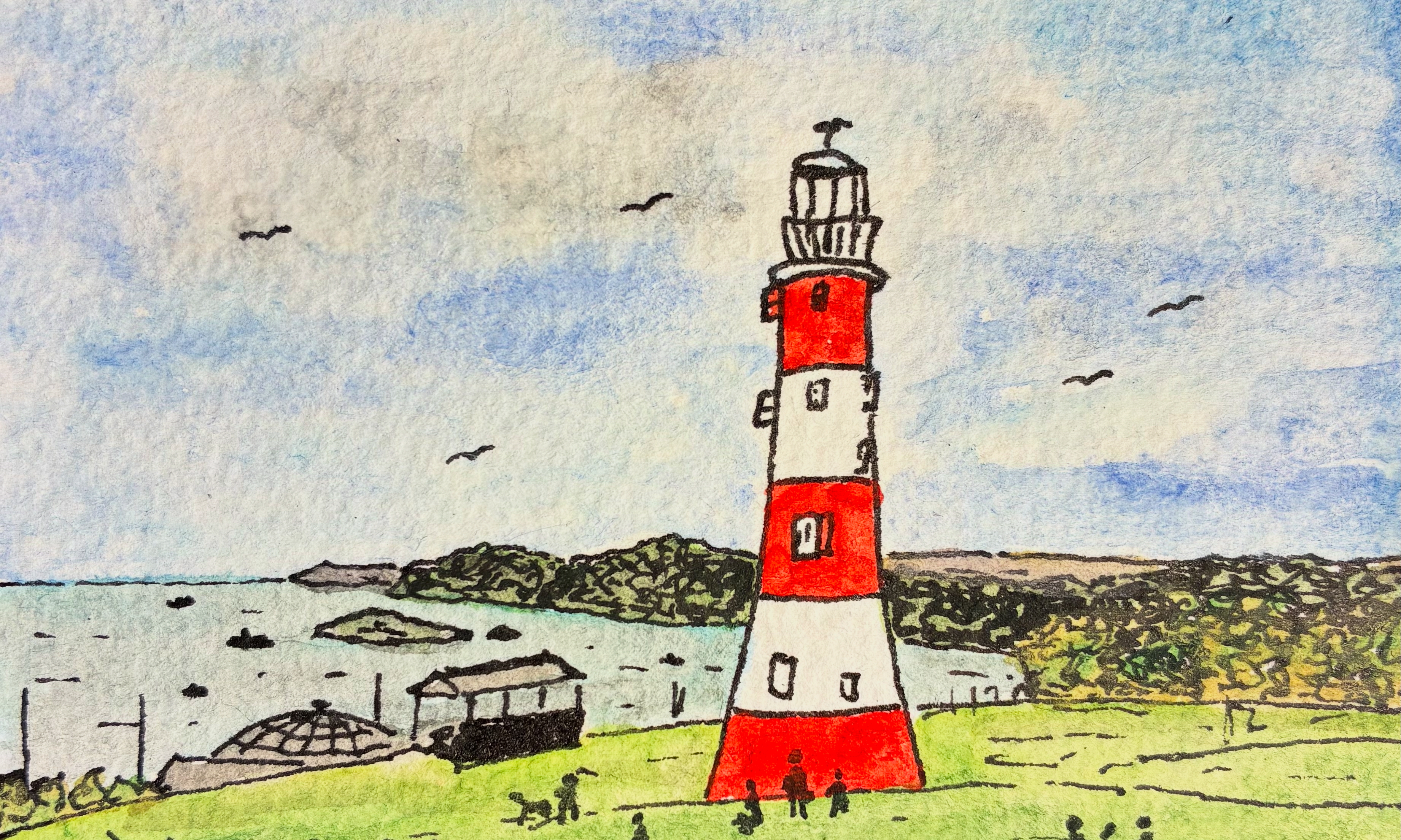
One of the things that I wanted to make sure of before I launched my online shop was that I had all of my art-related points of contact joined up nicely. To that end, I managed to get hold of an email address and accounts on all of the major social media sites (Instagram, X, Bluesky, Facebook, Meta) that matched the name of my etsy shop (@timohareart). To help with future networking and promotion activities, I designed some business cards to convey all of this information to anyone interested. For these, I decided that I would paint a picture of Plymouth’s most iconic landmark, Smeaton’s Tower, with Plymouth Sound and Cornwall in the background to use on the front of the card. It took me several attempts to set up the picture so that I could add the name of my art ‘business’ without the text crossing the darker parts of the picture and that could be cropped nicely into a circle for use on the back of the card and on my social media accounts. The picture at the top of this post is final version.

The final form of the business card is shown below (front and back)…

… and just in case you’re reading this and are tempted to explore a little more, here are some direct links:

shop: timohareart.etsy.com
web: timohare.blog/art
instagram: @timohareart

(Instagram is probably the best social media site to see all of my artwork as I produce it, but you can find my art via the same social media handle on the other sites, although these are not all updated to the same extent.)

Walkham Woods (charcoal/watercolour) #art

Since I started drawing and painting back in April 2024 I have primarily worked with ink and watercolour paints, with my ‘go-to’ format being small, usually ~5cm square, pictures on some particular theme that I have chosen to explore for a few days. Producing pictures of that type has become my staple art activity, to the extent that I describe this as my ‘art practice’. However, I am constantly thinking about how I would like to explore different formats and work with different media. This especially happens when I visit an art exhibition, see works by other artists,and wonder what I could produce if I branched out a bit. The funny thing is that prior to my big shift into art in April 2024 I had actually begun to dabble with creating pictures with pastels (e.g. see my post Rediscovering The Artist Within) but I have not returned to pastels once since then.

Sometime back in May I must have been somewhere that brought me into contact with some charcoal drawings. I had a set of charcoal pencils sitting unopened in my art supplies box, and so I thought I would branch out a little and see what happened when I completed the drawing phase of a picture with charcoal, rather than adopting my usual approach of starting off with some faint pencil lines and then going all in with my black ink pen. I think I hoped that the different drawing texture might lead to me producing a more abstract picture. Then, after scribbling away with the charcoal pencil for a bit, I returned to the familiar territory of my watercolour paints to give my drawing some colour.

The result of my efforts is shown in the picture above – a charcoal -cribbles-with-watercolour painting of a row of what I refer to a ‘wall trees’, somewhere in the valley of the River Walkham, from a photo that I had taken on a walk there.

I’m not sure exactly what I think of this picture. It seems quite basic and simple – the trees sitting very much on top of the leafy backdrop and lacking much detail in their trunks and branches – and that simplicity pushes me towards thinking that the picture doesn’t quite work. But I also quite like the more impressionistic look – the rough lines suggesting the texture and structure of the stone wall, and the bright greens and particularly the yellows of the leaf canopy shouting out for attention. The picture has a naivety which I think gives it a certain charm. As I look at the picture, my eyes seem to be drawn in to explore what little detail there is, perhaps more so than happens when viewing one of my more detailed ink and watercolour pictures. Overall, I think that perhaps the switch in drawing medium was successful in helping me to present the view in a more abstract, suggestive manner than my normal ink-and-watercolour approach.

I’ve not had another go with charcoal pencils since I created this picture just over two months ago, but revisiting it now and writing this post has fired me up to spend some more time over the coming period to play around with different approaches and media a bit more. I wonder what will emerge!

Cornwall Landmarks #art

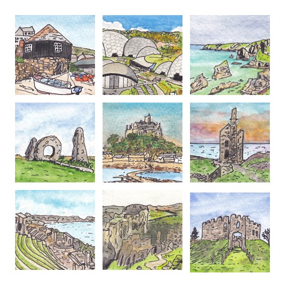
I like to try to spend a little time painting on as many days as I can, and for obvious reasons, the key to this is to keep my pictures small. One of my favourite formats seems to be 5cm square pictures painted in a fairly loose style, with not too much detail and a fairly limited colour palette. Each picture starts with a few pencil marks that serve as guide lines for the pen work, mostly outlining key features and providing various forms of shading. Once the ink has dried, which only takes a few seconds, I start to apply the watercolour paint, usually colouring the sky and any large blocks of vegetation first, before moving on to fill in any details. The whole process generally takes less than 30 minutes and my preference is to spend time of this as pretty much the first thing I do in the morning. When I completed my first small picture, I didn’t have any particular plans for further pictures on the same theme, but one picture led to another, and it seems that I end up producing these miniature watercolours as part of a series, first Dartmoor Scenes and then House Plants, Capital City Landmarks, and a series of slightly larger Mysterious Britain pictures. Most recently, returning closer to home, I completed this set of pictures showing various landmarks in our neighbouring county, Cornwall.

The pictures weren’t painted in this order, but the subjects of my Cornwall Landmarks series are (from top-left working across the rows and down the columns in the composite picture above) The Roundhouse Gallery, Sennen Cove, The Eden Project near St Austell, Bedruthan Steps, Men-An-Tol stone ring, St Michael’s Mount near Penzance, a classic coastal tin mine pumping station, the Minac Theatre, Tintagel Castle and Restormel Castle near Lostwithiel. If I had to choose favourites then I think I would go for the pictures of The Roundhouse Gallery, Bedruthan Steps and Restormel Castle, although I might well make different selections the next time I look at them!

As with each of my other miniature watercolour series, I plan to get some copies of the 3 x 3 composite picture printed as greetings cards to sell at some point, and I will probably try out some of them as individual framed versions too.

I guess the obvious question for me now is where I will go next with this kind of miniature watercolour picture. This morning I painted a view from a photograph I took last week while staying in Exmoor, and so I guess that it is likely that I will end up doing some more from that beautiful part of the world. But whether I will end up with enough for a full series, so that I can make another 3 x 3 composite, only time will tell!

An Encounter on Ilkley Moor #poem

It was the morning of the fourth day of July, twenty twenty-three,
and I was running, alone, on Ilkley Moor.
I could not take the path that I had planned,
for it was stolen from me by the grasp of ferns,
and so, instead, I found another way to travel west –
my route, like life, a path of unexpected turns.

As I drew level with a group of trees, planted in my mental map,
I turned to head, almost a scramble, up the rock-strewn slope,
until with the ground flattening all around, I came to a stone wall
and followed a well-worn path that lay in its shadow,
east, towards the radio mast.
From there I knew my way,
down the track they call the Keighley Road,
with a view across the valley over Ilkley town
that, like the passing of a life, would slip away too fast.

As I began my descent, his profile came into view,
to my right, just off the track,
though still some distance well ahead –
a small, dark man, sitting, gazing directly across my path,
chin resting on hands,
elbows propped on knees,
his head straining forwards
as if to peer through time to seek some other space.
He remained there as I closed, his features sharpening in my sight,
and I was struck how, like so much else in life,
his presence was incongruous.
For this did not seem to be his place.

I expected him to move as I approached, if only to shift his pose,
but he sat looking west across the track, across the moor – still.
And as my eyes searched for detail in his form
I saw that he was too small, about two-thirds the size of a man,
and so dark, yet without colour.

My brain was screaming at me: ‘Something is not right here’,
and I felt a heavy weight in the air around me.
I continued on,
towards the point beside the grey stone on which he sat.
My heart was beating fast, preparing to meet another life,
but on my arrival there was no-one there.

(c) Tim O’Hare, August 2023


AN ENCOUNTER ON ILKLEY MOOR: This poem tells the true story of an encounter that I had on a morning run while staying on Ilkley Moor for a week. There was a rock on the verge by the track that I ran along as I made my descent to our holiday let. As I came down the track towards it, I saw the figure of a small, dark man sitting there, just as I describe in the poem, and I instinctively felt that I was not able to recognise all that lay before me. Even now, many months later, I cannot let go of the fact that he was there and that, just for a few moments, either he or I was not in the right place.

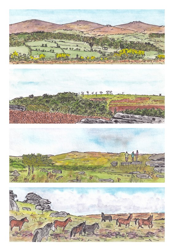
Dartmoor Panoramas #art

The proximity of Dartmoor to our home in Plymouth generally means that it is our go-to place for weekend walks, so it is hardly surprising that my phone is full of photographs of Dartmoor landscapes. I’m a particular sucker for ‘big views’, but my attempts to capture these in photographs are always something of a let down. Looking with the naked eye, big views fill my visual space with rich detail, but on camera everything seems to shrink, recede and flatten, resulting in a rather distant picture that is dominated by sky, and especially foreground, that the brain somehow filters out of the live view. I expect that this phenomenon is well understood by photographers, and it probably even has a special name, but to me it is just known as ‘disappointment’. This is compounded by the difficulty that I face when I subsequently try to capture this same kind of open, expansive view in one of my paintings. The part of a photograph that I want to paint seems to be only a small component of the whole, and no amount of zooming in seems to really help.

On one recent trip to Dartmoor I was pondering this issue when it occurred to me that what I was seeing with my eyes was a little like the view I got when I used my thumbs and index fingers to create a rectangular, letterbox-like, frame and then looked through that frame as if looking through a window. Despite there being so much more that could be seen, my brain seemed simply to ignore that part of the view that would have outside this frame, whereas my phone camera played no such trick. I began to wonder whether the key to painting this kind of view was to change the size and shape of the picture, adopting a similar letterbox, or panoramic, format. So, for a few days I played with this approach. The results are a series of four small painting that I refer to as my Dartmoor Panorama series.

I’m pleased with these pictures, at least to the extent that they better capture something approximating to the kinds of spacious views that I like best. Using a panoramic format does seem to work. In the third picture I was brave enough to include some people standing on one of the tors and gazing out at the view> I think this little piece of detail adds a lot to the picture, including a splash of contrasting colour. I was even more brave in the fourth picture, including a group of Dartmoor ponies. I tend to think that I’m not able to paint animals, but perhaps I am improving, because at least some of the ponies in this picture seem to have come out pretty well. I am particularly pleased with the grey pony in the foreground and the somewhat lively pony furthest to the right.

I feel sure that I will use this approach to painting expansive views again, and I suspect that at some point my curiosity will lead me to explore some photography guides to see whether I can find a proper explanation of my observation. It might have something to do with ‘foreshortening’ and/or ‘depth-of-field’ (words that I am vaguely familiar with that at least sound like they could be contributing factors). Who knows, perhaps someone reading this post will be able to point me in the right direction!

Plymouth Postcards #art

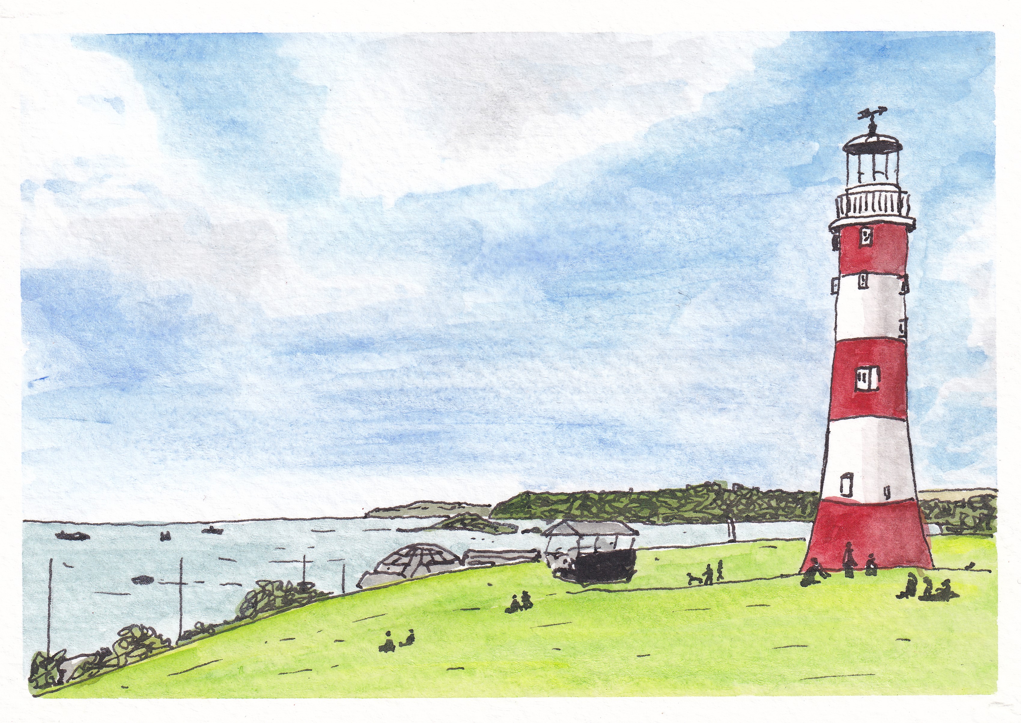
Smeaton’s Tower Lighthouse, Plymouth Hoe

Back in April, after completing four series on miniature watercolour pictures (Dartmoor Scenes, House Plants, Capital City Landmarks and Mysterious Britain), I decided that I would give myself a new challenge by scaling up my paintings a bit and keep my subject matter close to home with a set of pictures that I described with the working title ‘Plymouth Postcards’. I wanted to try to keep the same kind of fairly loose style but I thought it would be good to be able to capture a bit more detail of each scene. My miniature watercolours had been just 5cm square (or 5cm x 7cm in the case of the Mysterious Britain series) but this new series was, naturally, postcard sized (roughly 10cm x 15cm). That’s an increase in area of up to six times, and so it gave me quite lot more sketching, drawing and painting to complete!

My first picture (above) focused on what is probably the most iconic view associated with Plymouth, the red-and-white striped form of Smeaton’s Tower – one-time lighthouse on the Eddystone Rock which was moved to Plymouth Hoe when it was replaced in the 1880s.

Next up, I remained close to the waterfront with a view across the inner basin of Sutton Harbour towards the old customs house and the Three Crowns pub. I am not sure that the colour of the water there is ever quite as blue as my picture suggests, but I like the bright and cheery feel of this painting…

Sutton Harbour, Plymouth

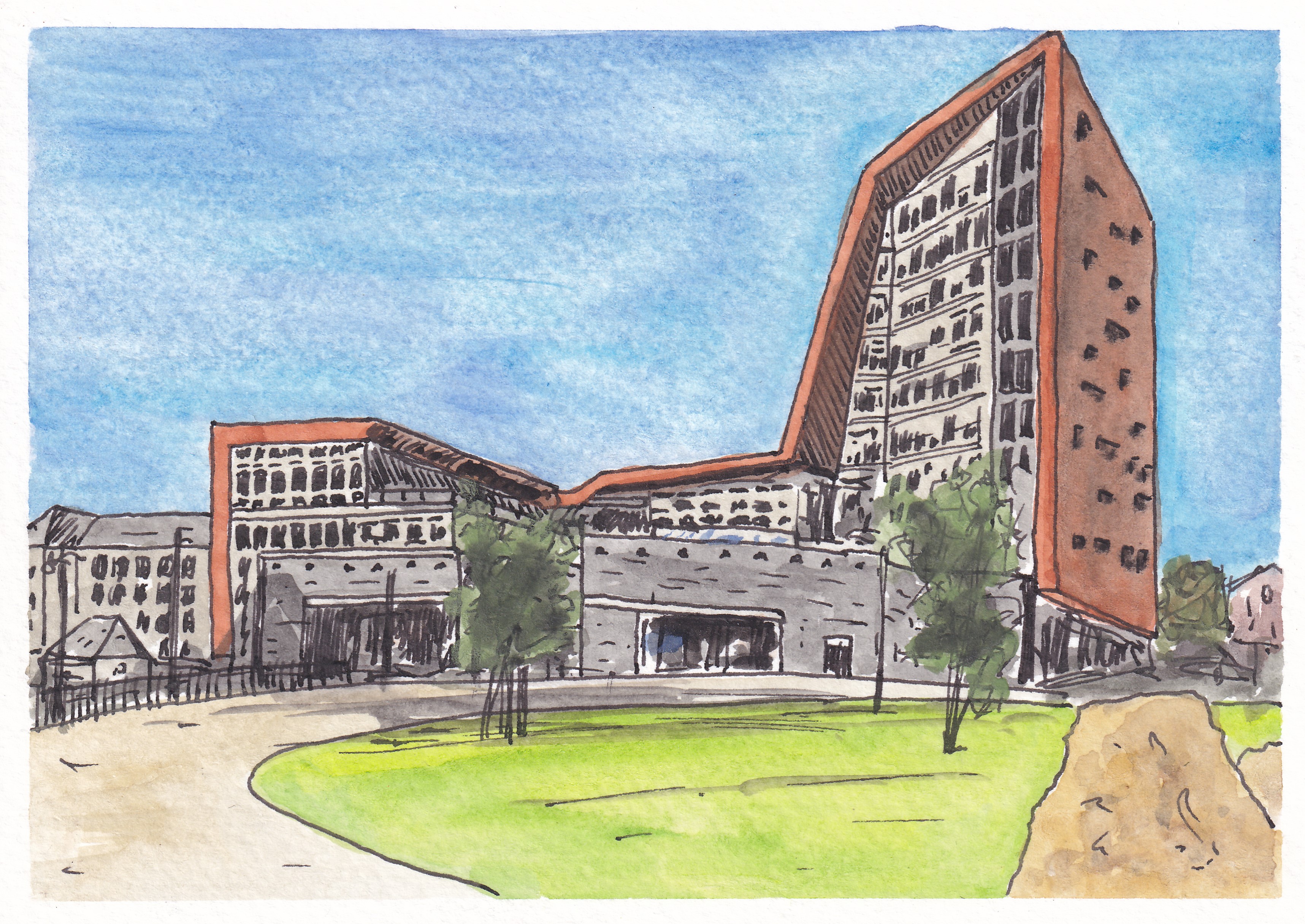
Third came a view of one of Plymouth’s most distinctive new buildings, the Roland Levinsky Building, home of the Arts Faculty at my workplace, the University of Plymouth. Again, the sky is perhaps a little too bright, but I like the three-way competition between the blue sky, the green of the grassy area in the foreground, and the coppery-orange cladding of the building itself…

The Roland Levinsky Building, University of Plymouth

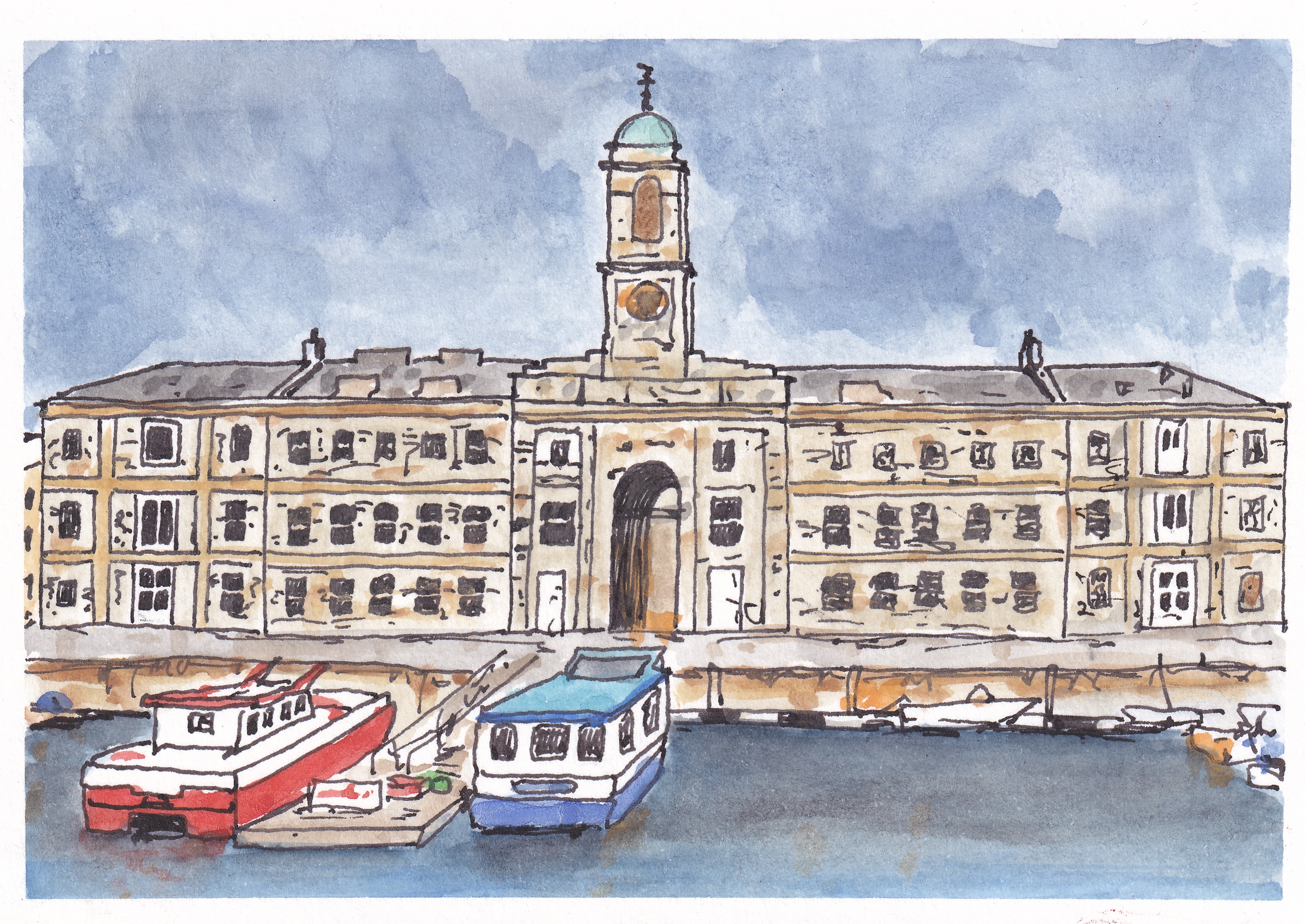
After painting a fairly new building, it was time to visit a much older one with a ffront-on view of one of the main buildings at the Royal William Yard, formerly the victualling yard for the Royal Navy but now a home for swanky apartments, restaurants, various studios and art spaces, and a cinema. I think this is one of my favourites from the series…

Royal William Yard, Plymouth

Then, it was back to the city centre for a picture showing the Charles Church, bombed in the Second World War and left in its broken state as a memorial to lives lost. Behind it, the angular exterior of the eastern end of the Drake Circus Shopping Centre forms an interesting backdrop which was surprisingly challenging to paint…

Charles Church and Drake Circus Shopping Centre, Plymouth

For my sixth Plymouth Postcard, I took a trip down to the Barbican area of the city for a view of the Plymouth Gin Distillery on Southside Street. It was difficult to get the perspective of the curved road right but I think I have just about managed it…

Plymouth Gin Distillery, Southside Street

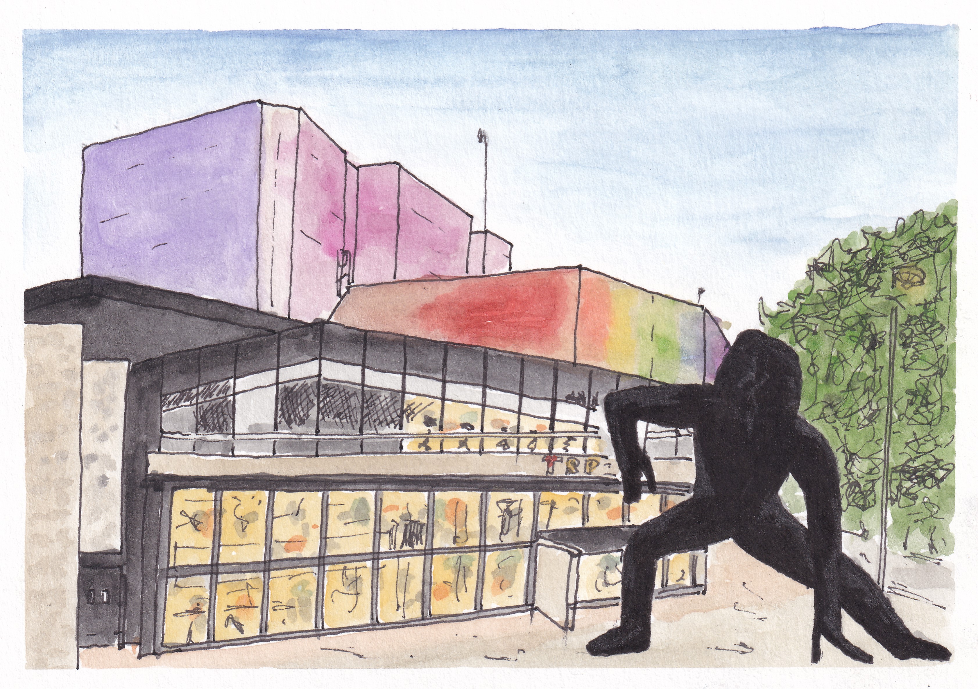
It was time to get a bit ‘arty’, so my next picture was of the interestingly illuminated Theatre Royal, with the imposing form of the statue ‘Messenger’ in front of it. I think that I did pretty well with the theatre itself, and the shape of the statue isn’t too bad, but my initial attempts to shade its dark form resulted in it looking like a hairy gorilla, and so I coloured it black with a permanent marker to try to salvage the picture. Unfortunately, this was only partially successful and I think I would have to describe this one as something of a ‘fail’…

Theatre Royal and ‘Messenger’, Plymouth

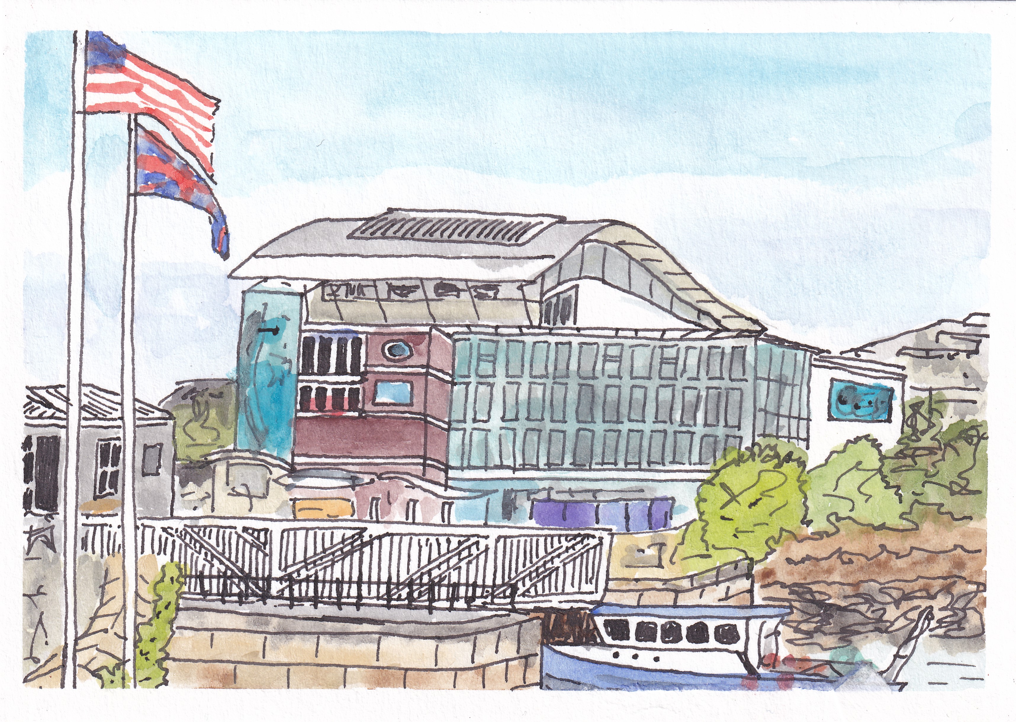
Painting number eight took me back to Sutton Harbour, this time looking across the swing bridge towards the Fish Market on the far left and the National Marine Aquarium, with its wavy roof in the centre. I’m please with the way I captured the blue colour of the windows and the advertising poster on the left of the building, and I like the foreground detail of the boat and bridge. Sadly, my attempt at a Union Jack flag was not quite so successful and the flag of the USA seems to have lost its stars…

The National Marine Aquarium, Plymouth

My ninth picture took me to very familiar territory, with a view of the old turnstiles at Home Park, home of Plymouth Argyle Football Club…

Home Park, Plymouth Argyle Football Club

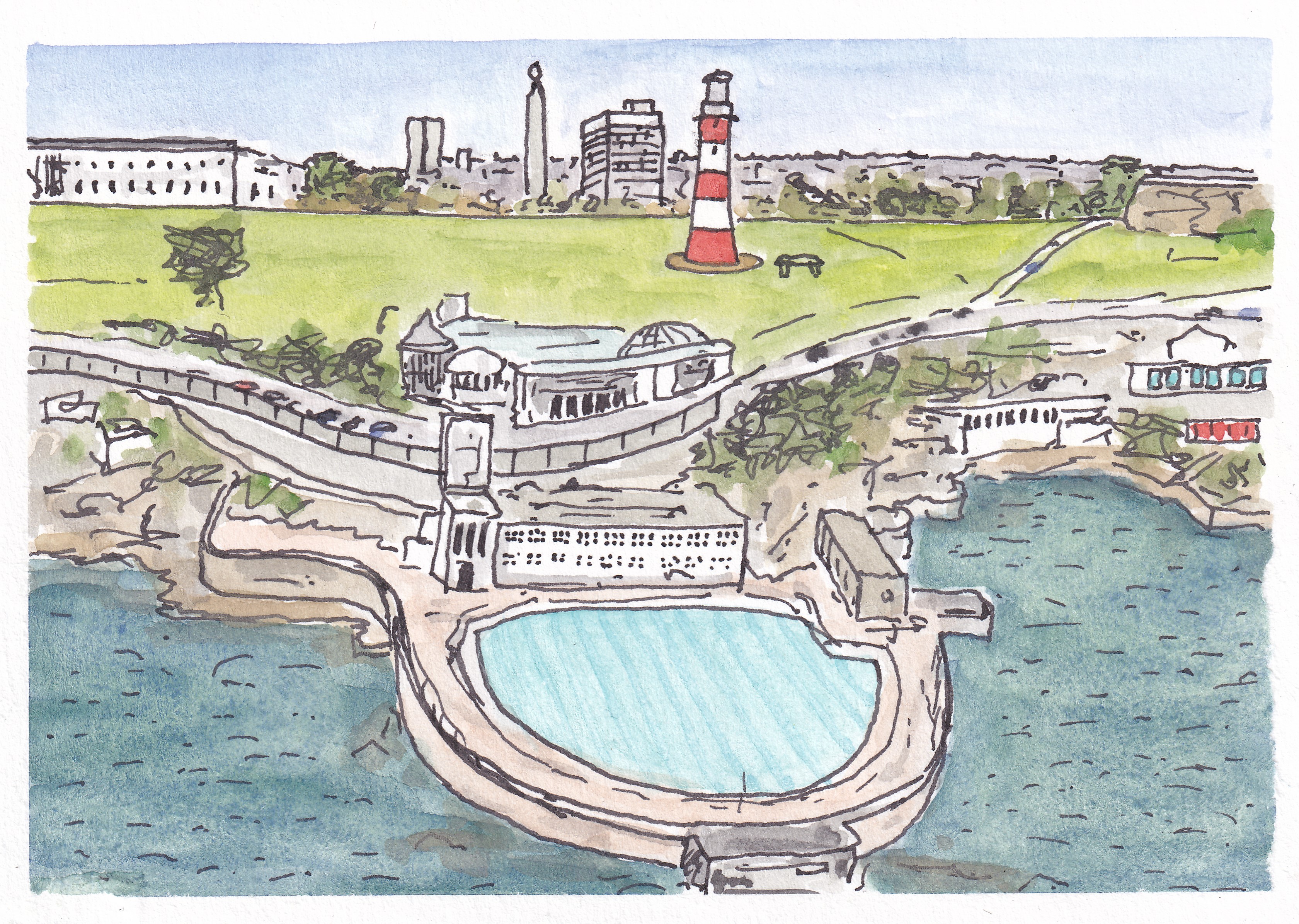
… and then it was back to the waterfront with a view of the art deco Tinside Lido with part of Plymouth Hoe, Smeaton’s Tower and the war memorial in the background…

Tinside Lido and Plymouth Hoe

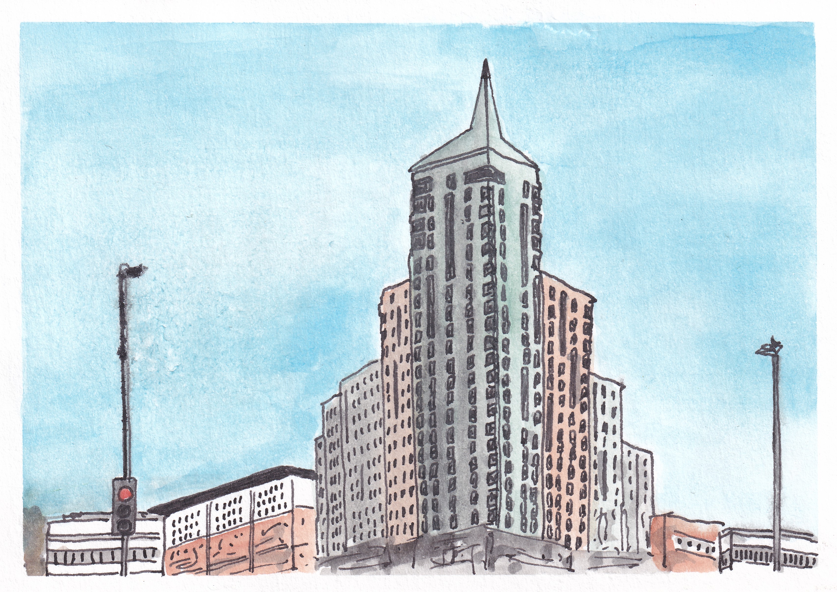
I finished my series with two pictures of contrasting buildings. First up was the Devonport Town Hall and Column, with the oddly coloured and spectacularly fronted (and named) Odd Fellows Hall on the right. Finally, my subject was the sharply-topped, and so highly appropriately named, Beckley Point (a Hall of Residence for students in the city). This is, apparently, the tallest building in the southwest of England (although I don’t know what is being counted as the southwest in this case)…

Devonport Town Hall and Column and the Odd Fellows Hall
Beckley Point Hall of Residence, Plymouth

This was a fun series to do, taking 17 days to complete, and overall I was pleased with the results of my efforts. It was interesting to try to capture some of the more striking buildings and views that Plymouth has to offer, particularly as it is generally regarded as an architecturally bland and unexciting place (largely as a result of the fact that much of the city centre was flattened by bombing raids in the Second World War).

I am sure that I will do plenty more paintings of Plymouth views in the future, but I think this set forms a good initial collection, showcasing some of the different areas and places of interest in the city nicely.

A Walk Around Peek Hill #other

We are blessed by the fact that although we live towards the centre of a fairly large and busy city (Plymouth), we are just 10-15 miles drive from the open moorland and wonderful walking landscapes of Dartmoor National Park. I know that some people love the really bleak, wilderness sections of Dartmoor, but my own preference is for what I think of as the ‘edgelands’, where the rougher terrain gives way to wooded valleys and the surrounding farmland. I have always liked landscapes that mix wildness with areas where humans have worked with the land over a long period of time in a relatively unchanging manner. The edgelands of Dartmoor certainly fit this description.

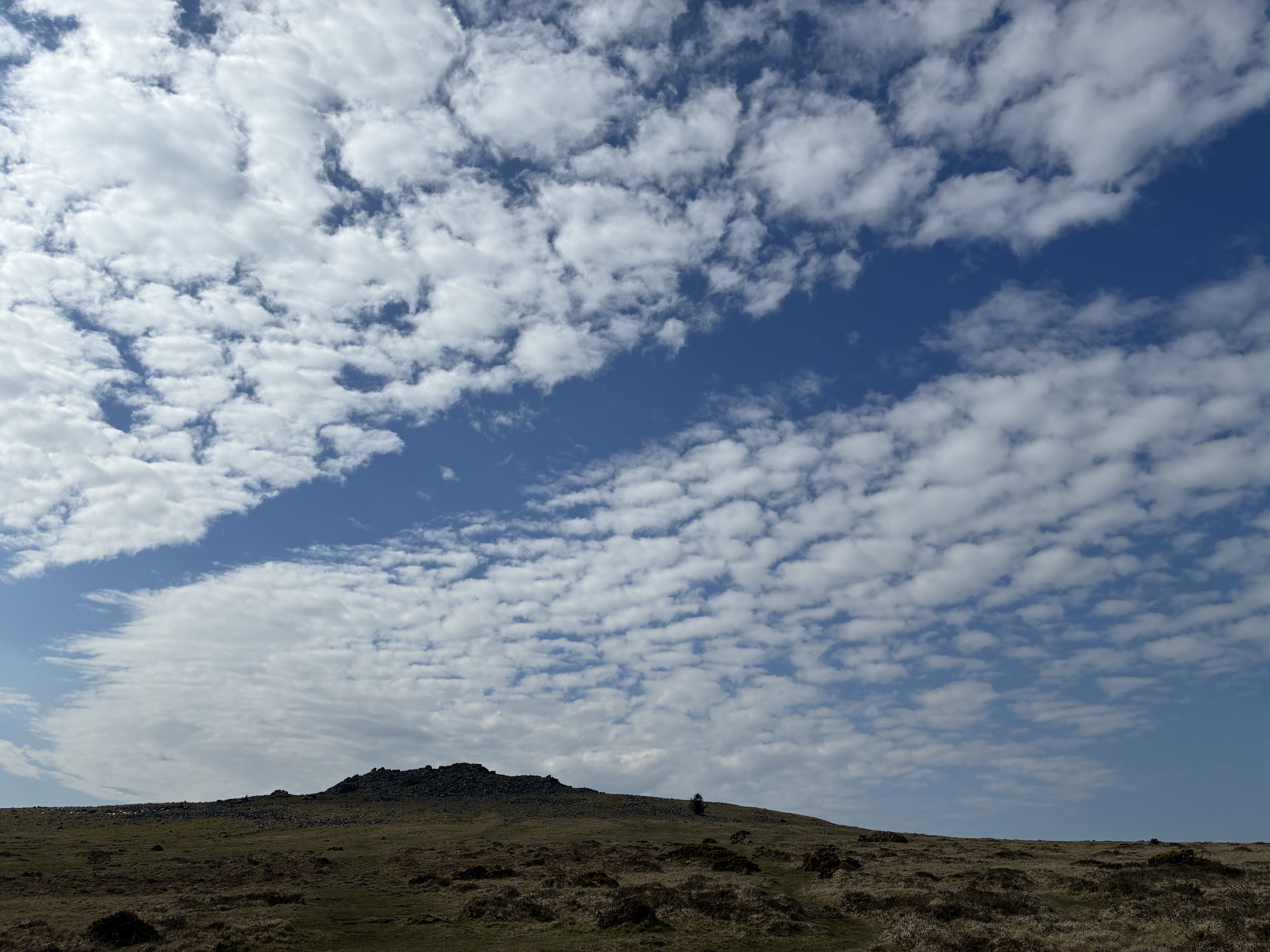
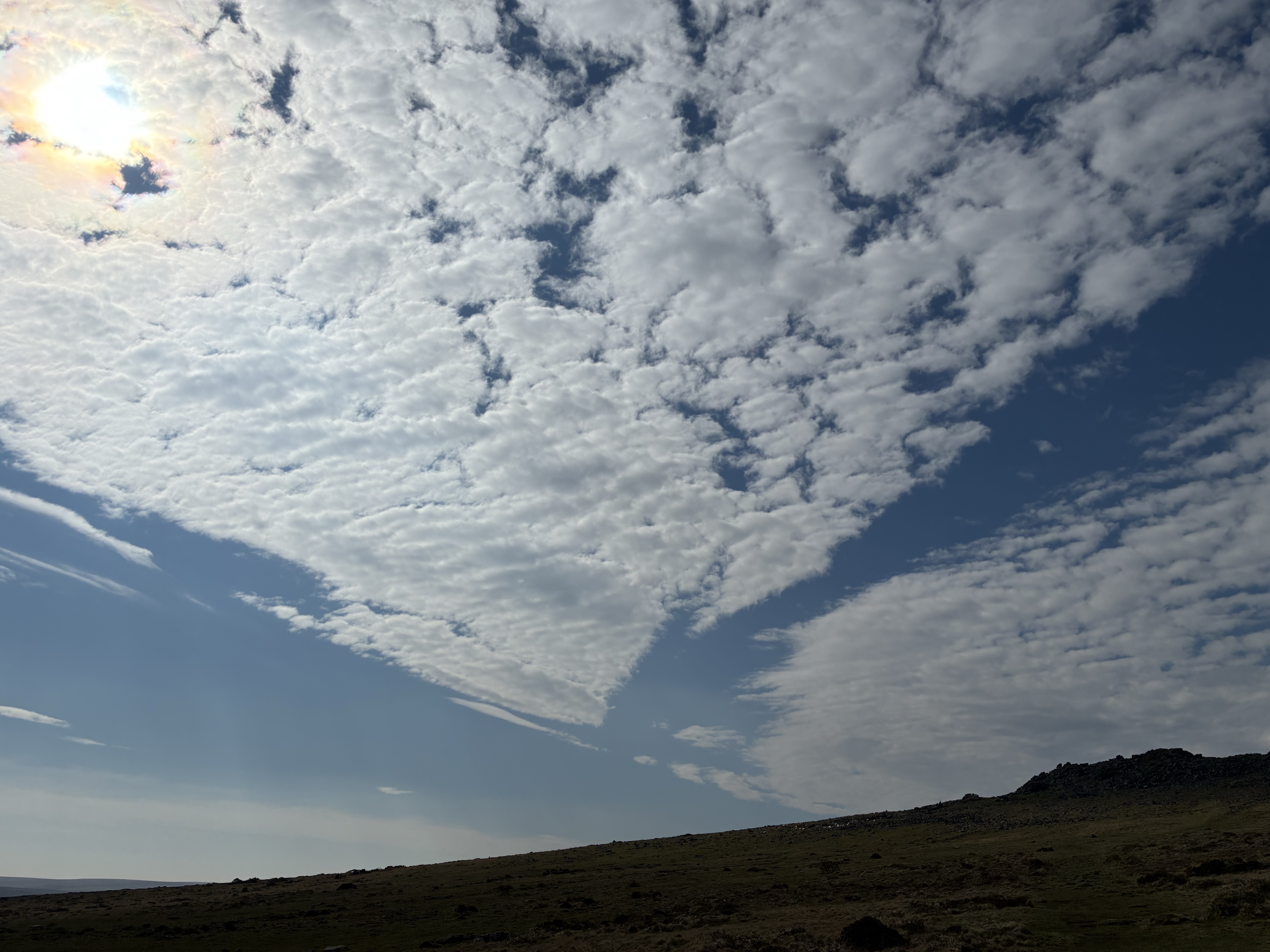
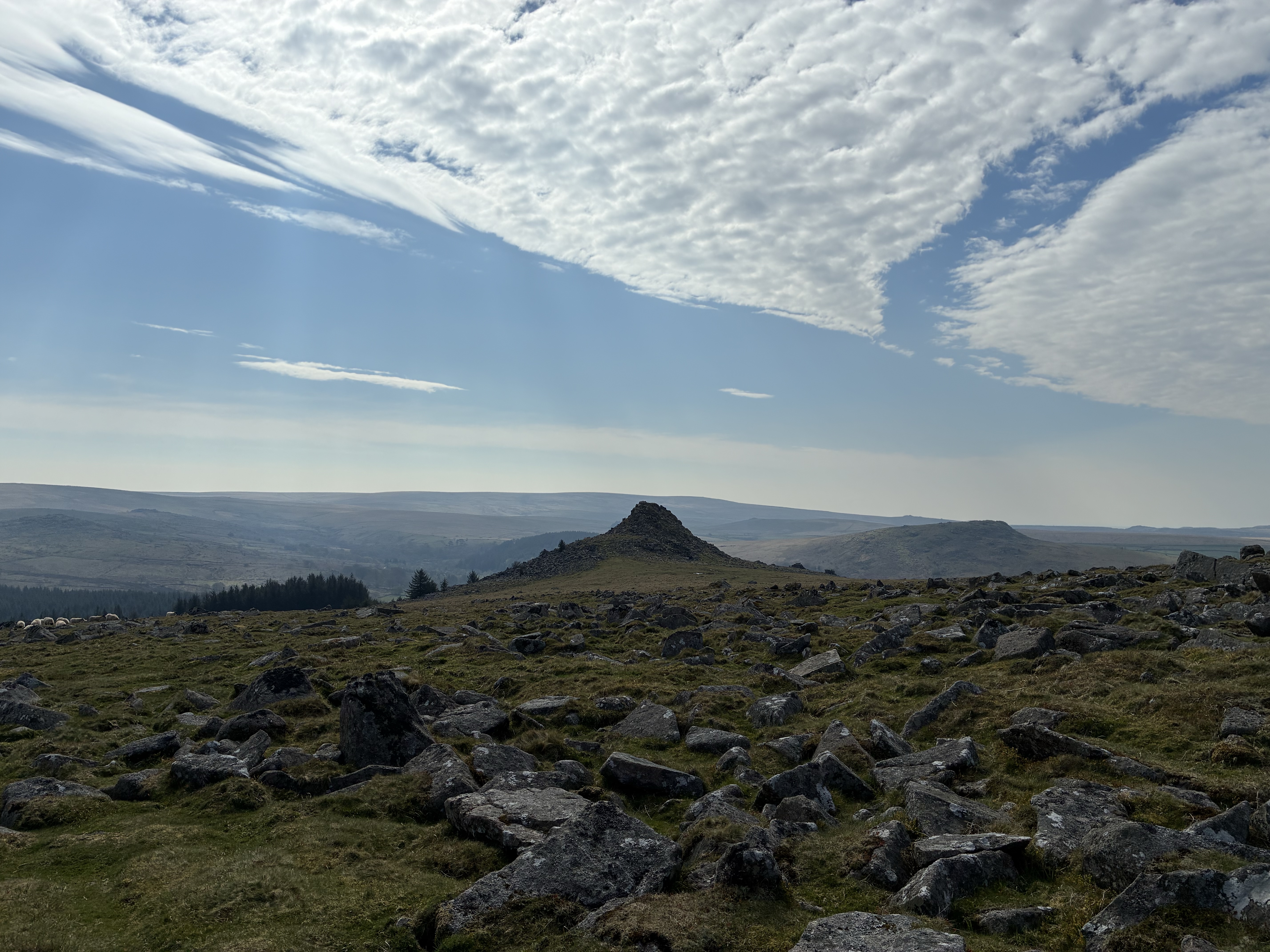
A couple of months ago we drove up towards Princetown and parked a little way from the rocky mass of Sharpitor (above and immediately below). It was a fine day, but one with plenty of interesting cloud formations that arguably made our view of the sky as interesting as the views of the hills and valleys around us…

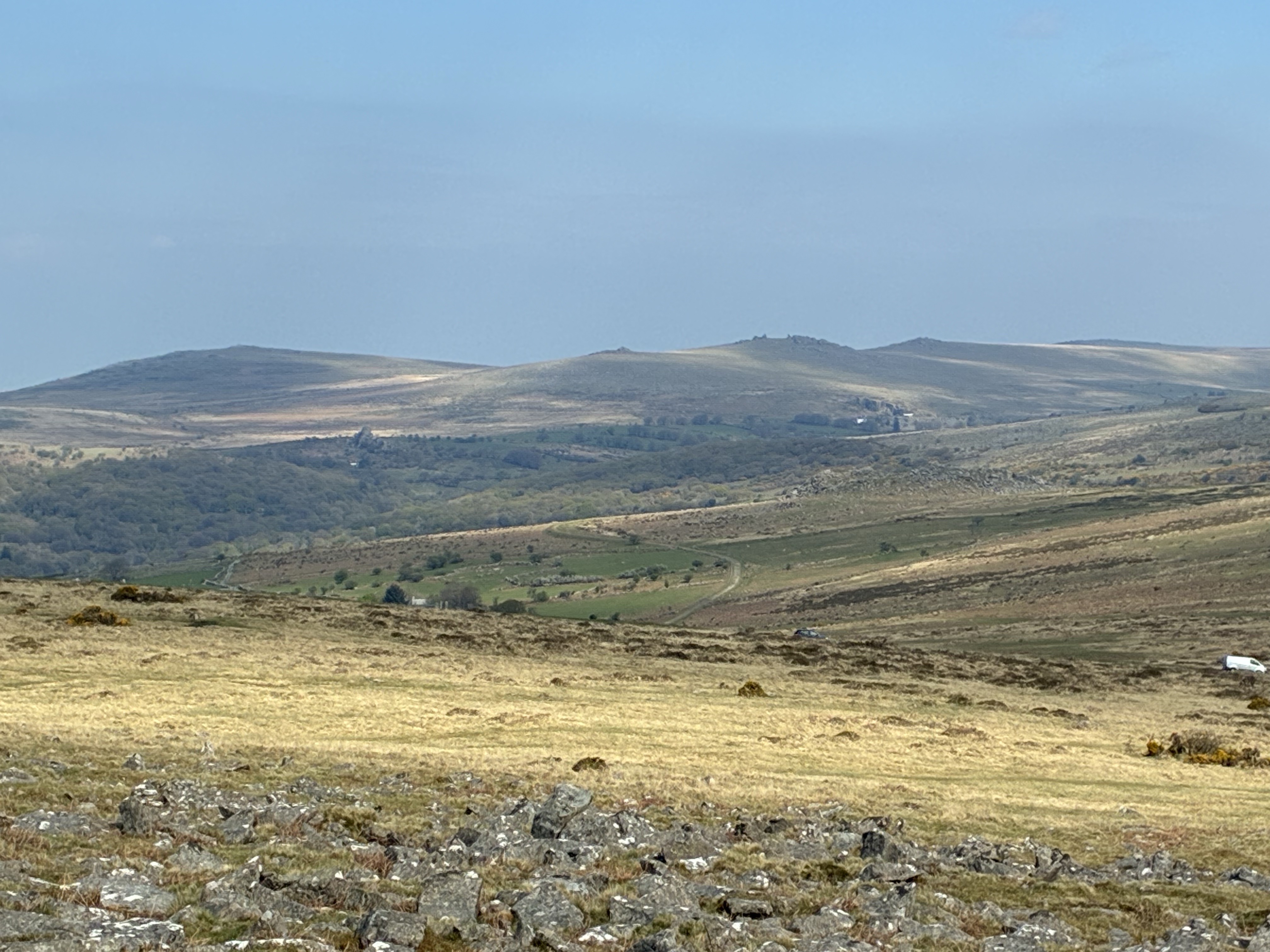
Our walk took us just north of Sharpitor, from where we were welcomed with expansive views to the northeast of classic Dartmoor moorland:

After rounding Sharpitor, the prominent, rather pointed, conical peak of Leather Tor came into view…

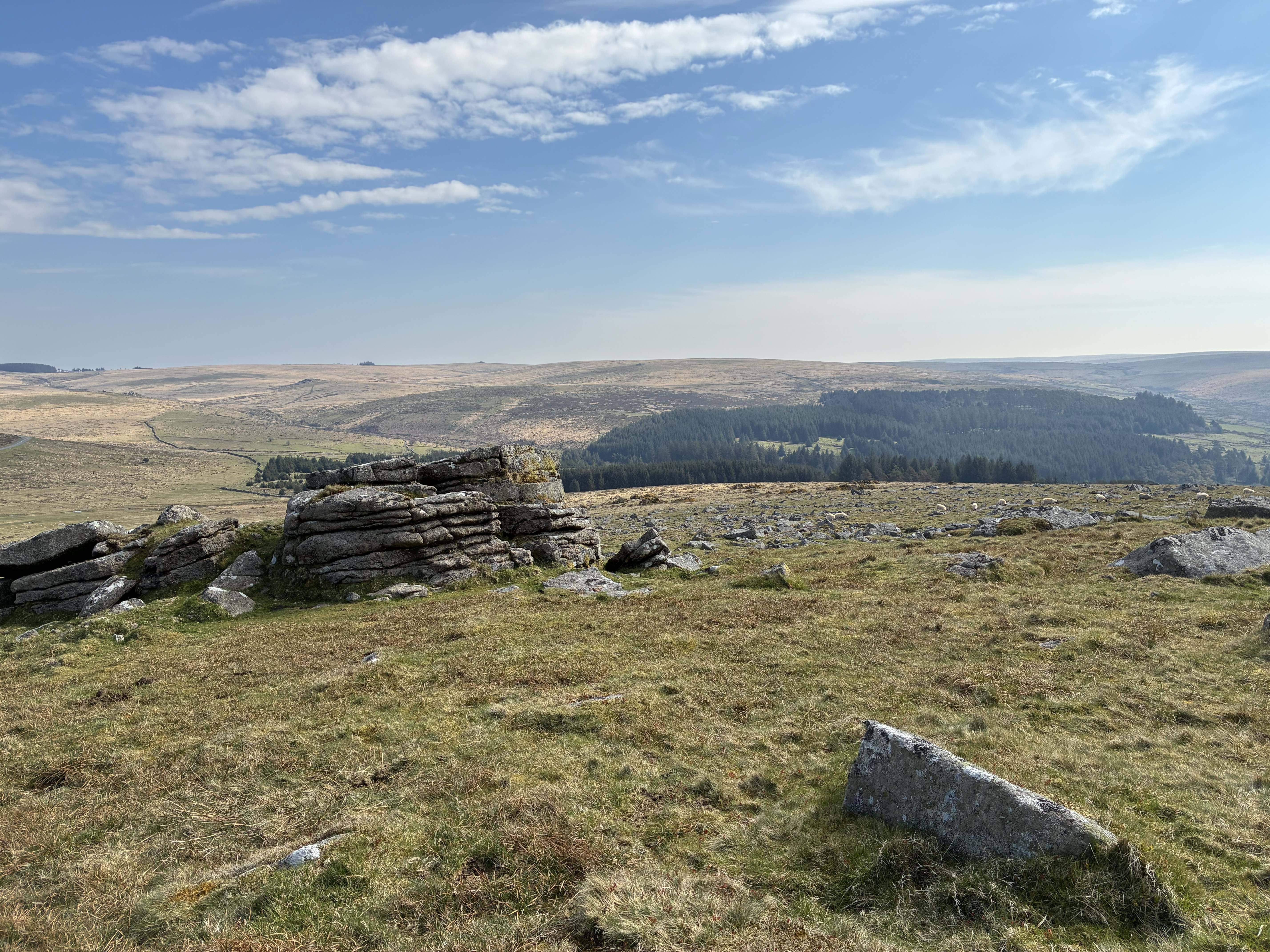
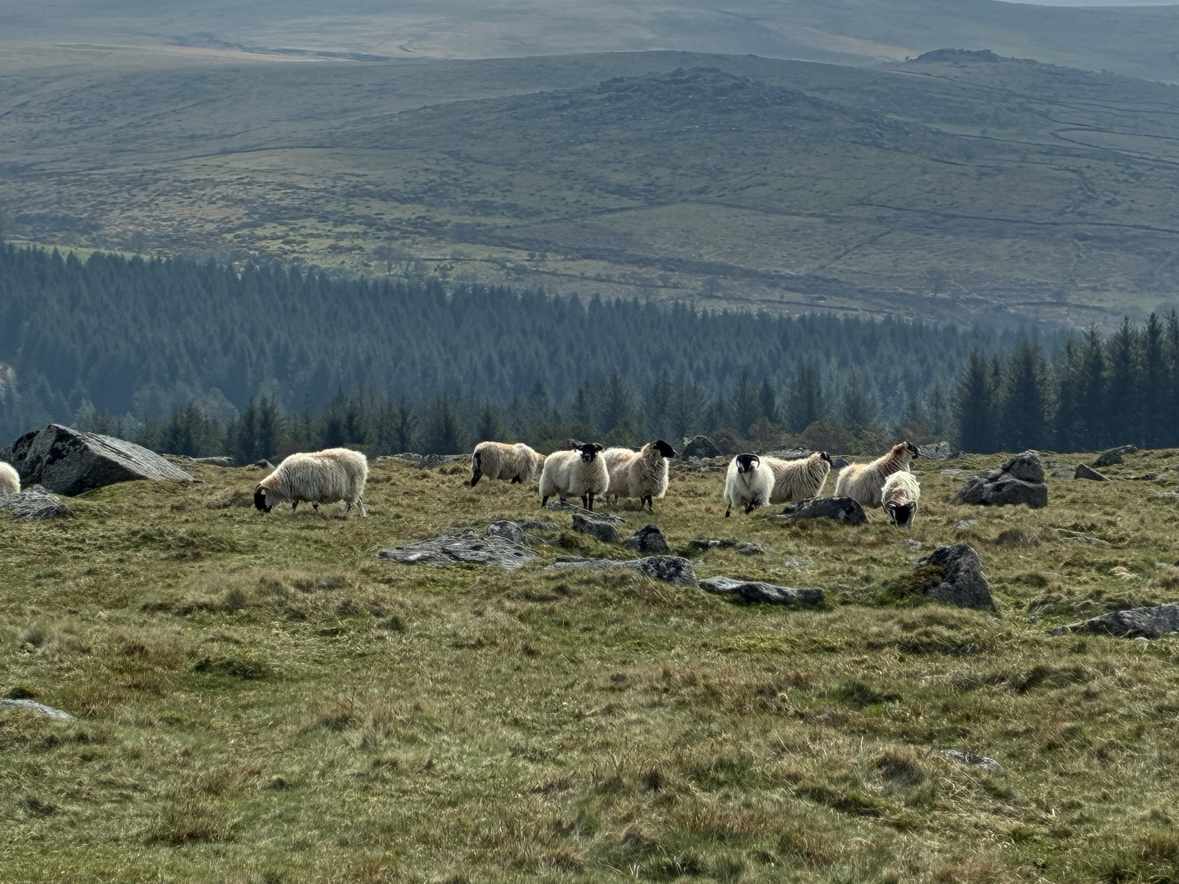
… and we were greeted by a typical group of Dartmoor’s sheep, grazing on the rough hillside…

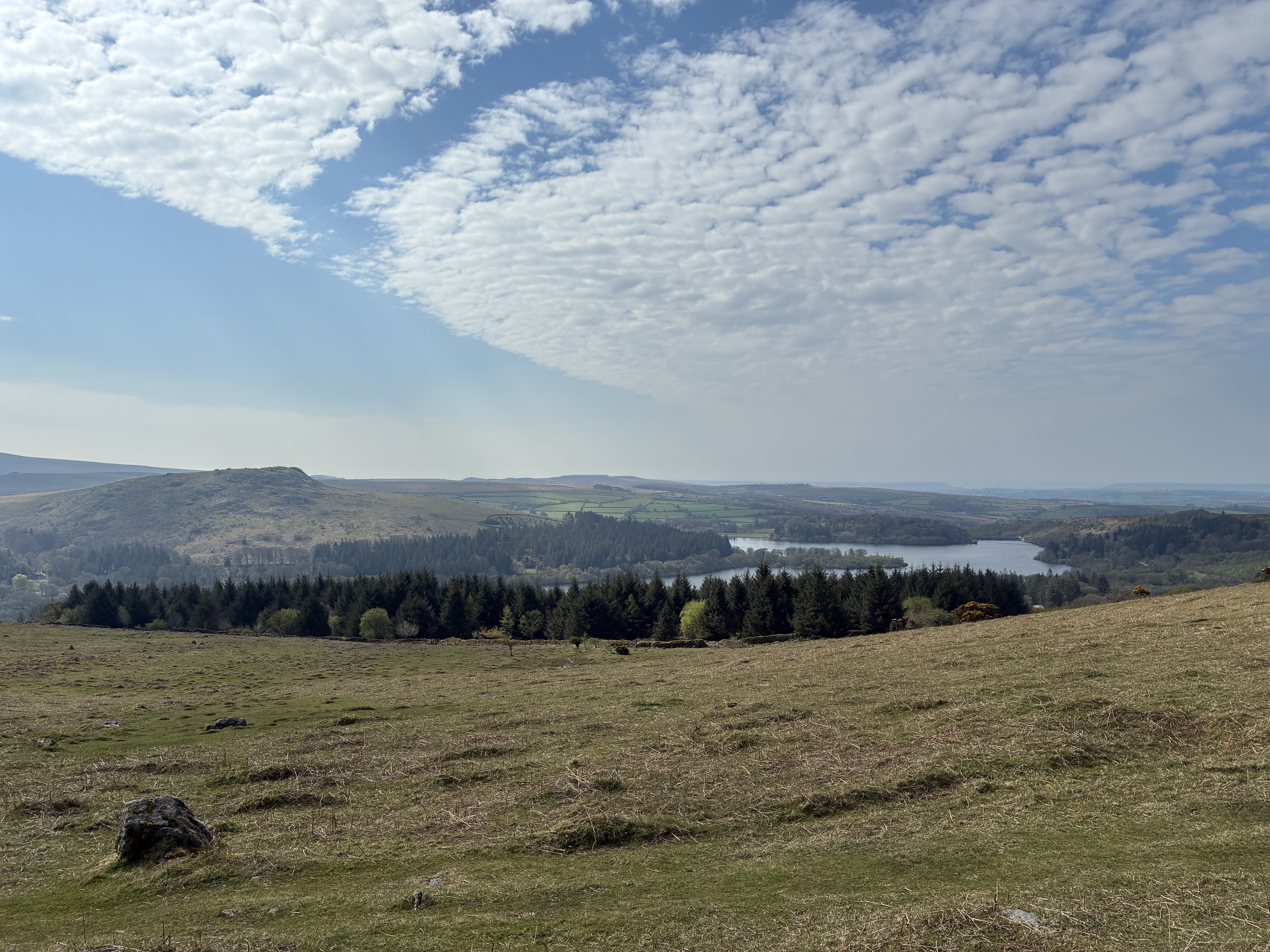
Having passed midway between Sharpitor and Leather Tor, we turned southwest towards Peek Hill, and from here the view opened out to reveal the waters of Burrator Reservoir, with Plymouth visible towards the horizon…

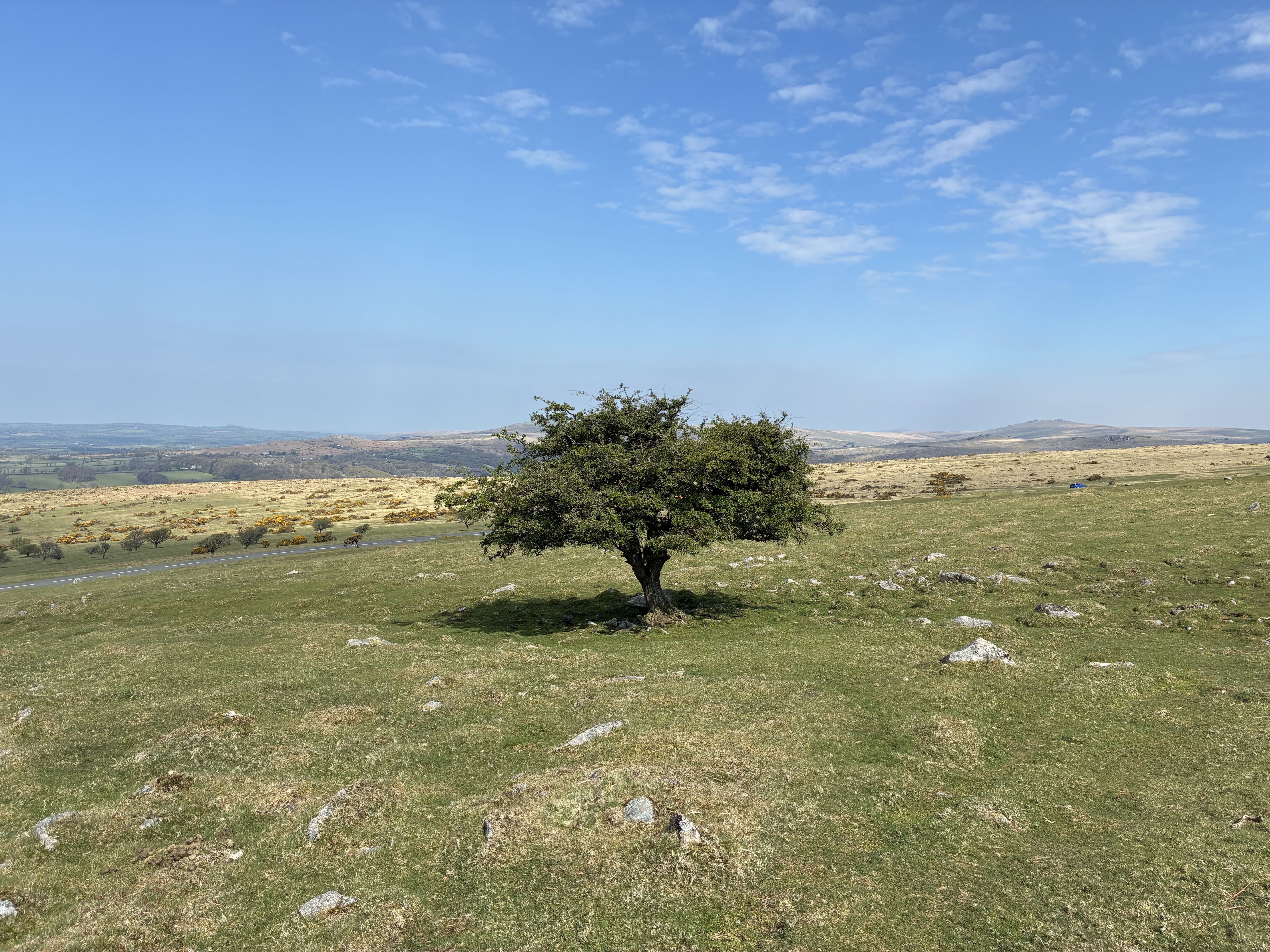
Our route took took us northwest, down the slope from Peek Hill towards the Plymouth-to-Princetown road, and along the way we passed one of my favourite sights, a lone tree of a type that I like to refer to as a symmetree…

Then, just across the road stood this wonderful row of Beech(?) trees, planted into the old stone wall, their dark, essentially leafless, forms making beautiful patterns when viewed against the bright colours of the fields, sky and clouds beyond…

This row of trees – in fact any row of trees like these – are really one of my favourite sights of all, and although there was still a little more walking to do, down towards an ancient stone row that we then followed back towards the car, I think that they are a fitting place for me to end this little photo-tour of our April walk around Peek Hill. I often think that I ought to have a go at painting this row of trees one day… but there are so many branches, so many, many branches… I am not sure that I have the patience for that!

The Killing Field #poem

This is the killing field –
but the danger does not come to you or me
from the piercing horn of a bull’s rush,
the digoxin punch of a fox’s glove,
or a saliva-damp kiss from a cow’s lip.

This is the killing field –
but the danger does not come to you or me
from the aconitine grip of the wolf’s bane,
the spicular burn from a nettle’s leaf,
or a sudden unexpected stroke of a pony’s tail.

This is the killing field –
and just for once, the danger does not even come
from those who strip the land to build and burn,
who work the soil to plant and grow,
who take whatever they wish to take,
who go wherever they wish to go.

This is the killing field –
but the danger does not come to you or me.
It comes to the little creatures
that scuttle and slither over ground,
or paddle at the water’s edge,
or take flight into the humid air,
or hide away within the sedge.
For they refused to yield
to kiss the ground before the wise birds’ shrieks,
and so were baited by the raptors’ curse.

This is the killing field –
but the danger does not come to you or me.
It comes to the mouse, the rabbit and the vole,
not fast enough to find a hole,
the beetle, grub and dragonfly,
left with no escape to try,
the snake, the newt, the toad, the frog,
too slow to get beneath a log,
the pigeon, finch and moorhen chick,
this time, alas, insufficiently quick.

This is the killing field –
and for all the little creatures that you love,
death comes unheralded from far above.

First comes
Buteo buteo (Buzzard):
Mightiest of all,
soaring high in thermal plumes,
before swooping down
to grasp in taloned feet
the unfortunate prey it must consume.

Then comes
Circus aeruginosus (Marsh Harrier):
Not far behind in stature and power,
ranging low with undulating flight,
before entering the reed bed
to pluck out
the tiny creatures hiding there in fright.

But not all threats require wings of such size, for now come
Falco tinnunculus (Kestrel):
Fast wings, steady hover,
sharp eyes,
before falling like a stone
to pounce
with great surprise
and
Falco subbuteo (Hobby):
Wings swept, swift flier,
thrilling chase,
before making the snatch,
to prove
that it has won the race.

An optimist might think
that the setting of the sun
and the falling of the dark
could bring respite.
But this is the killing field –
and the danger comes both day and night.

For now, in fading light, comes
Tyto alba (Barn Owl):
Heavy flaps, ghostly glide,
a pause upon a post,
before the sudden drop
to make the surprise visit
to its host.

Then, as darkness gathers like a cloak, comes
Athene noctua (Little Owl):
Sitting, watching from a lofty perch,
shattering the silence with its screech,
before flying down,
to snaffle up
whatever it can reach.

And finally, with all light gone, comes
Strix aluco (Tawny Owl):
Master of the dark,
Night vision goggled, waiting patiently with hunting ears,
Before pouncing,
silently,
on each and every morsel of a meal it hears.

This is the killing field –
but the danger does not come to you or me.
The danger comes from far above
from birds named with gladiatorial sounding words:
Buteo buteo and Circus aeruginosus –
majestic Buzzard and Marsh Harrier.
Falcos tinnunculus and Subbuteo –
agile Kestrel and Hobby.
Tyto alba, Athene noctua and Strix aluco:
Barn, Little, Tawny – three wise owls. 

This is the killing field –
and the danger comes with such beauty and grace,
that seeing Death
has never before
put such a smile upon my face.

(c) Tim O’Hare, July 2023


THE KILLING FIELD: While staying in Suffolk during the second week of our summer holiday we walked around Redgrave and Lopham Fen one afternoon. Having seen various birds, but not being entirely sure that I had been able to identify them all correctly, I made sure that we went back for a second look, and I was really thrilled to confirm my first ever sightings of a Marsh Harrier and a Hobby along with the oft-seen Buzzard and Kestrel. These are all beautiful birds, and it was fascinating to watch their different flight patterns and to look up information about their diets and hunting styles. But it struck me quite forcibly that with that beauty and guile came death, and the idea that the area around the fen was a ‘Killing Field’ took root in my head. During our stay we also heard or were told of the whereabouts of several different species of owls – the evening and night hunters – and so I threw those into the deadly mix too.

Plymouth Waterfront from Plymouth Sound #art

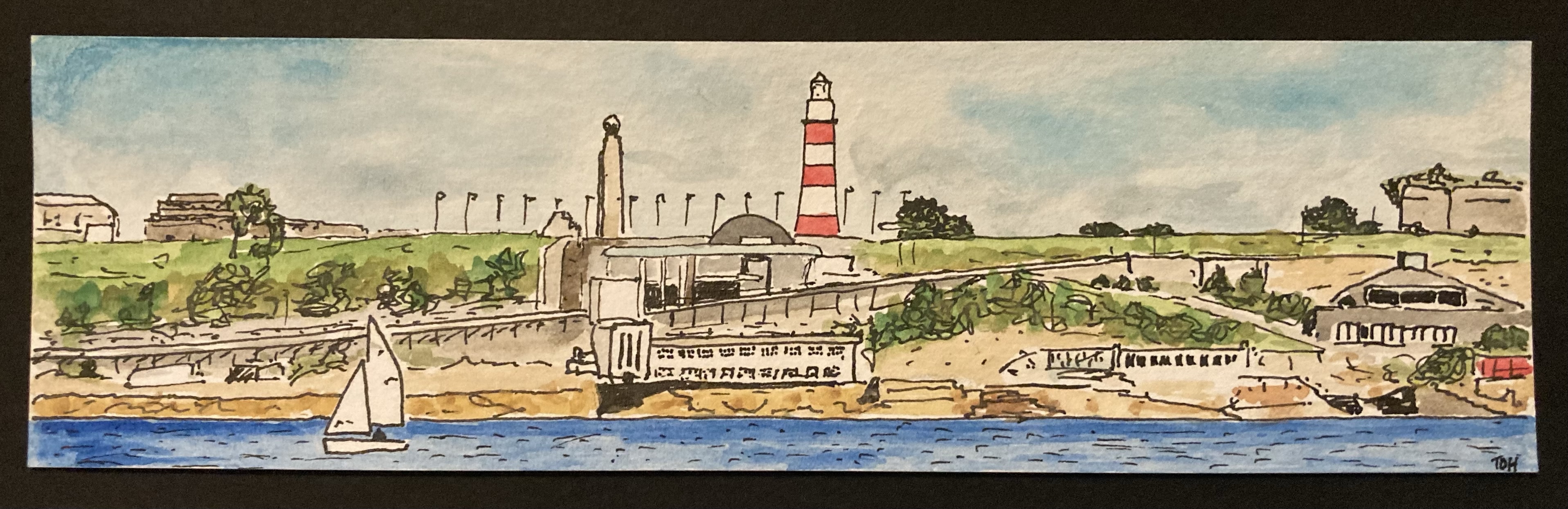
I painted this small panoramic picture of Plymouth Waterfront as viewed from Plymouth Sound as a bookmark to accompany the birthday present (books!) that my wife gave to one or her friends back in March. They enjoy a weekly walk down to the Plymouth Waterfront on most Friday mornings and so this scene was the obvious subject matter to choose.

It was interesting to paint in this wide format, and it’s an approach that I have been using more recently for some Dartmoor pictures. I think that when we view a landscape in real life our brain naturally provides a somewhat wide-screen view, and that this might be why, at least to some extent, it is often somewhat disappointing when you take a photograph of a view and much of what you see in real life seems to be condensed into a very small part of the picture.

One advantage of adopting this kind of panoramic composition, at least for a novice and completely untrained painter like me, is that it reduces the amount of sky, as this is often tricky to paint. And in this particular picture it also reduced the amount of water that I had to paint, something else that I’m not especially confident with.

All in all, I really liked this picture with its pops of colour [did I really just write ‘pops of colour’ – this seems to be such a trendy turn of words these days on TV programmes relating to art, interior design, home improvement etc. I must have caught it from there…]. I am sure that this is a format and also, with its obvious local interest, a view that I will return to in the future.

Mistakes Are Not Always Bad #wisdom

A couple of weeks ago we paid a visit to Make Southwest, an exhibition space for contemporary craft and design and a leading charity for craft education located in the small town of Bovey Tracey on the southern edge of Dartmoor, about 25 miles from our home in Plymouth. It’s a venue that we have visited a few times before – there is always some kind of special exhibition (this time it was a exhibition of contemporary bells called Sound and Silence) and an interesting array of local artwork, books and assorted items to look at in the shop. On this occasion, the reason for our trip was to see a smaller exhibition of wood engraved prints and, in particular, the printmaker Molly Lemon, who had travelled down from her base in Gloucestershire to demonstrate her work. We have encountered Molly at several Craft/Art Events in the last couple of years and always enjoyed viewing, and chatting to her, about her work. We also enjoyed seeing her compete in, and reach the semi-finals of, the Sky Arts TV Series Landscape Artist of the Year a few weeks ago.

Since I started painting about a year ago, whenever I go to any kind of art gallery or art/craft event I particularly enjoy scavenging the work that is on display or sale for ideas that I can try out for myself. Looking at the various pieces of artwork for sale in the shop at Make Southwest, I was particularly enamoured by some tiny pieces of work created by the printmaker Mike Tingle (also here). These were very small (just a few centimetre) square prints on slightly larger squares of rough-edged paper, with a title and the artist’s name written in pencil around the picture (there is an example of a similar kind of picture just below the centre in this piece of work: Dartmoor Box No 1). I really liked the miniature size and somewhat ‘rough’ nature of the pieces and I immediately thought that it would be fun to try to produce something similar using one of my own small Dartmoor Scenes watercolour paintings.

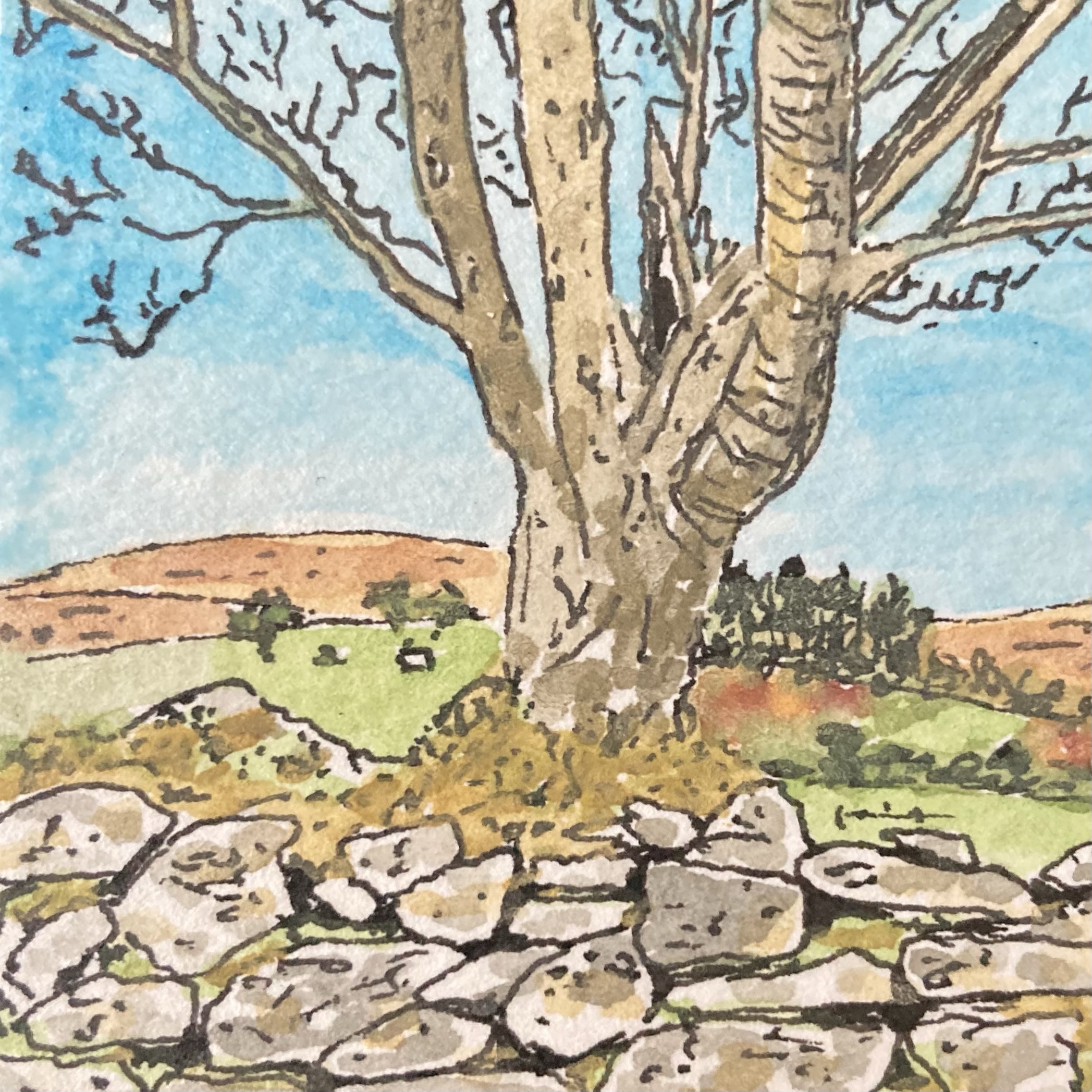
After returning home, I set about seeing what I could produce. First, I selected one of my pictures, opting for this one of a tree growing out of a typical Dartmoor dry-stone wall:

The original picture is a 4.5 cm square ink and watercolour sketch, and my intention was to use our home inkjet printer to make the best quality colour photocopy of it that I could, printing onto a sheet of watercolour paper so that the texture of the original was preserved. I’d already played around with making copies of some of my paintings in this way and so I knew that although the copied versions weren’t quite the same as the originals, with the paler colours tending to wash-out a bit, the process worked pretty well. So far so good.

This is the point at which I made my mistake. In the process of making the copy I somehow selected black-and-white printing, and so when I saw what the printer had spat out into the print tray I was instantly annoyed and frustrated. To make matters worse, because the original picture was on a small square of fairly thick paper, as the scanning light moved below the copier glass a dark shadow line was cast on one side of the copied picture. Not only did I only have a black-and-white copy, but I had a black-and-white copy that had a dark line along one of its edges. What a waste of a sheet of paper and ink…

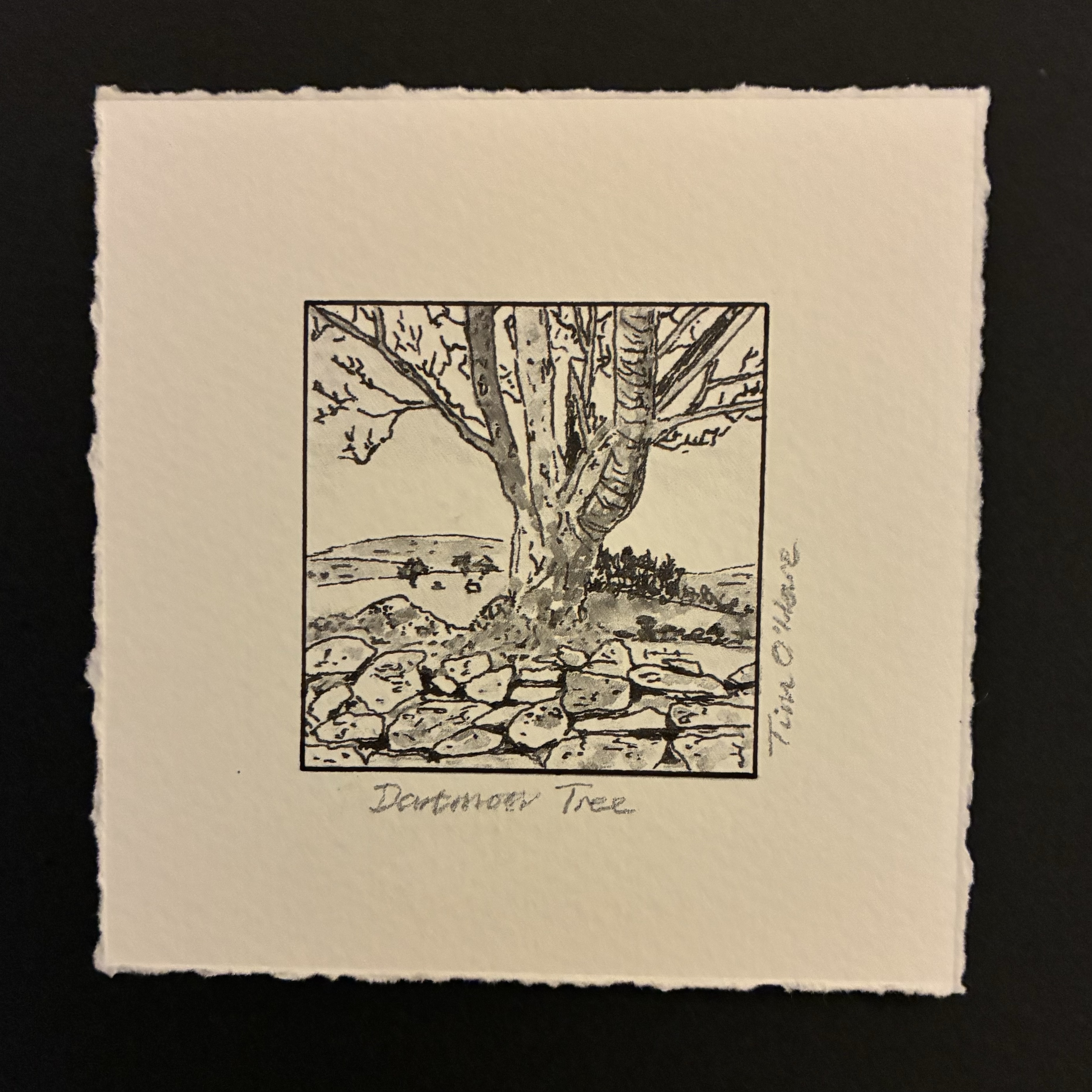
However, once I had overcome my initial disappointment and self-censure, I decided to press on with the rest of my production process and see what the end result looked like. I had intended that there would be no border between the picture and the surrounding area of paper, but now there was that dark line along one side spoiling that design idea. What could I do? Well, go with the mistake of course. I took my drawing pen and with the aid of a straight edge and a lot of care, I inked in a similar line on the other three sides. Hmmm… it didn’t look as I had planned but I liked the result. Then I measured out a wider border, and again aided by a straight edge, I tore the paper down to size. This part of the process is something that I have found takes a lot of care… if the tear is too sharp you don’t get the nice rough edge I was after, but if you are at all rushed and loose you end up with something that looks clumsy and careless. Fortunately, I managed to do a good job. Finally, I grabbed a soft pencil and quickly wrote a title below the bottom edge and my name on the right-hand side…

The result of this endeavour was the small picture shown at the top of this post and, despite my black-and-white and shadow mistakes in the copying process, I’m really pleased with the end result, so much so, in fact, that I intend to take the rest of my Dartmoor Scenes pictures and treat them in the same fashion. Even better, not only did I end up with a new picture that I really liked and the discovery of a new way to transform existing pictures into a different, somewhat distinctive, form, but I also gave myself a great reminder that making mistakes in life is not always a bad thing. In fact, sometimes, as in this case, a mistake can open up a different path from the one that was intended that leads you towards an unexpected but interesting, exciting or enjoyable destination!