Walkham Woods (charcoal/watercolour) #art

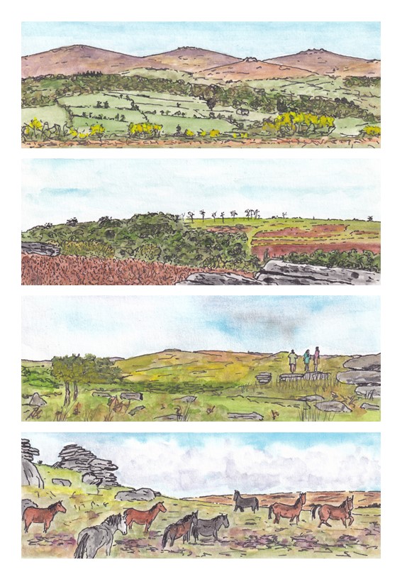
Since I started drawing and painting back in April 2024 I have primarily worked with ink and watercolour paints, with my ‘go-to’ format being small, usually ~5cm square, pictures on some particular theme that I have chosen to explore for a few days. Producing pictures of that type has become my staple art activity, to the extent that I describe this as my ‘art practice’. However, I am constantly thinking about how I would like to explore different formats and work with different media. This especially happens when I visit an art exhibition, see works by other artists,and wonder what I could produce if I branched out a bit. The funny thing is that prior to my big shift into art in April 2024 I had actually begun to dabble with creating pictures with pastels (e.g. see my post Rediscovering The Artist Within) but I have not returned to pastels once since then.

Sometime back in May I must have been somewhere that brought me into contact with some charcoal drawings. I had a set of charcoal pencils sitting unopened in my art supplies box, and so I thought I would branch out a little and see what happened when I completed the drawing phase of a picture with charcoal, rather than adopting my usual approach of starting off with some faint pencil lines and then going all in with my black ink pen. I think I hoped that the different drawing texture might lead to me producing a more abstract picture. Then, after scribbling away with the charcoal pencil for a bit, I returned to the familiar territory of my watercolour paints to give my drawing some colour.

The result of my efforts is shown in the picture above – a charcoal -cribbles-with-watercolour painting of a row of what I refer to a ‘wall trees’, somewhere in the valley of the River Walkham, from a photo that I had taken on a walk there.

I’m not sure exactly what I think of this picture. It seems quite basic and simple – the trees sitting very much on top of the leafy backdrop and lacking much detail in their trunks and branches – and that simplicity pushes me towards thinking that the picture doesn’t quite work. But I also quite like the more impressionistic look – the rough lines suggesting the texture and structure of the stone wall, and the bright greens and particularly the yellows of the leaf canopy shouting out for attention. The picture has a naivety which I think gives it a certain charm. As I look at the picture, my eyes seem to be drawn in to explore what little detail there is, perhaps more so than happens when viewing one of my more detailed ink and watercolour pictures. Overall, I think that perhaps the switch in drawing medium was successful in helping me to present the view in a more abstract, suggestive manner than my normal ink-and-watercolour approach.

I’ve not had another go with charcoal pencils since I created this picture just over two months ago, but revisiting it now and writing this post has fired me up to spend some more time over the coming period to play around with different approaches and media a bit more. I wonder what will emerge!

Dartmoor Panoramas #art

The proximity of Dartmoor to our home in Plymouth generally means that it is our go-to place for weekend walks, so it is hardly surprising that my phone is full of photographs of Dartmoor landscapes. I’m a particular sucker for ‘big views’, but my attempts to capture these in photographs are always something of a let down. Looking with the naked eye, big views fill my visual space with rich detail, but on camera everything seems to shrink, recede and flatten, resulting in a rather distant picture that is dominated by sky, and especially foreground, that the brain somehow filters out of the live view. I expect that this phenomenon is well understood by photographers, and it probably even has a special name, but to me it is just known as ‘disappointment’. This is compounded by the difficulty that I face when I subsequently try to capture this same kind of open, expansive view in one of my paintings. The part of a photograph that I want to paint seems to be only a small component of the whole, and no amount of zooming in seems to really help.

On one recent trip to Dartmoor I was pondering this issue when it occurred to me that what I was seeing with my eyes was a little like the view I got when I used my thumbs and index fingers to create a rectangular, letterbox-like, frame and then looked through that frame as if looking through a window. Despite there being so much more that could be seen, my brain seemed simply to ignore that part of the view that would have outside this frame, whereas my phone camera played no such trick. I began to wonder whether the key to painting this kind of view was to change the size and shape of the picture, adopting a similar letterbox, or panoramic, format. So, for a few days I played with this approach. The results are a series of four small painting that I refer to as my Dartmoor Panorama series.

I’m pleased with these pictures, at least to the extent that they better capture something approximating to the kinds of spacious views that I like best. Using a panoramic format does seem to work. In the third picture I was brave enough to include some people standing on one of the tors and gazing out at the view> I think this little piece of detail adds a lot to the picture, including a splash of contrasting colour. I was even more brave in the fourth picture, including a group of Dartmoor ponies. I tend to think that I’m not able to paint animals, but perhaps I am improving, because at least some of the ponies in this picture seem to have come out pretty well. I am particularly pleased with the grey pony in the foreground and the somewhat lively pony furthest to the right.

I feel sure that I will use this approach to painting expansive views again, and I suspect that at some point my curiosity will lead me to explore some photography guides to see whether I can find a proper explanation of my observation. It might have something to do with ‘foreshortening’ and/or ‘depth-of-field’ (words that I am vaguely familiar with that at least sound like they could be contributing factors). Who knows, perhaps someone reading this post will be able to point me in the right direction!