The proximity of Dartmoor to our home in Plymouth generally means that it is our go-to place for weekend walks, so it is hardly surprising that my phone is full of photographs of Dartmoor landscapes. I’m a particular sucker for ‘big views’, but my attempts to capture these in photographs are always something of a let down. Looking with the naked eye, big views fill my visual space with rich detail, but on camera everything seems to shrink, recede and flatten, resulting in a rather distant picture that is dominated by sky, and especially foreground, that the brain somehow filters out of the live view. I expect that this phenomenon is well understood by photographers, and it probably even has a special name, but to me it is just known as ‘disappointment’. This is compounded by the difficulty that I face when I subsequently try to capture this same kind of open, expansive view in one of my paintings. The part of a photograph that I want to paint seems to be only a small component of the whole, and no amount of zooming in seems to really help.
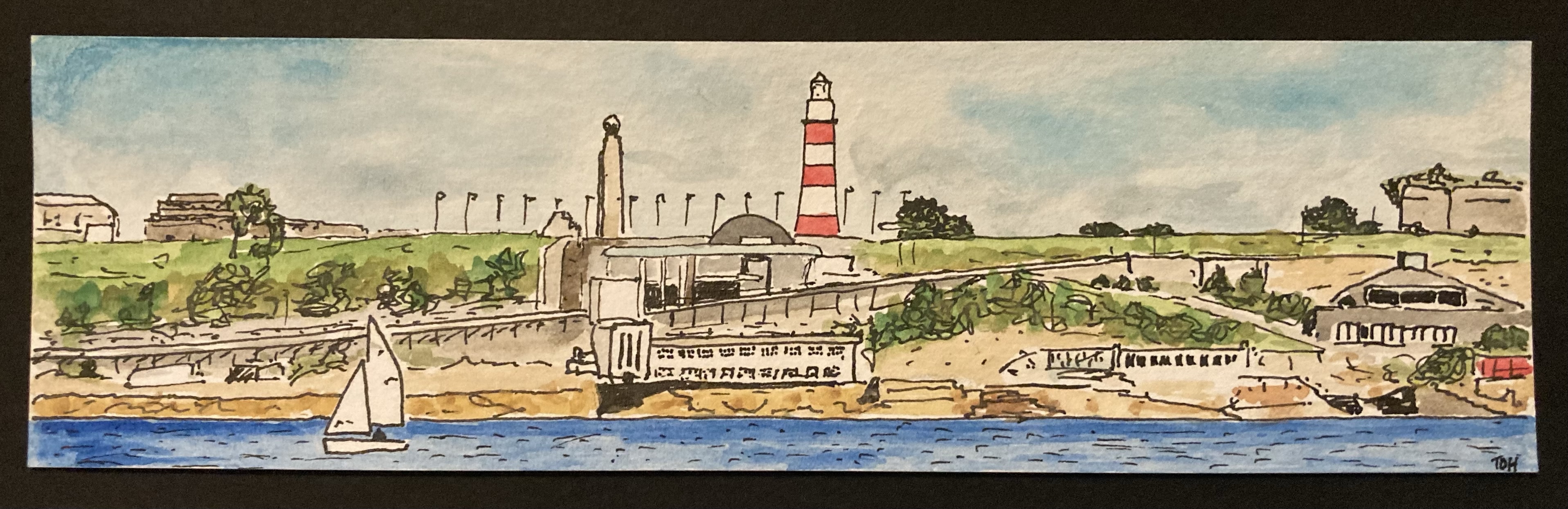
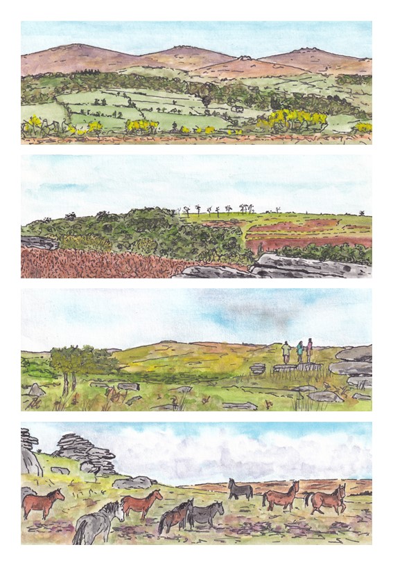
On one recent trip to Dartmoor I was pondering this issue when it occurred to me that what I was seeing with my eyes was a little like the view I got when I used my thumbs and index fingers to create a rectangular, letterbox-like, frame and then looked through that frame as if looking through a window. Despite there being so much more that could be seen, my brain seemed simply to ignore that part of the view that would have outside this frame, whereas my phone camera played no such trick. I began to wonder whether the key to painting this kind of view was to change the size and shape of the picture, adopting a similar letterbox, or panoramic, format. So, for a few days I played with this approach. The results are a series of four small painting that I refer to as my Dartmoor Panorama series.
I’m pleased with these pictures, at least to the extent that they better capture something approximating to the kinds of spacious views that I like best. Using a panoramic format does seem to work. In the third picture I was brave enough to include some people standing on one of the tors and gazing out at the view> I think this little piece of detail adds a lot to the picture, including a splash of contrasting colour. I was even more brave in the fourth picture, including a group of Dartmoor ponies. I tend to think that I’m not able to paint animals, but perhaps I am improving, because at least some of the ponies in this picture seem to have come out pretty well. I am particularly pleased with the grey pony in the foreground and the somewhat lively pony furthest to the right.
I feel sure that I will use this approach to painting expansive views again, and I suspect that at some point my curiosity will lead me to explore some photography guides to see whether I can find a proper explanation of my observation. It might have something to do with ‘foreshortening’ and/or ‘depth-of-field’ (words that I am vaguely familiar with that at least sound like they could be contributing factors). Who knows, perhaps someone reading this post will be able to point me in the right direction!