A couple of weeks ago we paid a visit to Make Southwest, an exhibition space for contemporary craft and design and a leading charity for craft education located in the small town of Bovey Tracey on the southern edge of Dartmoor, about 25 miles from our home in Plymouth. It’s a venue that we have visited a few times before – there is always some kind of special exhibition (this time it was a exhibition of contemporary bells called Sound and Silence) and an interesting array of local artwork, books and assorted items to look at in the shop. On this occasion, the reason for our trip was to see a smaller exhibition of wood engraved prints and, in particular, the printmaker Molly Lemon, who had travelled down from her base in Gloucestershire to demonstrate her work. We have encountered Molly at several Craft/Art Events in the last couple of years and always enjoyed viewing, and chatting to her, about her work. We also enjoyed seeing her compete in, and reach the semi-finals of, the Sky Arts TV Series Landscape Artist of the Year a few weeks ago.
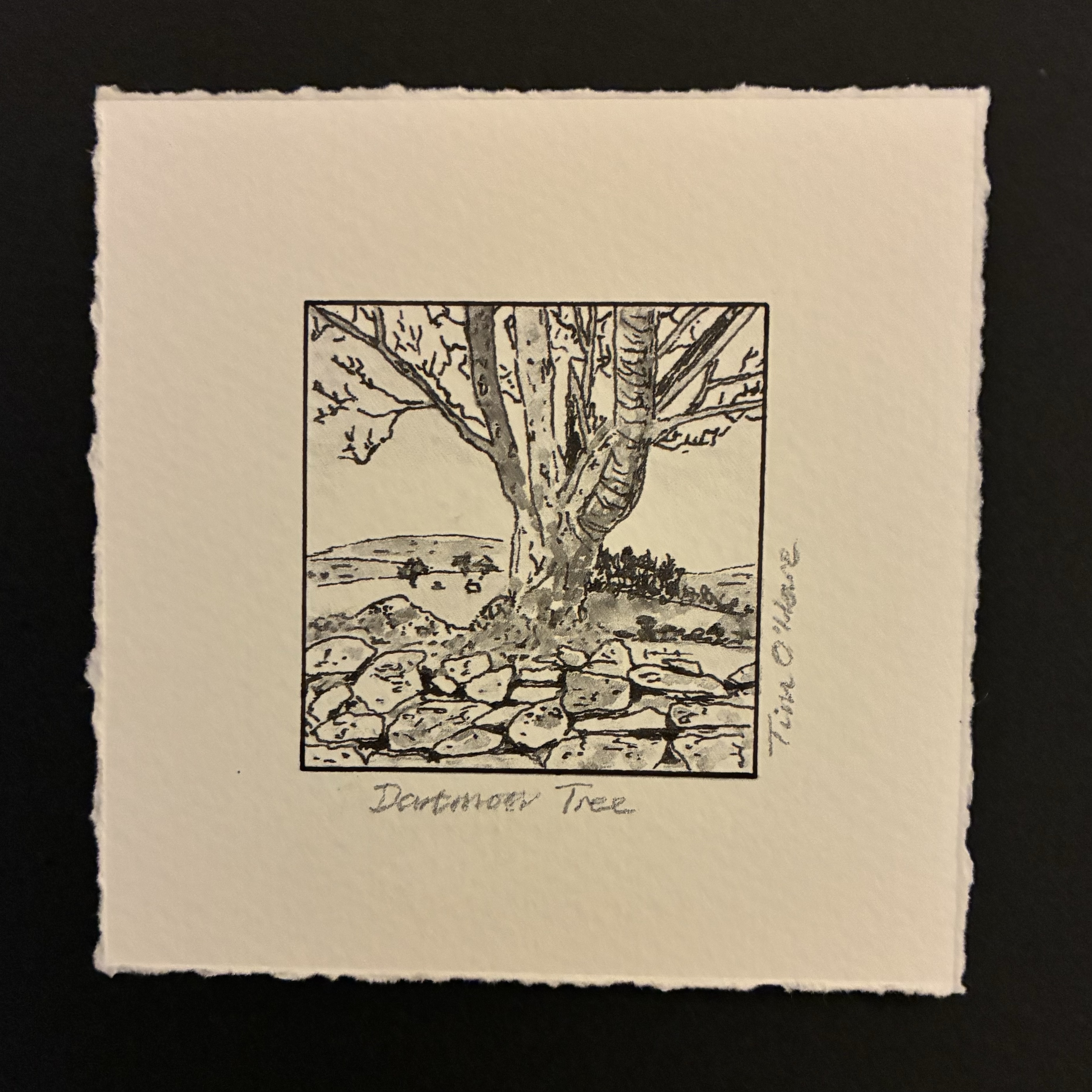
Since I started painting about a year ago, whenever I go to any kind of art gallery or art/craft event I particularly enjoy scavenging the work that is on display or sale for ideas that I can try out for myself. Looking at the various pieces of artwork for sale in the shop at Make Southwest, I was particularly enamoured by some tiny pieces of work created by the printmaker Mike Tingle (also here). These were very small (just a few centimetre) square prints on slightly larger squares of rough-edged paper, with a title and the artist’s name written in pencil around the picture (there is an example of a similar kind of picture just below the centre in this piece of work: Dartmoor Box No 1). I really liked the miniature size and somewhat ‘rough’ nature of the pieces and I immediately thought that it would be fun to try to produce something similar using one of my own small Dartmoor Scenes watercolour paintings.
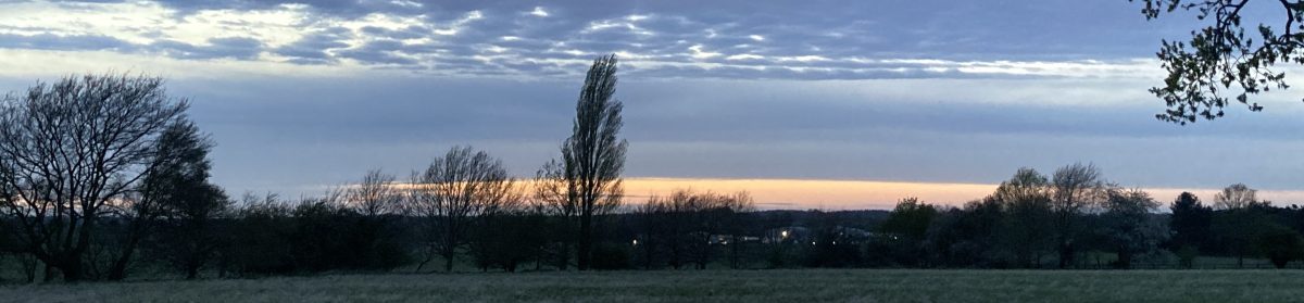
After returning home, I set about seeing what I could produce. First, I selected one of my pictures, opting for this one of a tree growing out of a typical Dartmoor dry-stone wall:
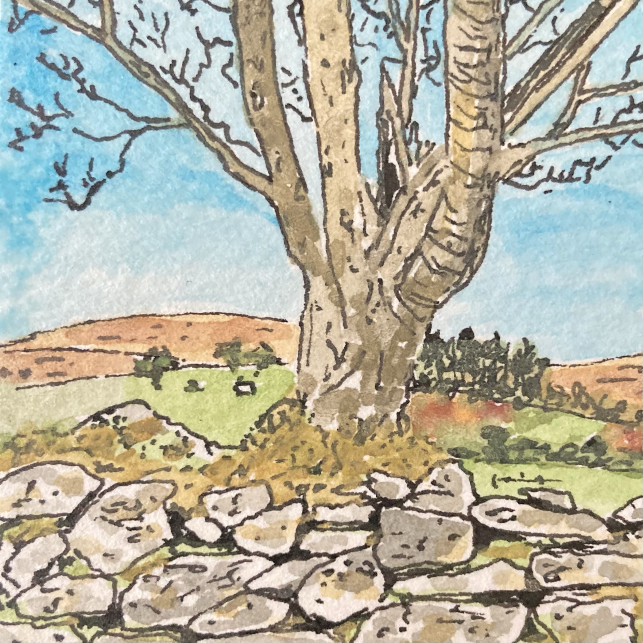
The original picture is a 4.5 cm square ink and watercolour sketch, and my intention was to use our home inkjet printer to make the best quality colour photocopy of it that I could, printing onto a sheet of watercolour paper so that the texture of the original was preserved. I’d already played around with making copies of some of my paintings in this way and so I knew that although the copied versions weren’t quite the same as the originals, with the paler colours tending to wash-out a bit, the process worked pretty well. So far so good.
This is the point at which I made my mistake. In the process of making the copy I somehow selected black-and-white printing, and so when I saw what the printer had spat out into the print tray I was instantly annoyed and frustrated. To make matters worse, because the original picture was on a small square of fairly thick paper, as the scanning light moved below the copier glass a dark shadow line was cast on one side of the copied picture. Not only did I only have a black-and-white copy, but I had a black-and-white copy that had a dark line along one of its edges. What a waste of a sheet of paper and ink…
However, once I had overcome my initial disappointment and self-censure, I decided to press on with the rest of my production process and see what the end result looked like. I had intended that there would be no border between the picture and the surrounding area of paper, but now there was that dark line along one side spoiling that design idea. What could I do? Well, go with the mistake of course. I took my drawing pen and with the aid of a straight edge and a lot of care, I inked in a similar line on the other three sides. Hmmm… it didn’t look as I had planned but I liked the result. Then I measured out a wider border, and again aided by a straight edge, I tore the paper down to size. This part of the process is something that I have found takes a lot of care… if the tear is too sharp you don’t get the nice rough edge I was after, but if you are at all rushed and loose you end up with something that looks clumsy and careless. Fortunately, I managed to do a good job. Finally, I grabbed a soft pencil and quickly wrote a title below the bottom edge and my name on the right-hand side…
The result of this endeavour was the small picture shown at the top of this post and, despite my black-and-white and shadow mistakes in the copying process, I’m really pleased with the end result, so much so, in fact, that I intend to take the rest of my Dartmoor Scenes pictures and treat them in the same fashion. Even better, not only did I end up with a new picture that I really liked and the discovery of a new way to transform existing pictures into a different, somewhat distinctive, form, but I also gave myself a great reminder that making mistakes in life is not always a bad thing. In fact, sometimes, as in this case, a mistake can open up a different path from the one that was intended that leads you towards an unexpected but interesting, exciting or enjoyable destination!
