I love figures and I love playing around with them…
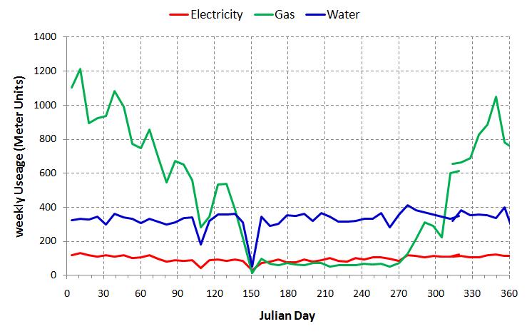
Over the last year, I have taken a meter reading for each of my household utilities every weekend. I started just after we had a water meter installed and I wanted to make sure I was checking regularly for leaks. The data is displayed graphically below. Some points of interest are:
1. The drop in water useage around Day 105 and 150 are when I went on holiday (4 days at Easter, 7 days in May).
2. Gas useage seems to show an apparent roughly monthly variation (in the winter) which is a bit odd (The graph below below is now a couple of weeks old – intriguingly the same pattern of roughly monthly variation in gas useage is starting to show up this winter too – have I discovered a signal of some previously unknown meteorological cycle?)
3. During the summer the electricity and gas show a small out of phase variation (gas goes up when electricity goes down and vice versa). I think this relates to the food we were eating – i.e. when we cooked something in the oven (electricity) we weren’t using the hob (gas).

